

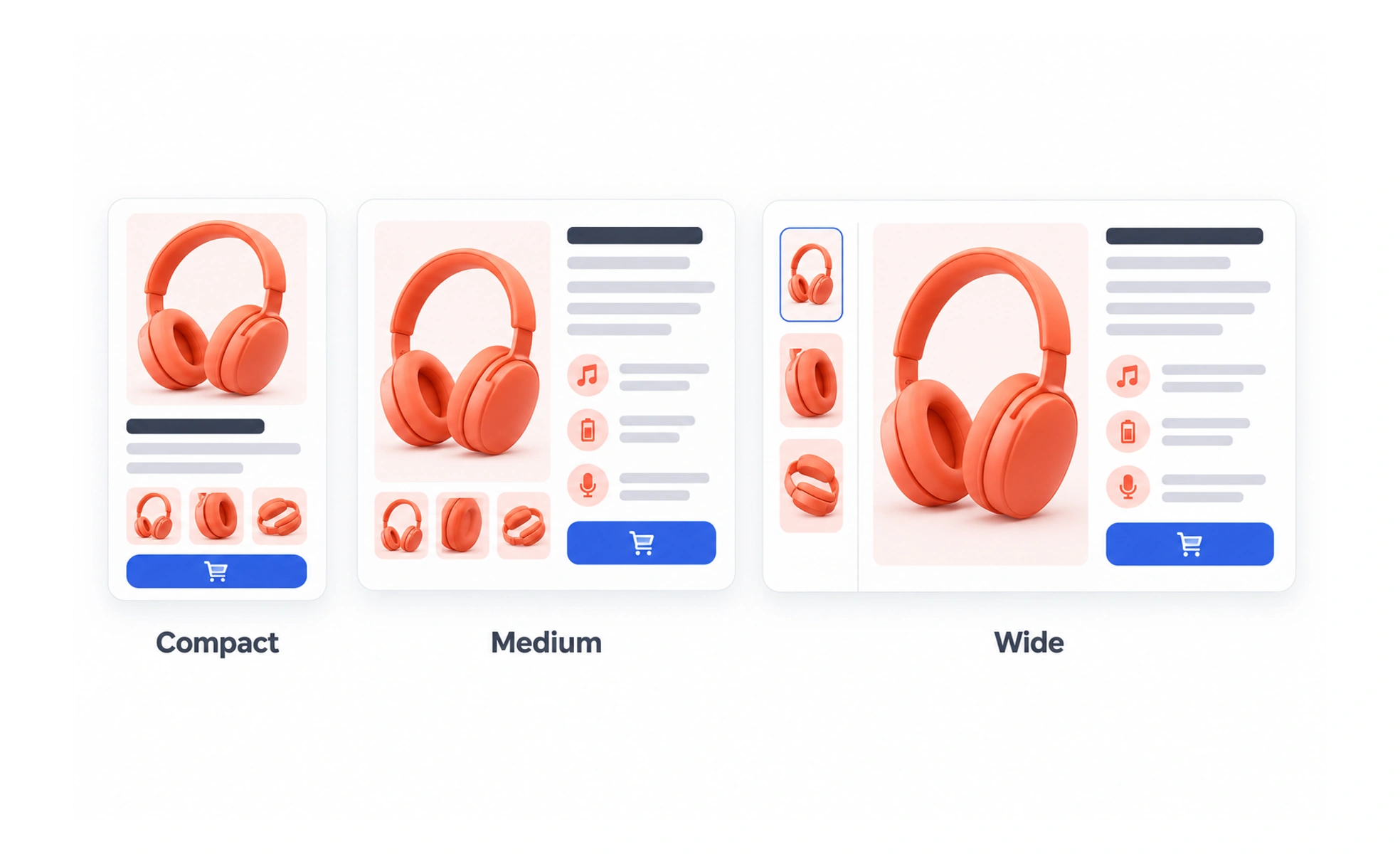
Adaptive design provides layouts or behaviors suited to different contexts, such as screen width, input method or user needs. It can use several deliberate arrangements rather than one fluid layout alone.
A room can be rearranged for a workshop or a lecture while keeping the same purpose and essential facilities.
Adapt to the task context
The context may include available width, touch or pointer input, reduced-motion preference, network conditions or assistive technology. Adaptation should preserve the task’s essential content and controls while making the interaction more suitable for that context.
Combine fluid and deliberate changes
Some elements can resize continuously; others need a structural change. A sidebar may become a drawer on a small screen, while text can simply reflow. Use the least complex approach that keeps the experience usable and coherent.
Keep behavior predictable
A control should not disappear merely because the viewport changed if users still need its function. If an action moves into an overflow menu, keep the label understandable and the action accessible. Respect operating-system preferences such as reduced motion rather than forcing an animation.
Example: a learning player
A lesson player can place theory and questions side by side on a wide display, then show one focused pane at a time on mobile. The learner should retain a clear way to switch between them, see progress and continue with keyboard or touch input.
Frequently asked questions
Key takeaways
- Adapt layout and behavior to real context needs.
- Preserve essential tasks across arrangements.
- Use fluid sizing where possible and structural changes where necessary.
- Respect input methods and accessibility preferences.