

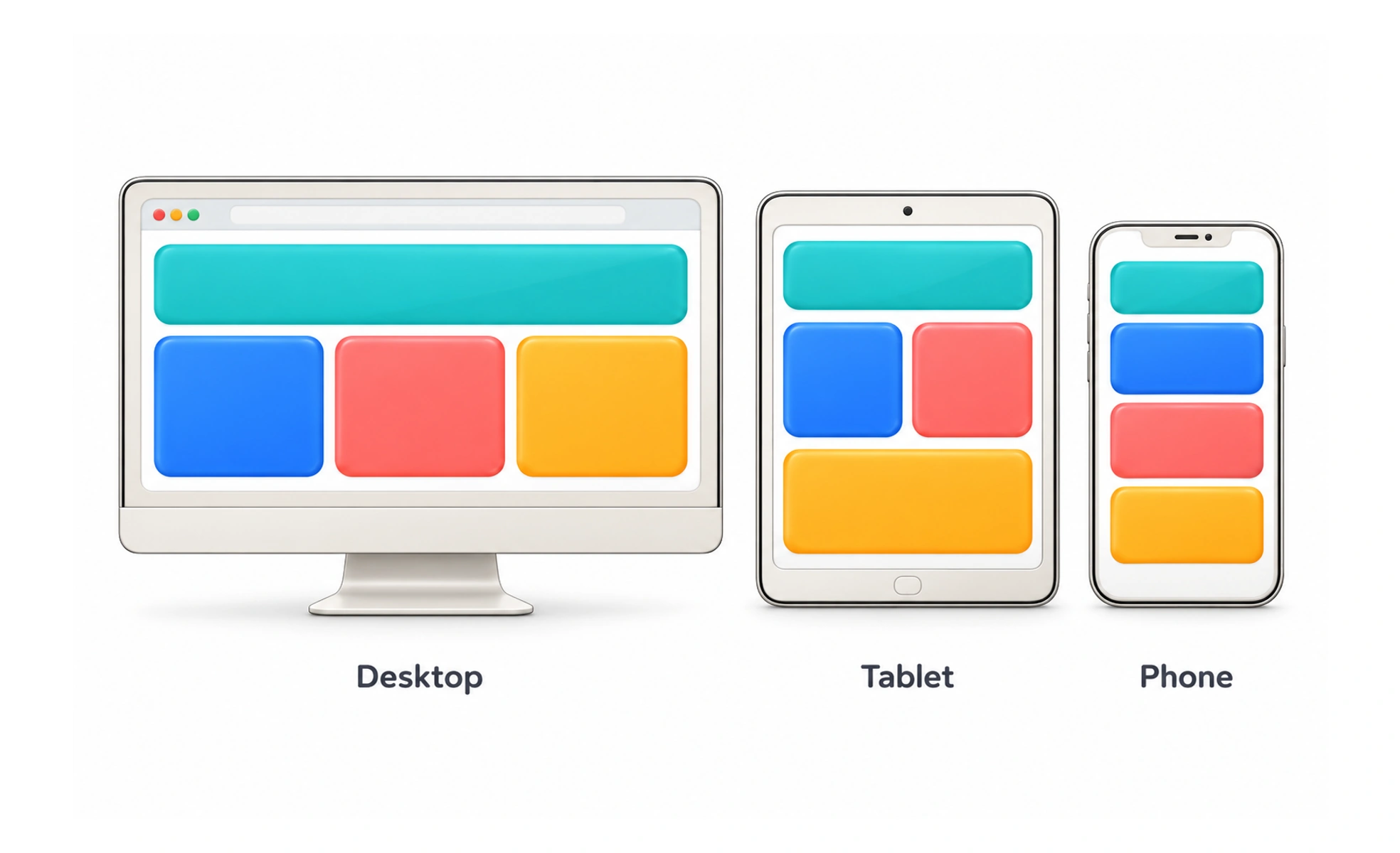
Using fluid grids, flexible images and CSS media queries, it delivers optimal viewing experiences across phones, tablets and desktops. It eliminates the need for maintaining separate mobile websites.
Think of it as water poured into different containers. Whether you pour water into a tall drinking glass, a wide bowl or a shallow cup, it naturally shapes itself to fit the vessel.
How it works
Responsive design unifies three core technical building blocks into an elastic layout engine.
- Fluid grid systems specify component widths using relative percentages or CSS fraction units rather than fixed pixels.
- Flexible media assets set max-width constraints on images and video embeds so they scale within parent containers.
- CSS media queries detect viewport widths and apply layout breakpoints to reflow columns and adjust type scales.
- Touch versus pointer detection adjusts target sizing and hover behaviors depending on whether the user touches or clicks.
When to use it
Implement responsive design on every modern web platform to support diverse device hardware.
- Cross-device web applications ensure users move seamlessly between their office desktop and home smartphone.
- Content publication hubs maintain comfortable reading typography whether viewed on an iPad or wide monitor.
- Search engine optimization consolidates all web traffic into a single canonical URL structure favored by search crawlers.
- Design system token frameworks defines consistent breakpoint tokens across engineering and product squads.
Common mistakes
Developers and designers frequently introduce layout bugs through rigid breakpoint assumptions.
- Designing only for specific devices like iPhone and MacBook, causing broken layouts on intermediate screen sizes.
- Hiding critical functionality on mobile, leaving phone users unable to access features available on desktop.
- Serving massive desktop image assets to mobile devices, draining mobile data and causing painful load delays.
Frequently asked questions
Key takeaways
- Responsive design ensures web interfaces dynamically adapt to any viewport dimension.
- It combines fluid proportion grids, responsive images and CSS media query breakpoints.
- Design mobile-first by establishing core content hierarchies before expanding to wider screens.
- Never hide essential features from mobile users; adapt the layout rather than stripping utility.