

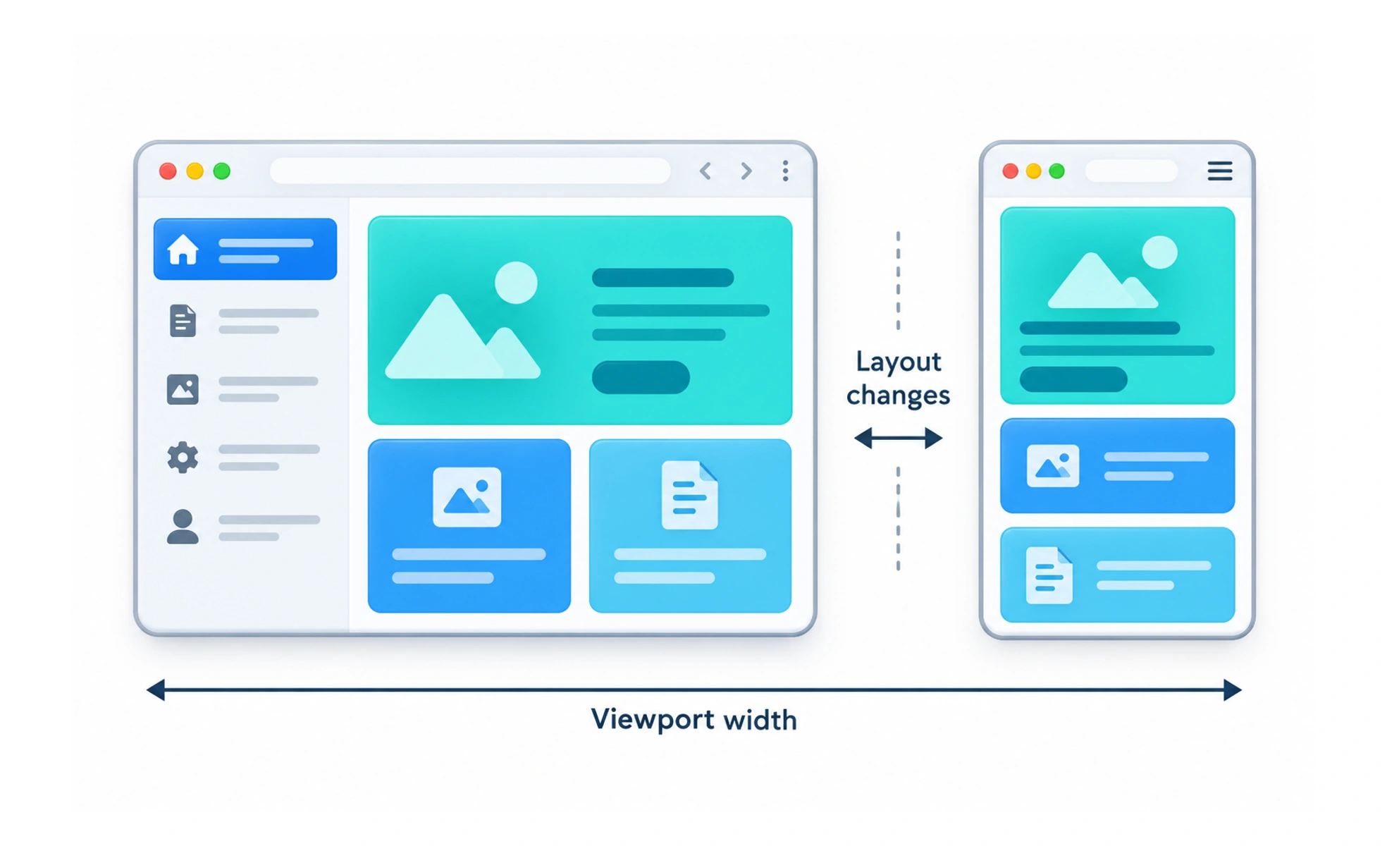
A breakpoint is a viewport condition at which a responsive layout changes its arrangement or behavior. Good breakpoints respond to content pressure rather than a specific device model.
A doorway needs to widen when people no longer pass through comfortably; the right point depends on the space, not the name of the building.
Find where the layout stops working
Resize the page and watch for cramped controls, awkward line lengths, overlapping content or navigation that no longer fits. That point is a useful candidate for a layout change. Starting from common device widths can be convenient, but test whether the actual content needs that change there.
Change structure only when needed
A breakpoint may collapse a sidebar, move actions into a menu or change a card grid. Avoid adding breakpoints for tiny visual differences that can be handled by flexible sizing. Every branch increases the number of states to maintain and verify.
Test the space between breakpoints
A layout can look good at two named widths and fail in between. Test just below and above each breakpoint, plus widths that expose long labels or translated text. Content zoom and browser text scaling also change the effective available space.
Frequently asked questions
Key takeaways
- Base breakpoints on content and interaction needs.
- Prefer flexible layouts before adding another breakpoint.
- Test just above, below and between breakpoints.
- Include zoom, translation and text growth in checks.