

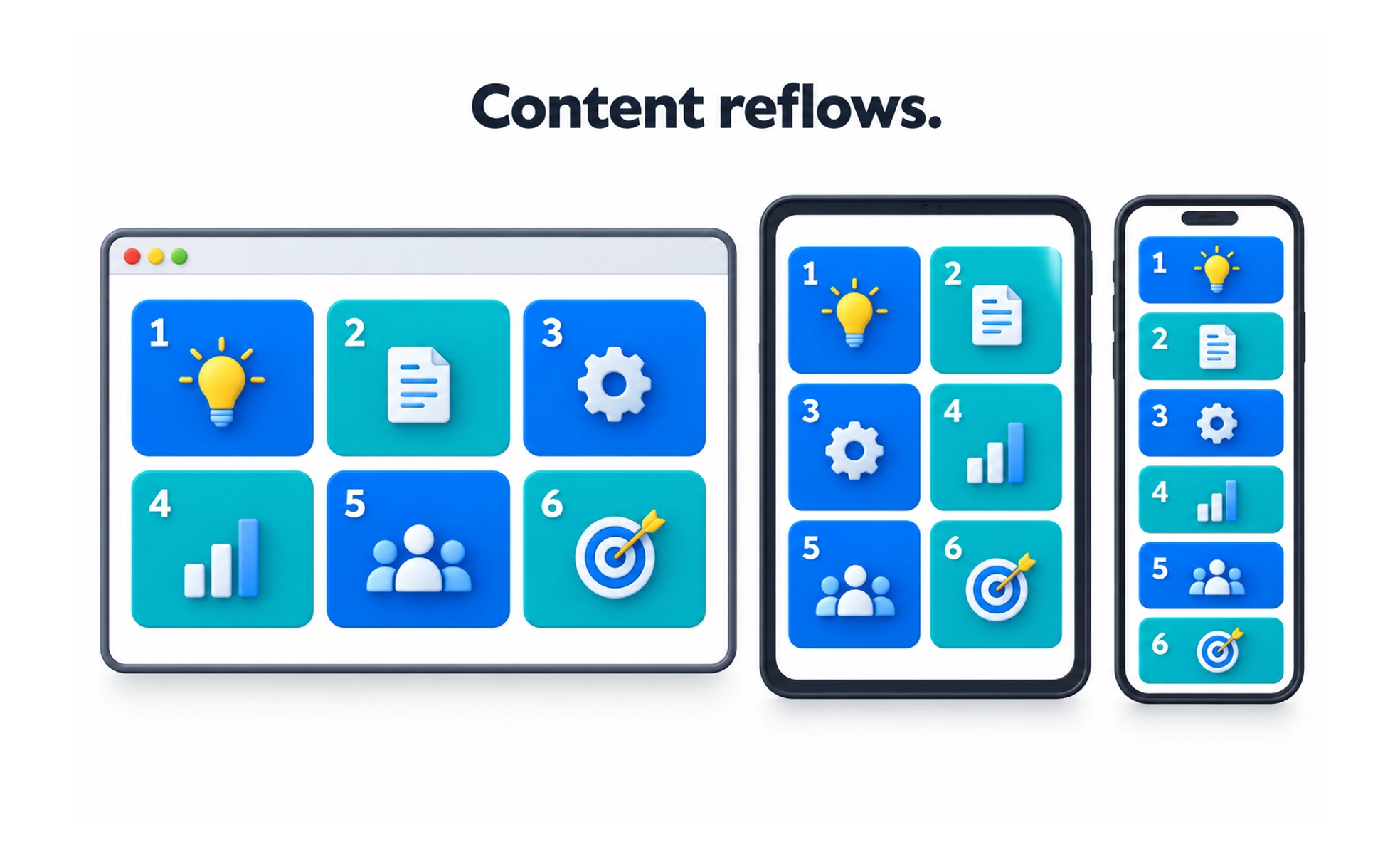
A responsive grid organizes content into rows and columns that adjust to the available viewport. It helps repeated items remain aligned while their number or width changes.
Like seats arranged for different room sizes, a responsive grid changes the number of places without changing the order of the event.
Start with content constraints
Decide how wide a card or text column can be before it becomes difficult to read or use. A grid should respond to both the viewport and the content, not simply switch at familiar device names. Define gutters and maximum widths as part of the system.
Choose columns and wrapping behavior
A catalog may show three cards per row on a wide screen, two on a medium screen and one on a narrow screen. Each card should retain enough width for its title and action. Use a consistent gap and avoid squeezing too many columns into the space available.
Preserve order and meaning
When columns collapse, items should follow an order that still makes sense. Avoid visual placements that produce a confusing reading order for keyboard or assistive-technology users. Text-heavy material may work better in one column even when the screen could technically fit more.
Example: a course library
A course library can use a flexible grid with a maximum content width. On a large monitor it may show several cards, while on a tablet it shows fewer. At every size, titles should wrap, metadata should remain readable and the bookmark control should stay in a predictable place.
Frequently asked questions
Key takeaways
- Set minimum useful card and text widths.
- Let columns respond to available room and content.
- Preserve a logical reading order when grids collapse.
- Test real content, not only empty card shells.