

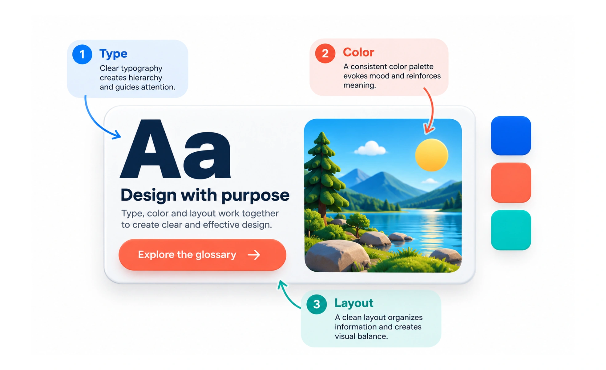
It goes far beyond cosmetic decoration by clarifying content hierarchy and guiding human eyes. Good visual design makes complex digital products understandable, trustworthy and delightful.
Think of it as architecture for digital spaces. It determines not just the paint color on the walls, but how light flows, where doorways sit and how spacious a room feels.
How it works
Visual design orchestrates multiple aesthetic disciplines into a cohesive communication system.
- Scale and proportion establish dominant focal points so users instantly know what to read first.
- Typographic hierarchy uses distinct font weights and sizes to organize headings, subtitles and body copy.
- Color palettes communicate brand mood while highlighting interactive buttons and critical alert states.
- Spatial rhythm applies consistent padding and margin tokens to create clean visual breathing room.
When to use it
Apply visual design principles to transform functional wireframes into polished, trustworthy products.
- Elevating brand perception builds consumer credibility and signals professionalism to prospective buyers.
- Clarifying cluttered workflows uses contrast and whitespace to make dense data tables scannable.
- Reinforcing mental models styles interactive affordances consistently so buttons look distinct from badges.
- Design system scaling codifies visual tokens across engineering teams to ensure multi-platform consistency.
Common mistakes
Teams often damage usability by prioritizing artistic novelty over functional clarity.
- Sacrificing contrast for aesthetics, such as using low-contrast gray text on white cards that washes out.
- Ignoring layout consistency, where buttons, margins and form inputs switch shapes across screens.
- Decorating without intent, adding arbitrary gradients, heavy drop shadows and animations that distract.
Frequently asked questions
Key takeaways
- Visual design shapes communication, hierarchy and trust, not just surface aesthetics.
- Clear visual hierarchy ensures users instantly perceive the most important information first.
- Consistent spacing, typography and color tokens create a cohesive and professional experience.
- Aesthetic choices must always satisfy accessibility standards and functional readability.