

It is both a compliance requirement and a design discipline. The same features that help a screen reader user often help someone in bright sunlight or with a temporary injury. Retrofitting accessibility at the end costs far more than building it in from the start.
Think of it like this. A curb cut on a sidewalk was designed for wheelchair users, but it also helps parents with strollers and travellers with suitcases. Design for the edge case and everyone benefits.
How it works
Accessibility follows four principles, known as POUR, from the Web Content Accessibility Guidelines (WCAG).
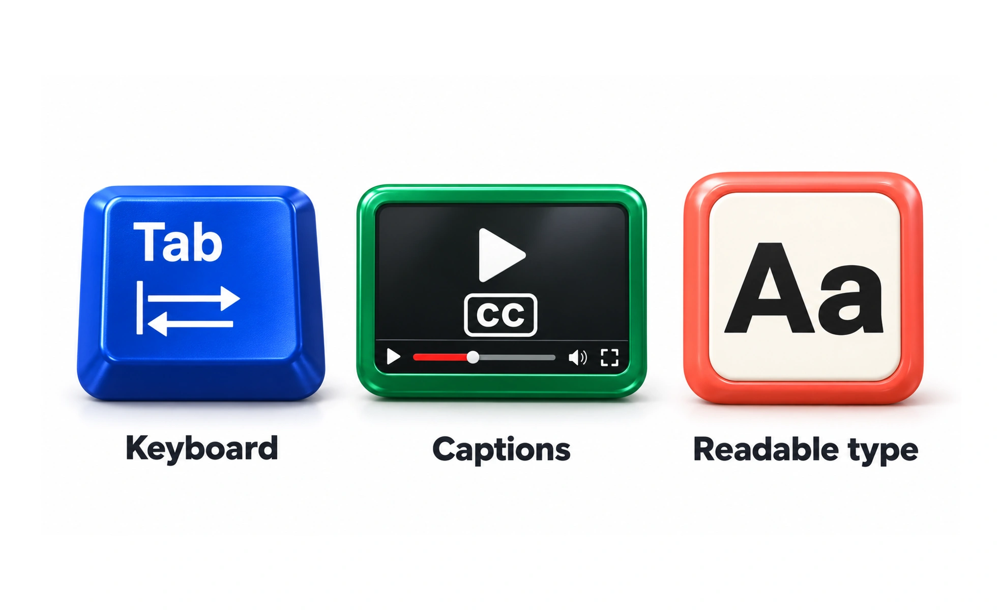
- Perceivable. Information must be available to the senses. Images need alt text. Video needs captions. Text needs enough contrast against its background. 4.5:1 for normal text under WCAG AA.
- Operable. Every function must work without a mouse. Keyboard users navigate the web constantly, and a missing focus indicator makes a page unusable for them.
- Understandable. Text should be readable. Behaviour should be predictable. Forms should explain what went wrong in words, not just turn the field red.
- Robust. Code should work with assistive technology. Semantic HTML, proper headings, lists, landmarks, gives screen readers a structure to navigate.
When to use it
Accessibility is not a feature you add when there is time. It is part of every decision from the first sketch onward.
Design systems are the most efficient way to deliver it at scale, because an accessible button component is inherited by every screen that uses it. Tokens that enforce contrast ratios and spacing that meets touch target minimums do the same for styling.
Automated tools catch maybe a third of issues. Manual keyboard testing and screen reader testing are still required, because the problems that matter most are the ones a checklist cannot see.
Common mistakes
- Treating accessibility as a compliance checkbox. A product that passes an automated audit and repels screen reader users is still inaccessible. The audit is a floor, not the work.
- Building it in at the end. Retrofitting costs more and misses things. Colour contrast baked into tokens from day one is free. Remeasuring every screen three weeks before launch is expensive.
- Thinking it is only for blind users. Accessibility covers visual, auditory, motor, cognitive and speech disabilities, plus temporary and situational limitations. A broken arm is an accessibility problem.
- Relying on automated tools alone. They catch maybe 30 to 40 percent of issues. The rest need a human with a keyboard and a screen reader.
Frequently asked questions
Key takeaways
- Accessibility is for anyone with a visual, auditory, motor, cognitive or speech impairment, plus temporary and situational limits.
- The curb-cut effect is real: design for an edge case and everyone benefits.
- WCAG AA, especially the 4.5:1 contrast ratio and keyboard operability, is the practical target for most products.
- Design systems are the cheapest way to deliver accessibility at scale.
- Automated tools catch a portion of issues. Manual testing catches the rest.