

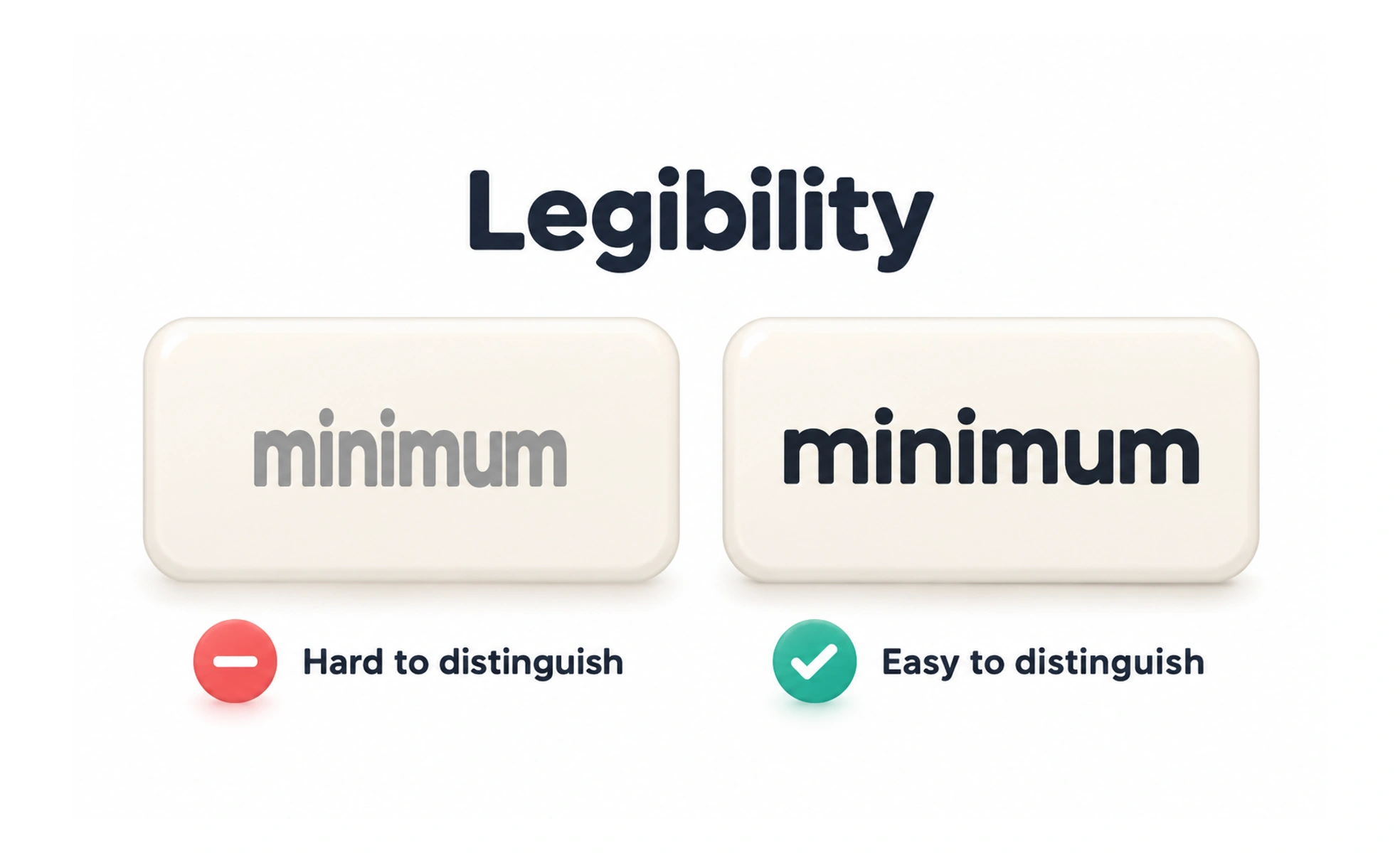
Legibility is how easily a person can distinguish individual letters and words. It depends on letterform design, size, spacing, contrast, and the conditions in which text appears.
A clear street sign uses recognizable letters and enough space between them so a driver can identify each word quickly.
Distinguish similar characters
Some typefaces make characters such as lowercase l, uppercase I, and the number 1 difficult to tell apart. This matters in usernames, codes, tables, and technical content. Choose forms that fit the task, and do not rely on color or context alone when a character must be entered correctly.
Give letters room to work
Very tight letter spacing can make words merge, while excessive spacing can make familiar word shapes harder to recognize. Use spacing that suits the typeface, size, and language. Check dense labels and all-caps text separately because they behave differently from normal sentence case.
Check contrast and rendering
Text can be hard to distinguish when it is too small, thin, faint, or placed on a busy background. Review it on real displays and in all product themes. Antialiasing, low-resolution screens, and font fallback can change how strokes appear, so inspect the rendered experience rather than only the design file.
Example: a verification code
A code that mixes letters and numbers should use forms that are easy to tell apart. Monospaced spacing can help people compare positions, but it does not solve ambiguous characters by itself. Add clear labels, allow paste where appropriate, and ensure the text remains legible when enlarged.
Frequently asked questions
Key takeaways
- Make similar letters and numbers easy to distinguish.
- Use spacing that fits the typeface and language.
- Check size, weight, and contrast in rendered screens.
- Pay special attention to codes, tables, and dense labels.