

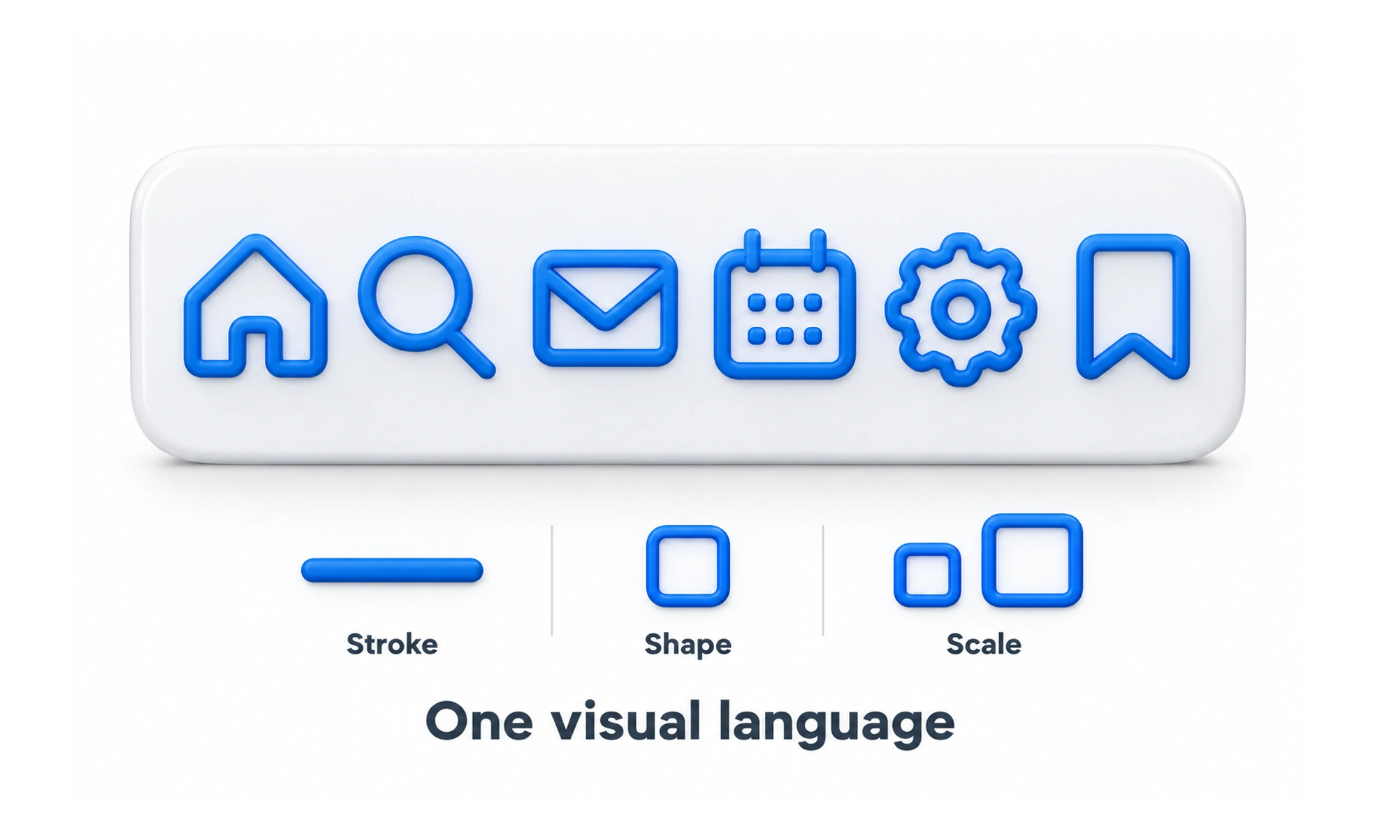
Iconography is the system of visual symbols used across a product or brand. A coherent system makes icons feel related and helps people learn their meanings.
A set of road signs works because the symbols share a visual language and each one has a consistent role.
Define a visual grammar
Set rules for line weight, filled versus outlined shapes, corner style, proportions and optical alignment. These rules help new icons fit the product without requiring each designer to invent a new style. A shared library also reduces duplicate assets and inconsistent variants.
Design for meaning and scale
A detailed illustration may work at a large size but blur in a compact toolbar. Make small icons simple enough to recognize and test them at their actual display size. Similar concepts should use related forms, while distinct actions should not look interchangeable.
Document states and usage
Specify when icons are decorative, interactive, selected, disabled or paired with a label. Include accessibility guidance for icon-only controls and rules for color contrast. Clear usage prevents the same glyph from communicating contradictory meanings in different parts of the product.
Example: a learning platform
A consistent set may use the same stroke style for search, bookmark and share actions, while course illustrations use a separate, more expressive style. Keeping those roles distinct helps users recognize controls without constraining the artwork used to explain a topic.
Frequently asked questions
Key takeaways
- Create shared rules for icon shape and rendering.
- Test icons at their real display size.
- Distinguish controls from illustrations.
- Document meanings, states and accessibility use.