

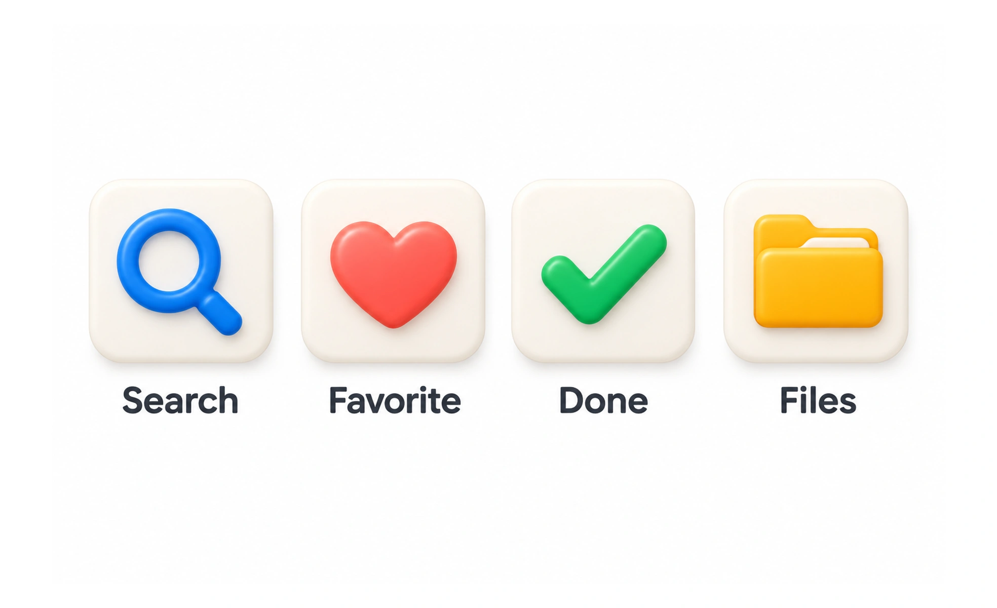
An icon is a compact visual symbol that represents an object, action or idea. It can aid recognition, but unfamiliar or ambiguous icons need a text label or other context.
A road symbol can be understood quickly when people recognize it; an unexplained symbol may send them in the wrong direction.
Use familiar meaning
Choose symbols people are likely to recognize in the product context. A magnifying glass often signals search, while an unusual abstract mark may not. If an icon could mean several things, pair it with a visible label, tooltip or supporting text rather than expecting people to guess.
Treat icons as controls when interactive
An icon button needs a clear accessible name and a visible focus state. Its hit area should be large enough to operate, and its state should be conveyed beyond color alone. Do not put an interaction on a decorative icon without a semantic button or link.
Keep the set coherent
Use consistent stroke weight, scale, corner treatment and optical alignment within a product. Prefer one icon family where possible. A patchwork of unrelated styles makes the interface feel less coherent and can cause similar actions to appear to have different importance.
Example: a save action
A bookmark icon can indicate saving when the surrounding product already uses that convention. The control should announce “Save” or “Remove from saved” based on its state, and the visual state should update when the action succeeds. A tooltip alone is not enough for touch users.
Frequently asked questions
Key takeaways
- Use symbols with recognizable meaning in context.
- Pair ambiguous icons with labels.
- Give icon buttons semantic names and visible states.
- Keep the icon family and interaction patterns consistent.