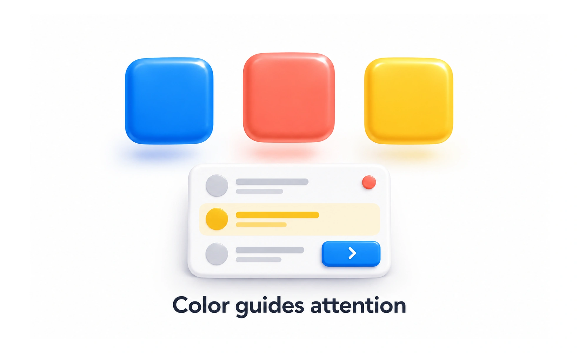
Color is one of the most powerful tools in design, and one of the most misused. It is the visual perception created by different wavelengths of light reflected or emitted by objects. In design, color is not decoration. It is a functional and expressive tool that affects how users perceive, understand, and feel about a product. Used well, color improves clarity and experience. Used poorly, it creates confusion, reduces readability, and undermines usability. Color serves many roles at once: indicating state, building brand identity, creating visual hierarchy, guiding attention, conveying emotion, and supporting or harming accessibility. The same color choice can do several of these things at the same time, which is why intentional color use matters more than picking hues that look good.
Think of it like this. Traffic lights do not use red and green because those are pretty colors. They use them because people learn fast that red means stop and green means go, and that meaning works even before you read any text. Color in design works the same way: it carries meaning people learn to read, and when it is used carelessly that meaning gets confused.
How it works
Color works through three properties that designers adjust to get the effect they want. Hue is the basic color itself, the red or blue or green that people name when they say color. Saturation is the intensity or purity of that color. A highly saturated red is vivid and loud. A desaturated red is muted, closer to gray. Brightness, sometimes called value, is how light or dark the color is. Light colors feel airy and open. Dark colors feel heavy and grounded. Temperature is the warm or cool feeling a color gives. Reds, oranges, and yellows feel warm and energetic. Blues, greens, and purples feel cool and calm. These four properties let designers do more than pick a hue. Adjusting saturation can make a color feel more or less important. Adjusting brightness can fix contrast problems. Choosing warm or cool tones can shape the mood of a whole interface without changing anything else.
When to use it
Use color deliberately, not decoratively. Every color choice should serve a purpose: communicating state, guiding attention, building recognition, setting mood, or improving readability. Color is worth reaching for when you need to signal meaning quickly, when you want certain elements to stand out, when brand recognition matters, or when you need to shape how a product feels. Color is the wrong tool when it is used only because it looks nice, when it is the only way information is conveyed, or when contrast is insufficient for people with low vision. Accessible color use is not optional. Insufficient contrast makes text unreadable. Relying only on color to convey information excludes color-blind users. Color should support the experience, not be the whole experience.
Common mistakes
The most common color mistake is using color as decoration instead of as communication. A palette that looks great but carries no meaning wastes the most powerful signal available. Another frequent mistake is relying on color alone to convey information, which excludes color-blind users and fails accessibility. Low contrast is the mistake that hurts the most people: text that is hard to read for users with low vision, and hard to read in bright sunlight for everyone else. Chasing trends without checking whether they serve the product is another trap. A trendy palette can age badly and conflict with brand identity. Forgetting dark mode or different display contexts is a common oversight, because colors that work on a calibrated designer monitor can look very different on a phone in sunlight. Finally, using too many colors at once dilutes every signal. When everything is emphasized, nothing is.
Frequently asked questions
Key takeaways
- Color is a functional tool, not decoration. Every choice should serve a purpose.
- Three properties matter: hue, saturation, brightness, and temperature. Adjust all four, not just the hue.
- Accessible color use is not optional. Sufficient contrast and never relying on color alone are required.
- Color carries meaning people learn to read. Use it intentionally or confuse the signal.