

It provides systematic principles for creating visual harmony, establishing hierarchy and guiding attention. In digital products, color directly drives brand identity and accessibility.
Think of it like this. In music, combining notes creates harmonious chords or jarring dissonance. Color theory teaches you which visual chords please the human eye.
How it works
Color theory models chromatic relationships through structured geometric tools and optical models.
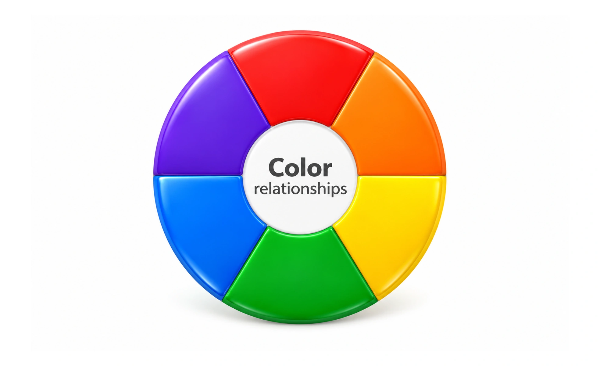
- The color wheel arranges primary, secondary and tertiary hues in a circle to identify natural harmonies.
- Complementary schemes pair opposite hues across the wheel, generating maximum visual energy and contrast.
- Analogous schemes combine adjacent hues on the wheel, creating serene, cohesive background atmospheres.
- HSL model controls hue, saturation and lightness, allowing designers to build accessible semantic tints.
When to use it
Apply color theory whenever you build interface palettes, interactive states and data charts.
- Defining semantic tokens assigns distinct hues to success, warning, error and informational alerts.
- Establishing visual hierarchy uses saturated primary colors on main action buttons to draw attention.
- Data visualization design selects perceptually uniform color ramps that communicate metric values clearly.
- Dark mode adaptation recalibrates saturation and lightness so surfaces remain comfortable in dark rooms.
Common mistakes
Designers frequently undermine usability by treating color purely as decorative artistic expression.
- Relying solely on color to communicate critical state changes, leaving colorblind users stranded.
- Using low-contrast color pairings that fail WCAG legibility standards on mobile screens outdoors.
- Overusing high-saturation accents across too many secondary elements, causing severe visual fatigue and distracting users from primary actions.
Frequently asked questions
Key takeaways
- Color theory governs how hues interact and influence human attention and comprehension.
- Always pair color cues with icons or text labels to ensure accessibility for colorblind users.
- Semantic color systems assign predictable meanings to green success and red error alerts.
- The HSL model offers fine-grained programmatic control over contrast and theme states.