

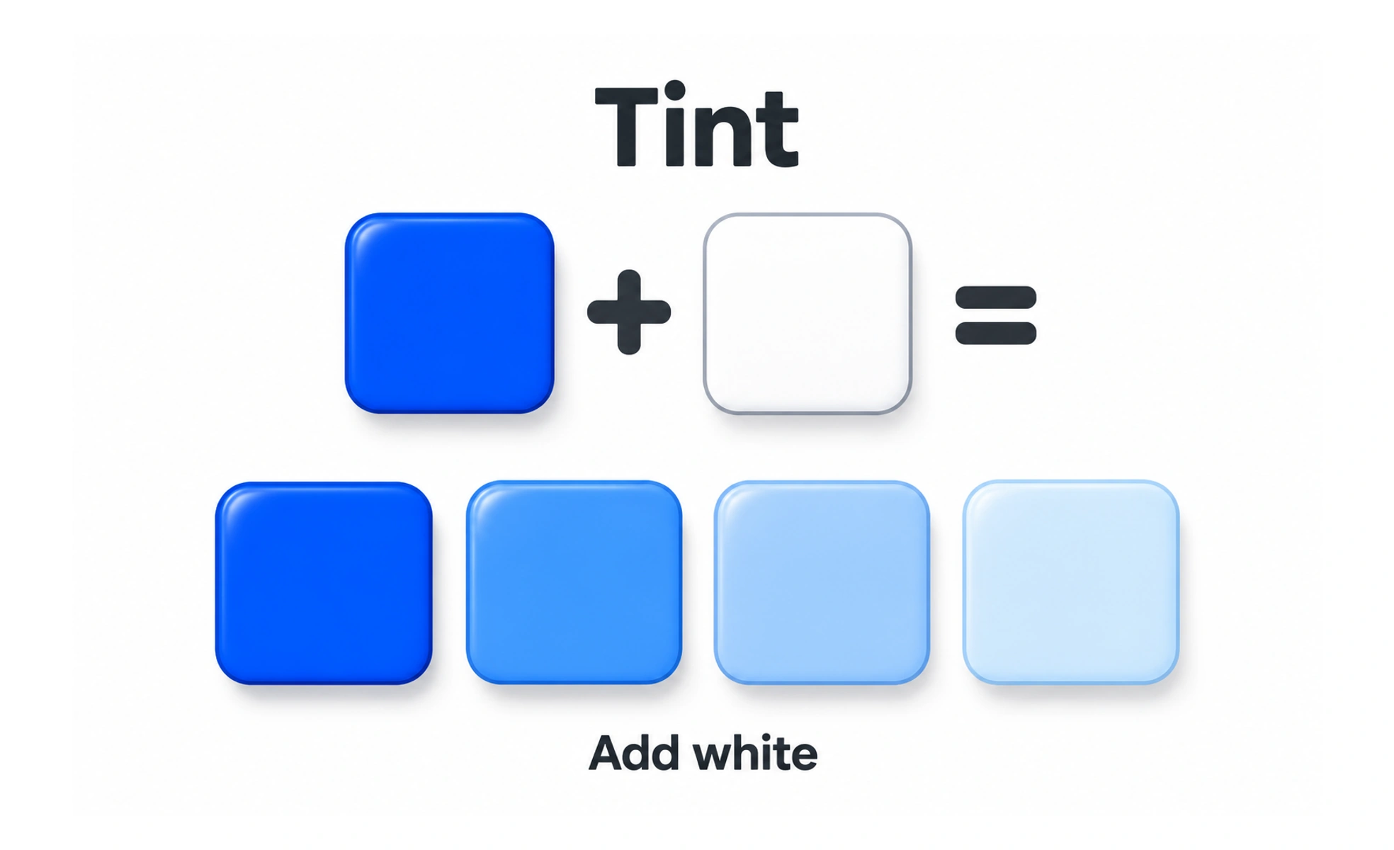
A tint is created by adding white to a color, making it lighter. Tints can support subtle surfaces and palette variation, but still need enough contrast for their intended role.
Adding white paint makes a color lighter, like a translucent wash that preserves some of the original color’s character.
Use light values with intention
A tint can create a soft surface behind a callout, selected item, or illustration. Make sure the color still communicates the intended relationship and does not disappear against the page. On a light theme, a very pale tint may need a border or another cue to define its edges.
Protect text and control boundaries
Light backgrounds often provide less contrast for white text and fine icons. Choose foreground colors for the tint itself, not only for the base brand color. Interactive controls need a visible boundary and focus state when the surface is subtle.
Design for more than one theme
A tint made by blending with white may work in a light theme but feel like a bright patch in dark mode. Define theme-specific semantic values rather than reusing the same tint blindly. Check adjacent surfaces and ensure the tint remains distinguishable for people with different display settings.
Example: a selected filter
A selected filter may use a pale tint with a stronger label, border, or checkmark. The selection remains clear even if the color difference is hard to see. Test the component in its unselected, hover, keyboard-focus, and selected states.
Frequently asked questions
Key takeaways
- Use tints to support, not replace, interface hierarchy.
- Choose readable foreground colors for each tint.
- Add boundaries or cues to subtle surfaces.
- Create theme-specific values and verify all states.