

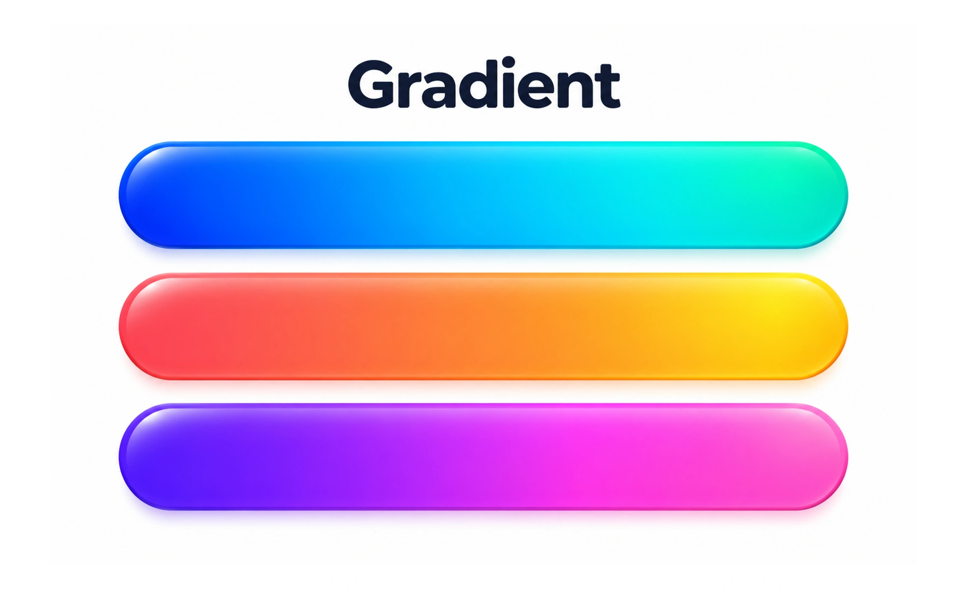
A gradient is a gradual transition between two or more colors. It can add depth or direct attention, but it should preserve readable contrast and a clear visual purpose.
A sunset blends colors across the sky; a digital gradient creates a similar transition across a surface or shape.
Choose the gradient’s job
A gradient may add atmosphere to a large background, show a range, or emphasize a focal area. Decide its purpose before choosing colors and direction. If it competes with the content or has no relationship to hierarchy, a solid surface may communicate more clearly.
Control color stops and direction
The color stops define where the transition begins, changes, and ends. Their positions and the gradient’s direction affect which areas receive the strongest contrast. Keep the transition intentional and test the full surface; the center or edge may look different from the sample swatch.
Protect text and meaning
Text over a gradient must remain readable throughout its entire area, not just at one carefully chosen point. Add a stable overlay or place text on a separate surface when contrast varies too much. Do not use a gradient as the only way to encode a status or value.
Example: a profile cover
A restrained gradient can provide depth behind a profile header while leaving the person’s name and controls on a calm region. Check the composition on narrow screens, where the crop may remove one color stop or bring text over a brighter area. Provide a theme-appropriate fallback if the gradient asset fails.
Frequently asked questions
Key takeaways
- Give every gradient a clear visual purpose.
- Review the full transition, not only its endpoints.
- Maintain text contrast at every position.
- Check responsive crops and do not encode meaning by color alone.