

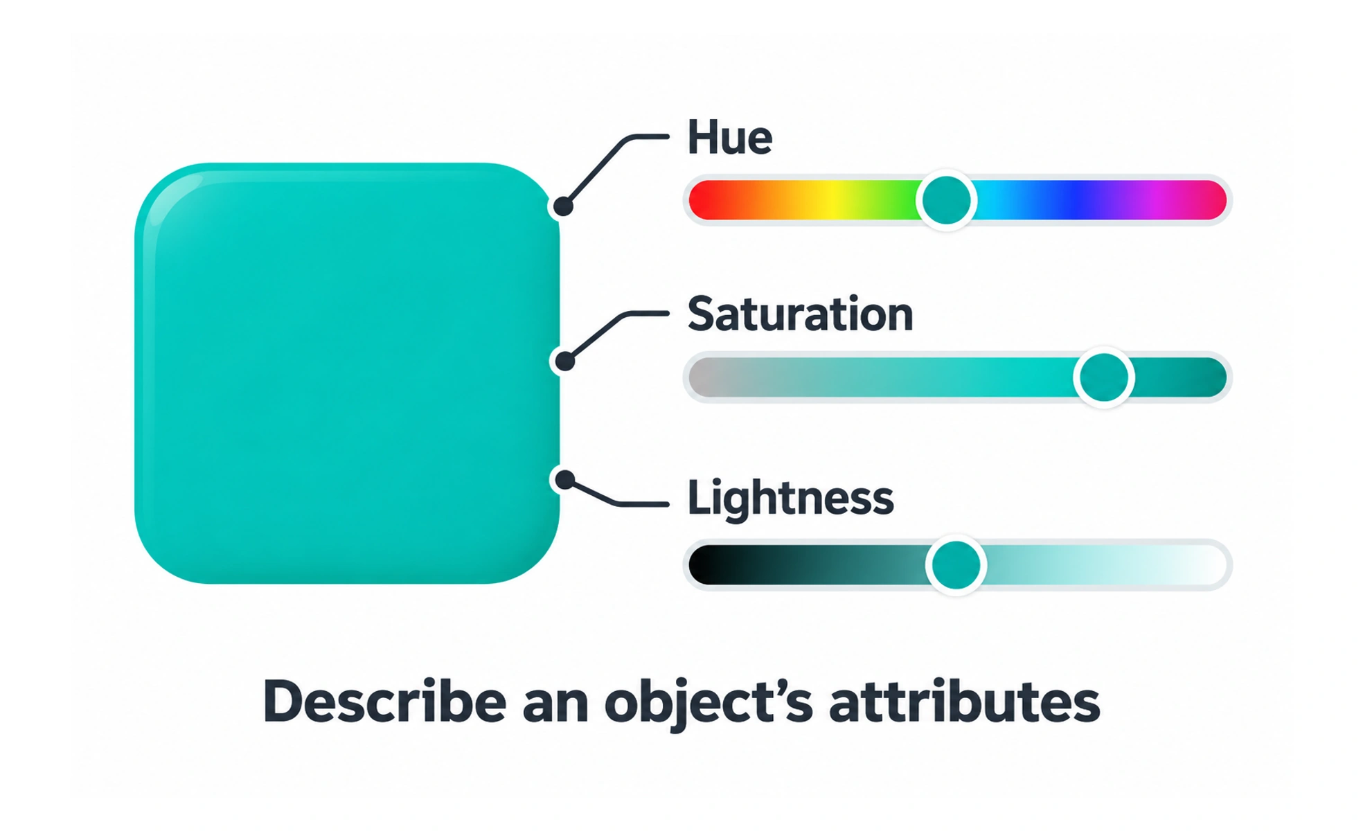
A property is an attribute used to describe or control something. In color design, properties such as hue, lightness, and saturation help describe how a color appears within a chosen color model.
A recipe describes ingredients and amounts separately. Color properties similarly provide different controls over a result instead of describing every color as simply brighter or darker.
Name the attribute precisely
Explain which property is being discussed and the system in which it is defined. Hue, saturation, lightness, and opacity describe different aspects of appearance. Informal words such as brightness can be ambiguous, so use the vocabulary of the current color model or tool.
Understand the chosen color model
Different models represent and adjust color in different ways. Equal numerical changes do not necessarily look equally large to a person. A value copied between tools may also need context about color space and transparency to reproduce the intended appearance.
Use properties to support interface roles
Adjusting a color can help create surfaces, text, and state treatments, but every result still needs contextual review. A more saturated accent does not automatically provide better text contrast. Store recurring choices in semantic tokens so their purpose stays clear across components and themes.
Example: a selected filter
A team might change a filter’s surface lightness while retaining an accent hue and adding a checkmark. Evaluate the actual foreground and background together in both themes. This is more dependable than instructing every component to make the selected color a little brighter.
Frequently asked questions
Key takeaways
- State the property and its context.
- Use the terminology of the chosen color model.
- Review numerical changes perceptually and in context.
- Map recurring color choices to semantic roles.