

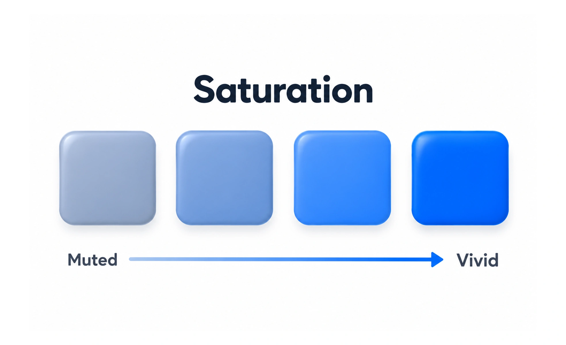
Saturation describes how intense or muted a color appears. Designers adjust it to create emphasis, balance a palette, and keep important interface states distinct.
Mixing gray into a bright paint color makes it less vivid; saturation describes a similar shift in color intensity.
Use intensity to manage emphasis
Highly saturated colors attract attention and can make a clear accent. If many areas use maximum intensity, they compete and the interface feels noisy. Reserve the most vivid colors for focused actions or information that genuinely needs emphasis.
Balance a palette
Muted colors can support large surfaces, while more saturated colors can identify selected or active elements. Balance depends on the amount of each color, its lightness, and its surroundings. A small vivid accent can dominate a page even when it covers little area.
Check text and state contrast
Saturation does not tell you whether text is readable. A vivid color may still have too little contrast against a background, particularly for small labels or thin icons. Measure the actual foreground and background pair, and provide cues other than a saturation change for critical states.
Example: a progress chart
A chart can use a saturated accent for the current series and muted tones for context. Include labels or patterns when values must remain distinguishable without color. Review the chart in both themes and with common color-vision differences rather than assuming muted hues will remain distinct.
Frequently asked questions
Key takeaways
- Use vivid colors selectively for emphasis.
- Balance saturated accents with supporting colors.
- Saturation does not replace contrast checks.
- Provide non-color cues for important states and data.