

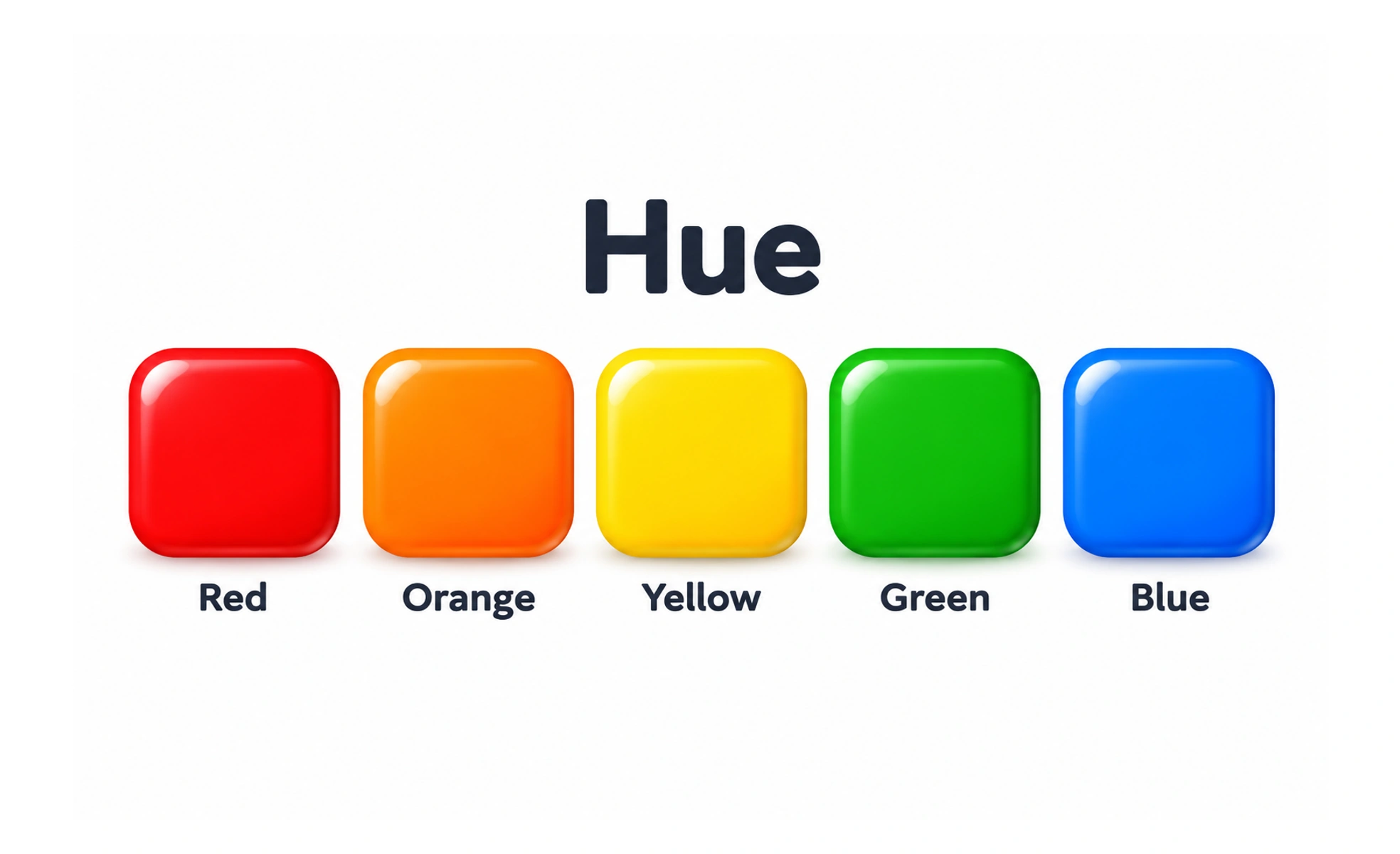
Hue is the aspect of color associated with its color family, such as red, yellow, green, or blue. It describes the kind of color, apart from its lightness or intensity.
Hue is the color name on a paint chart; adding white, black, or gray changes its appearance without changing that basic family.
Separate hue from other color properties
A blue can be pale or dark, vivid or muted; those changes do not necessarily make it a different hue. Designers often adjust hue alongside lightness and saturation to create a palette. Keeping these properties distinct helps explain why two colors that share a hue can still serve different roles.
Use hue relationships deliberately
Colors near each other on a color wheel can feel related, while distant hues may create stronger contrast. These relationships are starting points, not fixed formulas. Test actual colors together, because lightness and saturation strongly affect whether a palette feels balanced or whether text remains readable.
Avoid relying on hue alone
Color perception varies, and the same hue can look different on different displays or against different surroundings. Do not use hue as the only signal for success, warning, selection, or category. Add labels, icons, patterns, or other cues so the information remains clear.
Example: a status palette
A team may choose related hues for a set of status categories, then pair each with a clear label and icon. Check the palette in light and dark themes and in a chart with adjacent values. If two categories become indistinguishable, adjust their lightness or add a non-color distinction.
Frequently asked questions
Key takeaways
- Hue identifies a color family.
- Lightness and saturation change how a hue appears.
- Test color relationships in their real context.
- Use labels or other cues alongside color.