

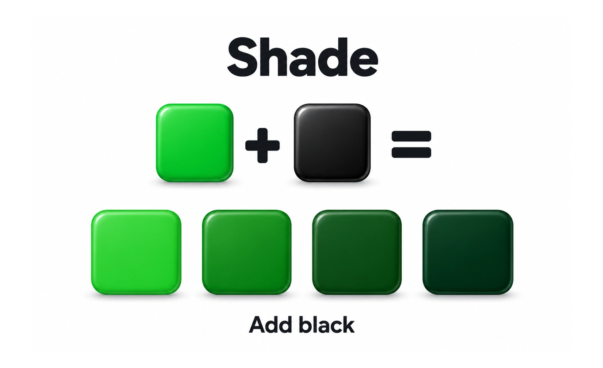
A shade is created by darkening a color, traditionally by adding black. Design systems use shades to provide deeper palette values for emphasis, depth, or contrast.
A tree casts a deeper version of the same color into shadow; a shade moves a color toward a darker appearance.
Create a useful range
A palette may include progressively darker values of a base color, but the steps should be chosen for real interface needs. Uniform numeric steps do not always look visually uniform. Check how the values appear beside one another and against the surfaces where they will be used.
Give each value a role
Darker values can support text, borders, pressed states, and areas of emphasis, depending on the hue and theme. Name or map them to semantic roles so components do not choose arbitrary points from the scale. A shade is not automatically suitable for body text or a disabled state.
Maintain contrast and theme behavior
Darkening a hue can change both perceived intensity and contrast. Test foreground and background pairs at their actual sizes, especially for small text and icons. A shade used on a light surface may need a different counterpart in dark mode rather than a mechanically inverted value.
Frequently asked questions
Key takeaways
- Build shades for concrete interface roles.
- Do not assume evenly numbered values look evenly spaced.
- Check contrast and interaction states.
- Map palette values to semantic tokens.