

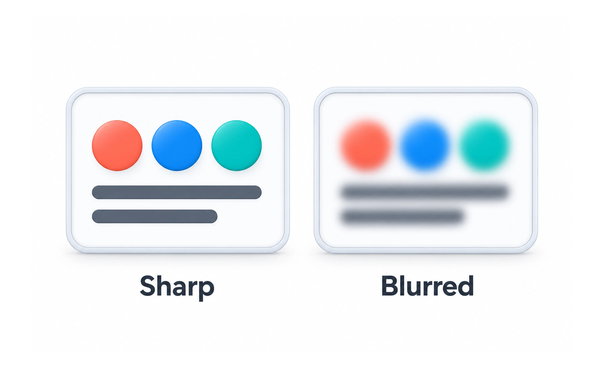
Blur softens detail by reducing sharp edges and contrast. In interfaces it can suggest depth or de-emphasize a background, but it must not hide information people still need.
A camera can focus on a nearby subject while the background becomes soft; interface blur can similarly separate a foreground layer from what sits behind it.
Use blur as a supporting cue
A blurred background can make a dialog or overlay feel separate from the page. Keep the foreground content crisp and provide sufficient contrast. Blur should support layering, not replace a clear backdrop, boundary, or focus state.
Consider performance and devices
Large blur effects can be expensive to render, especially across a full-screen area or on lower-powered devices. Test scrolling and interaction while the effect is active. Offer a simpler solid or translucent surface when the effect causes jank or is not supported consistently.
Preserve context and accessibility
Do not blur information that people still need to understand or act on. If content is intentionally obscured for privacy, communicate why and provide an accessible alternative when appropriate. A visual blur alone may not prevent underlying content from being read by assistive technology or exposed elsewhere.
Example: a modal backdrop
A subtle blur behind a modal can help focus attention on the dialog, while a dim overlay makes the active layer unmistakable. Keep the dialog itself readable and ensure background controls cannot receive focus or clicks. Check the effect with reduced transparency or motion settings if the product supports them.
Frequently asked questions
Key takeaways
- Use blur to support layer separation, not as the only cue.
- Keep foreground content sharp and readable.
- Measure rendering cost on real devices.
- Do not treat visual blur as a privacy or access-control boundary.