

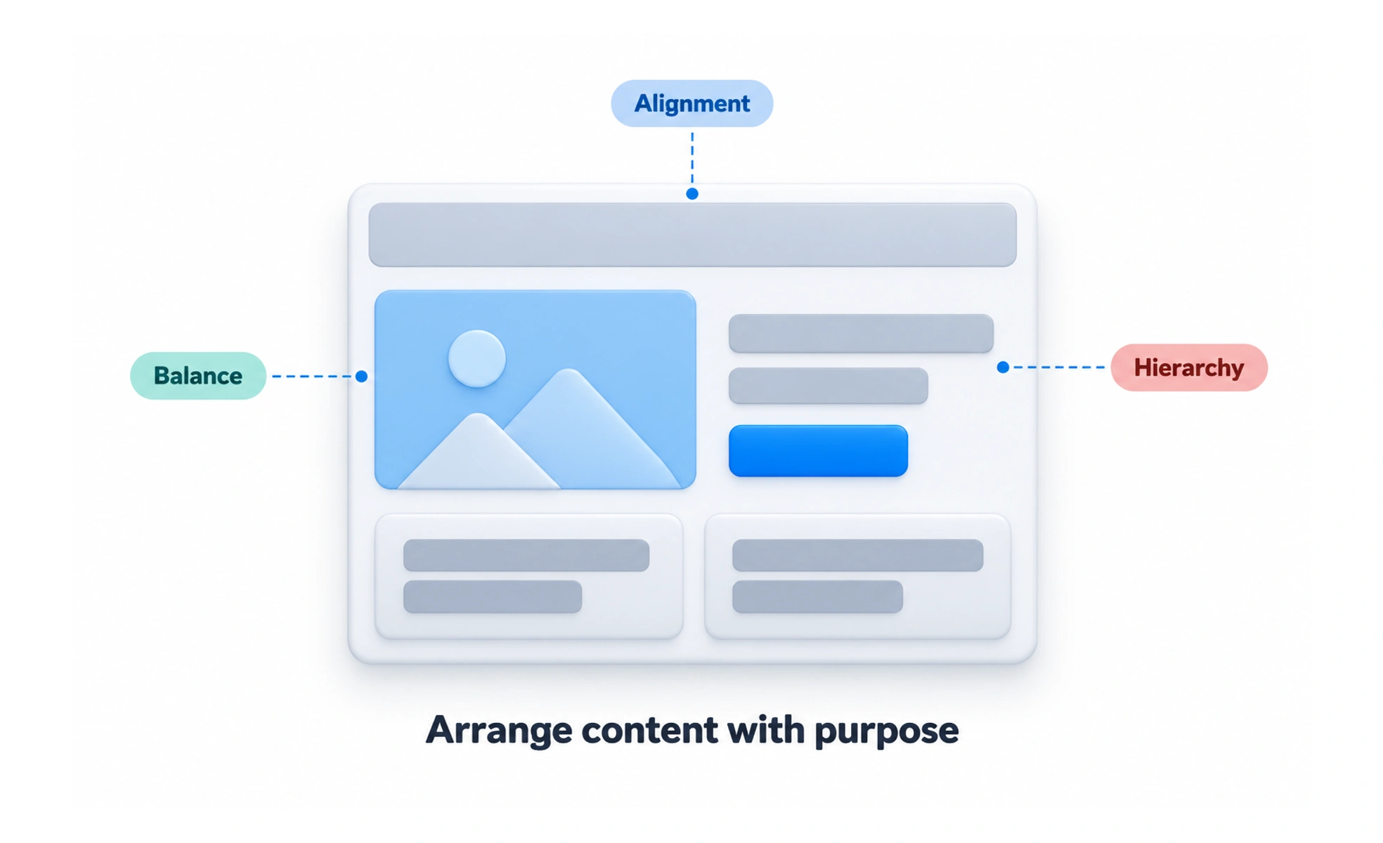
A page can contain all the right information and still feel difficult to use. Layout decides what belongs together, what needs attention first and how the eye moves through the content. Good composition supports reading and action without making people decode the arrangement.
Group what belongs together
Place a label close to its field and an explanation near the decision it supports. Use spacing, alignment and containers to show which items form a group.
If a price and its billing period are far apart, people may interpret them separately. Bringing them together can improve understanding without adding another sentence or a brighter color.
Use a structure that fits the content
A grid can help align repeated elements, but the content determines what the grid needs to support. An article needs a comfortable reading column; a comparison may need items visible side by side.
- Align related elements to create a clear reading path.
- Use space to distinguish groups rather than adding borders everywhere.
- Let important differences have enough visual emphasis.
- Check long labels and realistic data, not only ideal examples.
A balanced screenshot is not enough if the arrangement breaks when a title wraps.
Example: a course detail page
The main column explains the syllabus while a smaller panel summarizes access and progress. The summary should help the learner decide without interrupting every lesson description.
On a phone, the columns can become a single reading sequence. Decide where the summary belongs in that sequence. Shrinking the desktop columns until both fit usually produces narrow text and cramped controls.
Test the reading order
Review the page at different widths and zoom levels. Check that visual order agrees with keyboard and assistive-technology navigation. A card moved with styling can appear in a different place from its logical position.
Avoid relying on empty space that exists only in one viewport. The relationships between elements should remain understandable even as the arrangement changes.
Frequently asked questions
Key takeaways
- Use placement and space to communicate relationships.
- Choose a structure suited to the content and task.
- Review long content, zoom and narrow screens.
- Keep the logical and visual reading order coherent.