

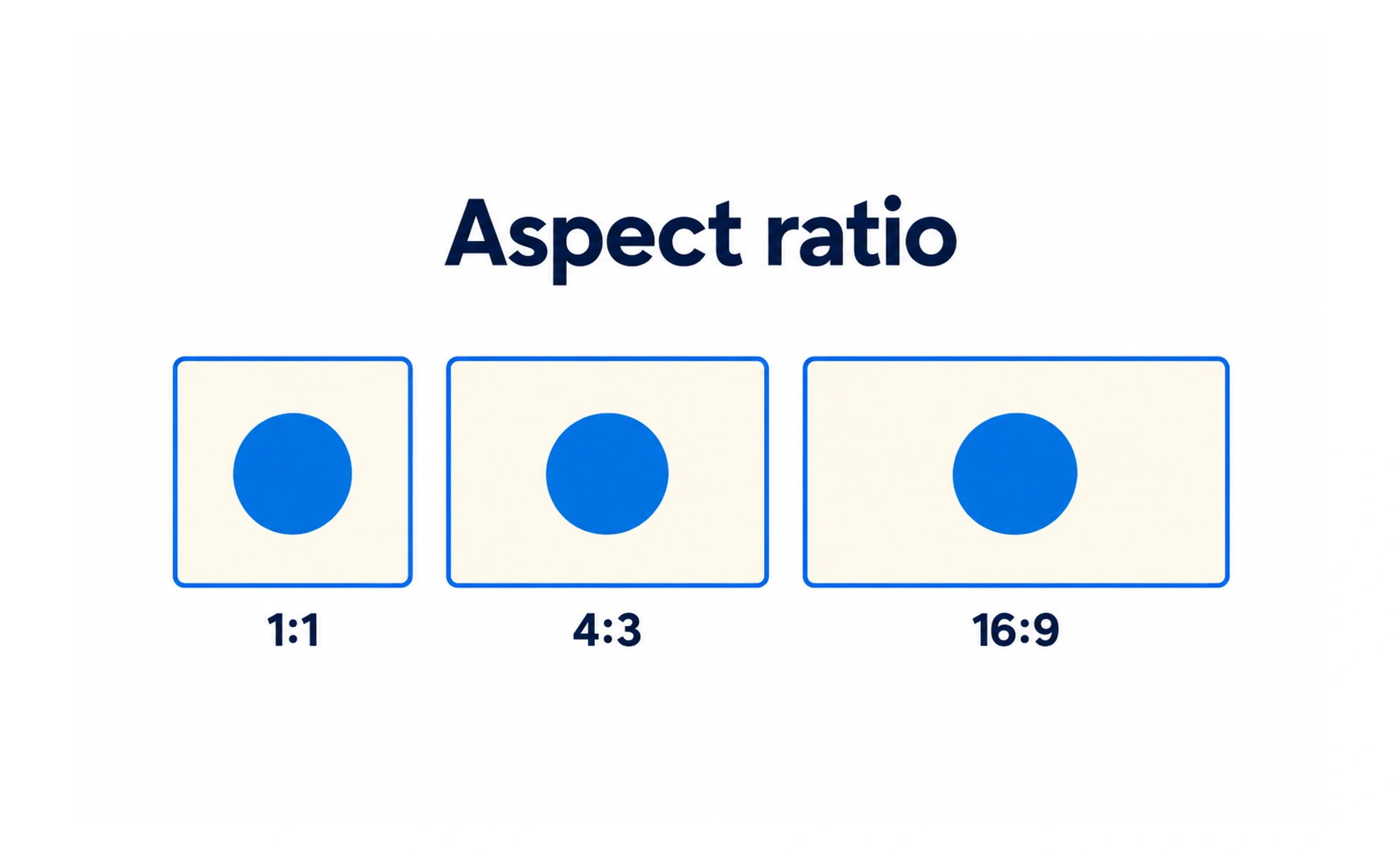
Aspect ratio is the proportional relationship between an image or container’s width and height. It helps a layout reserve predictable space while content loads or changes size.
A photo frame keeps the same shape when scaled; the picture can be cropped or fitted inside it without changing the frame’s proportions.
Choose a ratio for the content
A wide banner, square avatar and portrait lesson image serve different purposes. Select a ratio that gives the subject enough room and matches the surrounding layout. A ratio is a constraint, not a promise that every image will look good when cropped to it.
Decide how media should fit
Use a contain fit when the whole image matters, such as a diagram or product screenshot. Use a cover fit when a consistent frame matters more and cropping is acceptable, such as a decorative card image. Set a useful focal point so important faces, labels or objects remain visible across sizes.
Reserve space before loading
Knowing the ratio lets the page reserve the image’s space before the file arrives. This reduces content shifting and keeps cards aligned while images load. Keep the same ratio in placeholders and final media so a late image does not push nearby text or controls around.
Example: course cards
A course catalog can use a shared landscape frame for every cover. If a source image is square, cover cropping may remove its title or artwork. Review the crop at desktop and mobile widths, provide a deliberate focal point, or use contain with a background when the entire illustration must remain intact.
Frequently asked questions
Key takeaways
- Pick a ratio that fits the media’s purpose.
- Choose contain or cover based on whether cropping is acceptable.
- Reserve media space to prevent layout shift.
- Review important content at every crop size.