

Designers may use the ratio as a starting point for comparing sizes, spacing, or image crops. It is not a formula that guarantees beauty or usability. A proportion should be judged in context, alongside content, accessibility, cultural expectations, and the task the design needs to support.
It is one measuring stick among many in a workshop: useful for exploring a composition, but not a rule that every object must follow.
Understand the proportion
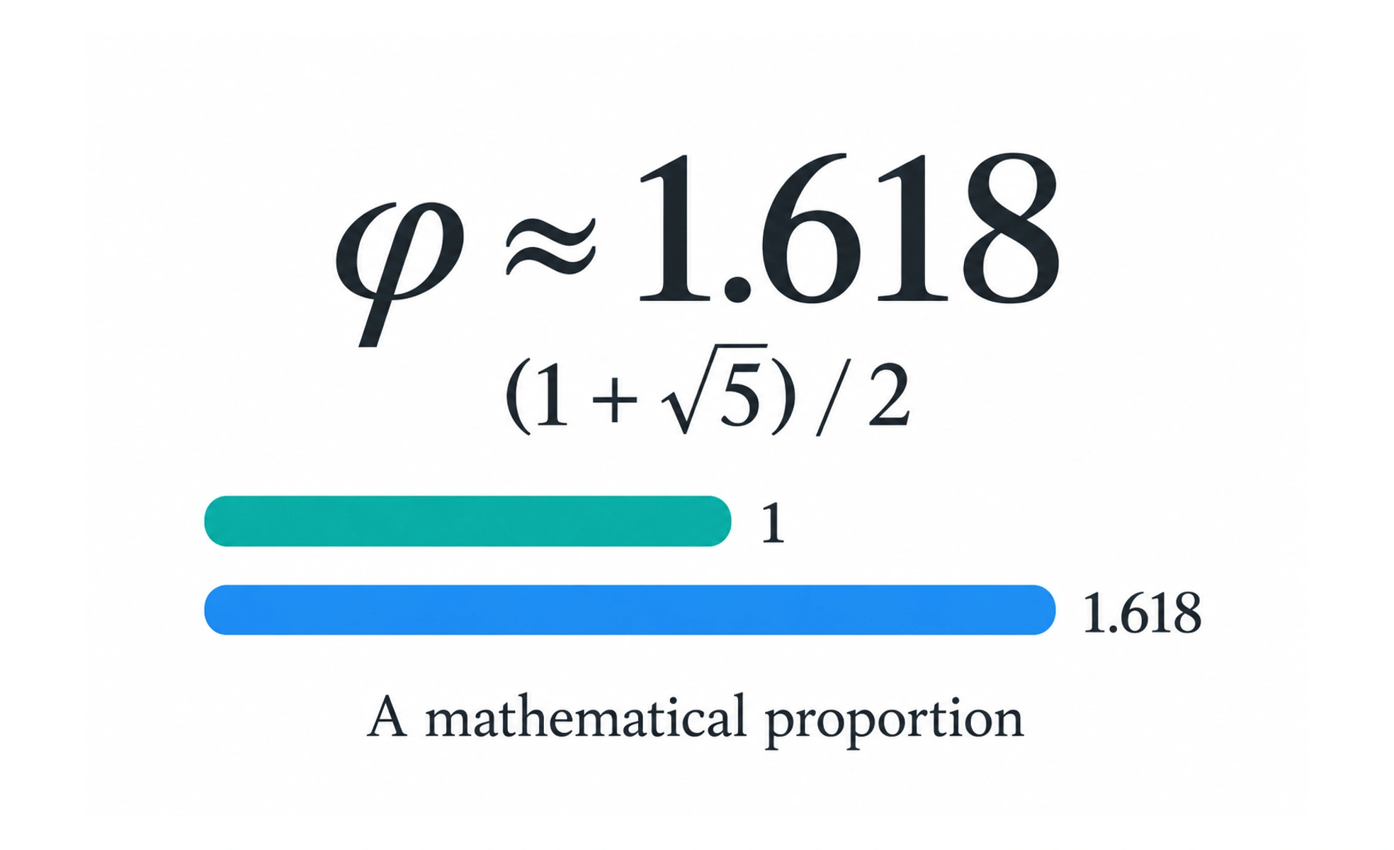
The golden ratio, often represented by the Greek letter phi, is approximately 1.618. In a golden rectangle, the longer side is about 1.618 times the shorter side. The proportion also appears in mathematical constructions, which is why it is discussed in art and design.
Use it as an exploratory aid
A designer can use the ratio to compare a content area with a sidebar, choose an initial type scale, or test a crop. Treat those values as hypotheses. Real content and viewport constraints may call for different proportions that work better for the audience.
Do not treat it as a beauty law
Claims that people universally prefer golden-ratio compositions are stronger than the evidence usually supports. Perception depends on context, familiarity, culture, and purpose. A layout that follows a mathematical ratio can still have poor contrast, weak hierarchy, or an awkward reading order.
Evaluate the result
Compare the proposed proportion with alternatives using realistic content. Check how it scales, whether important information remains visible, and whether users can complete their task. Use a ratio when it helps the composition, and change it when the design evidence points elsewhere.
Frequently asked questions
Key takeaways
- The golden ratio is approximately 1.618 to 1.
- It can provide a starting point for proportion and layout experiments.
- It does not guarantee visual appeal or usability.
- Evaluate proportions with real content, users, and responsive layouts.