

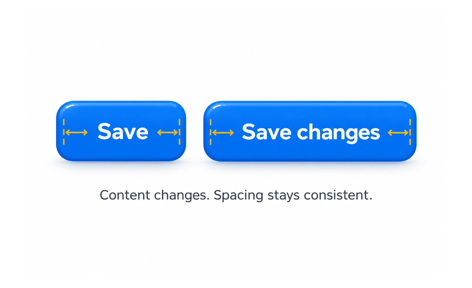
Auto layout arranges interface elements with reusable spacing and sizing rules. It lets groups adapt when text, content or available space changes.
It is like a tray with adjustable dividers: items stay in order while the tray makes room for different contents.
Describe relationships, not coordinates
A row, column, stack or wrapping group explains how elements relate. Fixed coordinates describe only where they happened to be in one version. Relationship-based layout is more resilient when a label gets longer, a badge appears or the viewport narrows.
Set spacing and sizing intentionally
Define the gap between related items and decide which child can grow, shrink or wrap. Keep text at its natural height, allow buttons to preserve usable hit areas, and avoid forcing every card to the same height when that creates empty space or clipped content.
Use nesting to express hierarchy
A card may contain a vertical stack of title and description, plus a horizontal row of metadata. Nesting groups makes each rule easier to understand. Too many nested containers, however, can make simple layouts hard to maintain; introduce a group when it captures a meaningful relationship or reusable pattern.
Example: a responsive action row
A form footer may place secondary and primary actions side by side on a wide screen. When space is limited, the group can wrap or stack while retaining the same order. Check long translations and validation states so actions remain reachable and do not overlap the content above them.
Frequently asked questions
Key takeaways
- Use flow and relationships instead of fixed coordinates.
- Choose which items grow, shrink or wrap.
- Nest groups when they express real hierarchy.
- Test changing content, translations and narrow screens.