

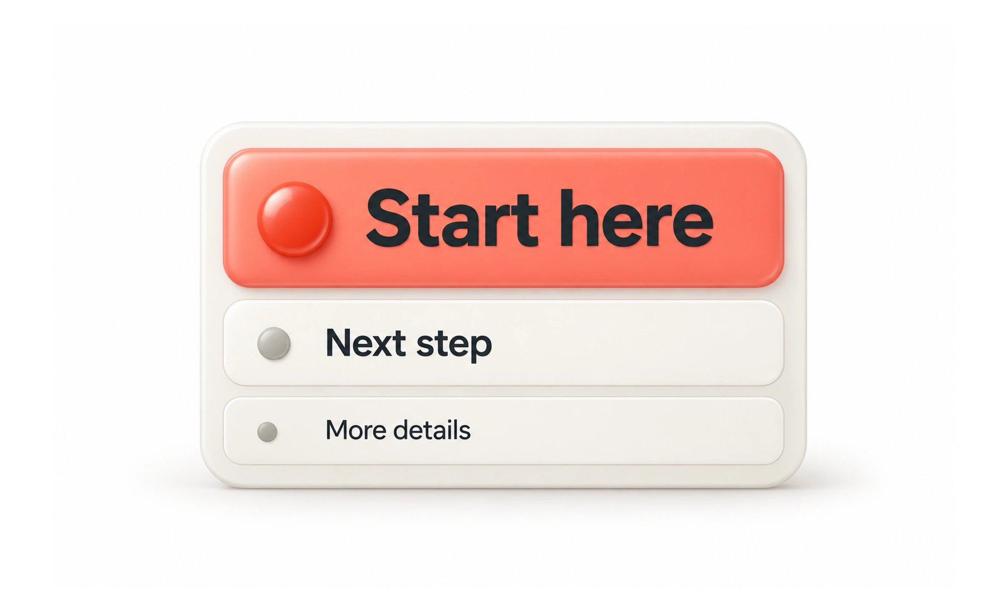
A page can make everything visible without making anything clear. Hierarchy helps a person identify the main message, related details and the next action. Size matters, but spacing, position, contrast and grouping also guide attention.
Decide what deserves attention
Start with the task rather than the available styles. On an invoice page, the amount due and payment status may matter more than a decorative illustration. In an article, the title and section headings help readers choose where to focus.
Agree what someone should notice first, second and later. If every element demands equal attention, the person must do the prioritization themselves.
Use several cues together
A heading can stand out through size and weight, while space separates it from the preceding section. A primary action can be prominent without making every nearby control look disabled.
- Group related information with consistent spacing.
- Make supporting details readable rather than hiding them in faint text.
- Use emphasis selectively so it retains meaning.
- Keep essential differences understandable without color alone.
Hierarchy is relative. Increasing one element’s emphasis changes the balance of everything around it.
Example: comparing subscription plans
The plan name, price and billing period appear together. The main action follows the information needed to choose. Limitations remain visible rather than being pushed into tiny text that people are unlikely to read.
The design guides attention while preserving informed choice. Making a discount enormous and the renewal terms nearly invisible would create emphasis, but not a trustworthy hierarchy.
Check more than the screenshot
Look at the page with realistic content, narrow widths and zoom. Ask someone what they think the page is for and what they would do next.
Also review the document structure. Visual headings should agree with meaningful heading levels and reading order. A large piece of text styled as a heading does not automatically provide the same navigation to assistive technology.
Frequently asked questions
Key takeaways
- Choose priority based on the task and information needs.
- Use size, spacing, contrast and grouping together.
- Keep supporting and consequential information readable.
- Check that visual emphasis agrees with logical structure.