

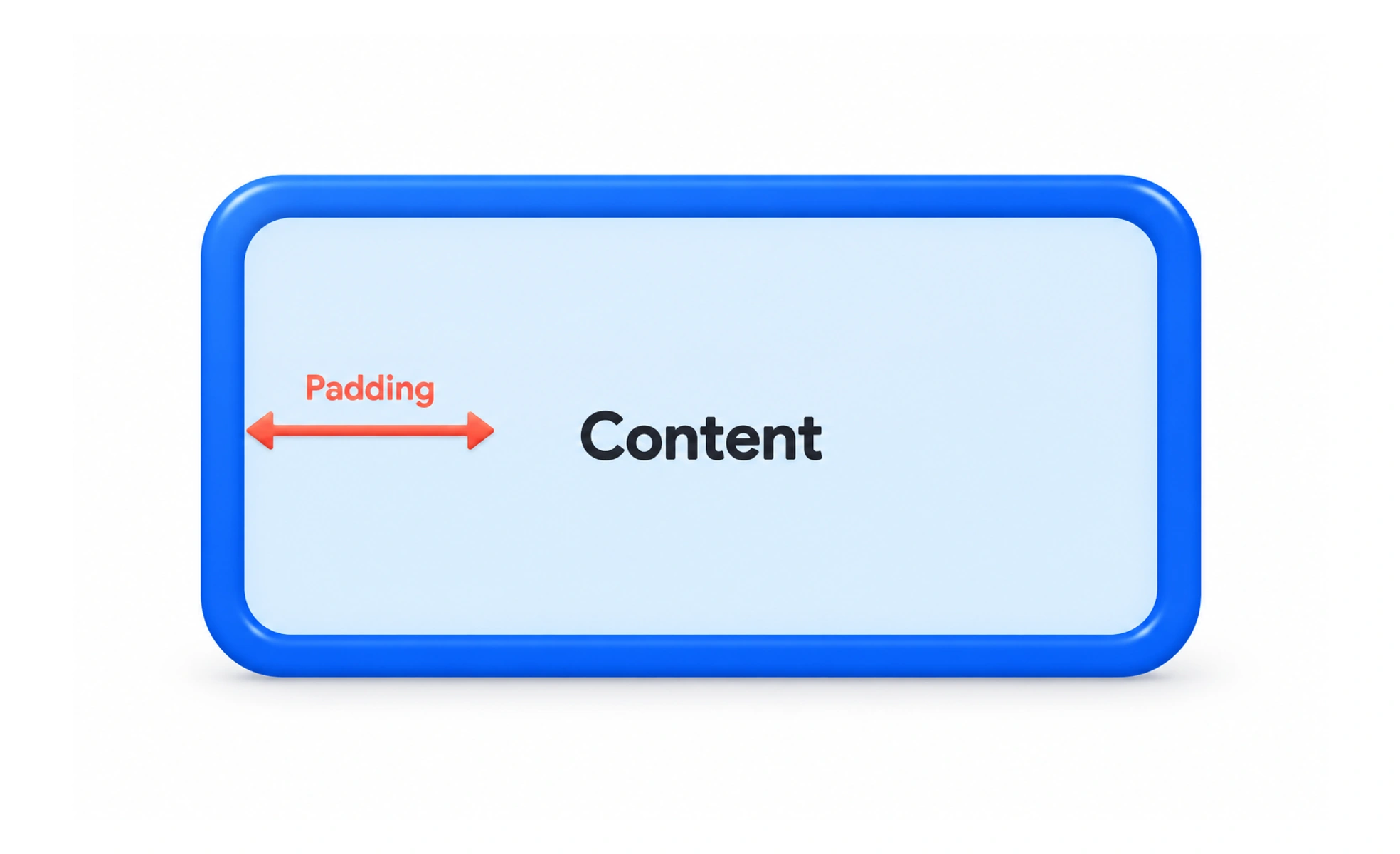
Padding is the space between an element’s content and its border. It gives text and controls room to breathe and can make interactive areas easier to use.
Padding is like the lining inside a box: it keeps what is inside from pressing against the edges.
Protect content from its boundary
Text placed close to a card border is harder to scan and can feel cramped. Padding creates a stable inset around the content. Choose the amount based on the component’s role and density, then repeat it across similar cards and panels.
Give controls usable room
Buttons and input fields need enough height and space around their labels to remain comfortable to read and operate. Padding contributes to the target size, but the full interactive hit area matters too. Do not reduce it merely to fit a crowded row; let the layout wrap or move secondary actions.
Adapt padding to content and viewport
A compact badge and a large dialog do not need the same inset. A narrow viewport may need smaller page-level padding while preserving enough room inside controls. Avoid setting height that cuts off wrapped text; allow content-driven height unless a bounded region has an intentional scroll behavior.
Example: a callout card
A callout with a heading, body and action can use consistent inner padding and smaller gaps between related elements. If the action touches the card edge on mobile, add a deliberate responsive inset or stack the action. Do not solve it by clipping the card or shrinking the text.
Frequently asked questions
Key takeaways
- Padding separates content from its border.
- Use enough room for legibility and comfortable controls.
- Keep component and page padding responsibilities distinct.
- Let content grow instead of clipping wrapped text.