

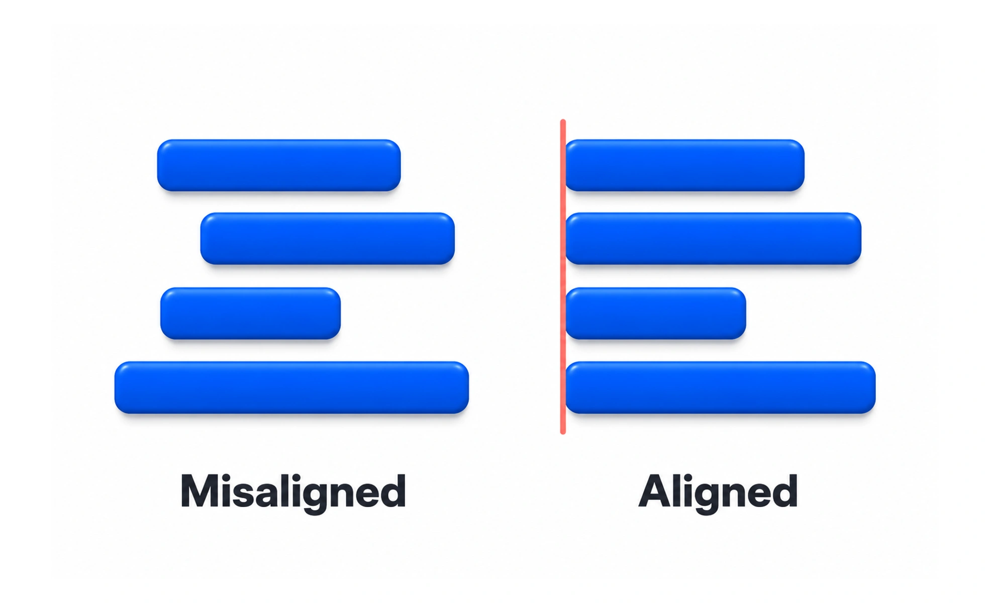
Alignment is the placement of elements along shared edges, centers or baselines. It creates visible order and helps people understand which content belongs together.
Like lining books up on a shelf, shared edges make a group feel intentional and easier to scan.
Use alignment to reveal structure
Choose a small set of alignment lines for a page: a shared left edge for text, a baseline for controls, or a center line for a compact empty state. Repeating those lines helps the eye move between related items. Alignment should support the content hierarchy rather than make every element mechanically symmetrical.
Match the edge to the content
Text is usually easiest to read when related headings, paragraphs and fields share a starting edge. Icons can align to the first line of a label rather than the middle of a tall paragraph. Numbers in a comparison table may align by decimal point. Small optical adjustments can make shapes look aligned even when their measured boxes differ.
Example: a settings form
If labels, inputs and help text each start at different horizontal positions, a person must repeatedly find where each field begins. A consistent column for labels and another for controls makes relationships clearer. On a narrow screen, stacking the label above its control may preserve that relationship better than forcing the desktop columns to fit.
Check visual and responsive alignment
Inspect alignment at actual content lengths and viewport sizes. A translated label or validation message can wrap and reveal a weak grid. Avoid fixing the appearance with arbitrary margins on individual items; adjust the shared layout rule, then make deliberate optical corrections only where the shape requires them.
Frequently asked questions
Key takeaways
- Shared edges and baselines make relationships easier to scan.
- Choose alignments that support the content hierarchy.
- Check wrapped text and narrow viewports.
- Fix the shared layout before adding one-off offsets.