

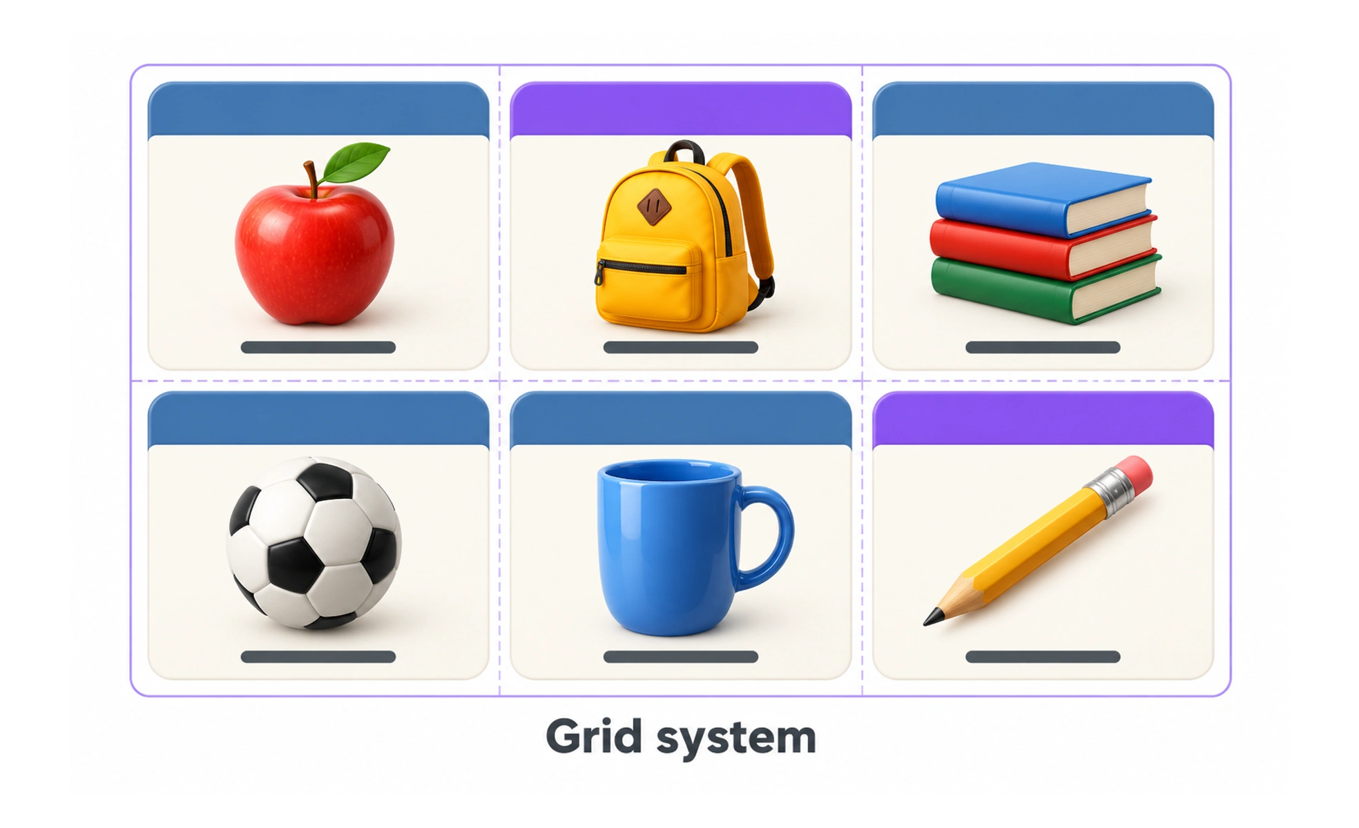
It provides an invisible skeleton that organizes typography, cards and interactive controls. This consistent framework ensures layouts scale predictably across diverse screen sizes.
Think of it like this. Street grids in planned cities like New York make navigation predictable and building placement organized compared to winding medieval alleyways.
How it works
A digital grid system divides the available viewport into structured structural units.
- Columns are vertical bands that hold content blocks, cards and text containers across the page.
- Gutters are the empty spaces between columns that prevent adjacent elements from colliding visually.
- Margins are the outer boundaries between the edge columns and the viewport edge.
- Breakpoints adapt the number of columns from twelve on desktop down to eight on tablet and four on mobile.
When to use it
Use a grid system whenever you design responsive software layouts and multi-column interfaces.
- Responsive page layouts ensure components resize proportionally as users resize browser windows.
- Design system tokens standardize column widths, gutter dimensions and outer margins across teams.
- Complex dashboard design aligns diverse widgets, analytics charts and data tables into cohesive rows.
- Cross-functional handoffs let engineers implement pixel-accurate layouts using standard CSS grid and flexbox.
Common mistakes
Designers frequently misunderstand how content should inhabit structured grid layouts.
- Placing content inside gutters rather than spanning content across columns and leaving gutters clean.
- Rigid adherence to columns for elements that genuinely need custom spacing, such as floating modals.
- Inconsistent gutter scales that mix random pixel values and destroy visual rhythm across views.
Frequently asked questions
Key takeaways
- Grid systems establish predictable visual rhythm and orderly alignment across screens.
- Most responsive desktop designs rely on flexible twelve-column layout architectures.
- Gutters create visual breathing room between content columns and must never contain elements.
- A systematic grid simplifies responsive adaptation and frontend developer implementation.