

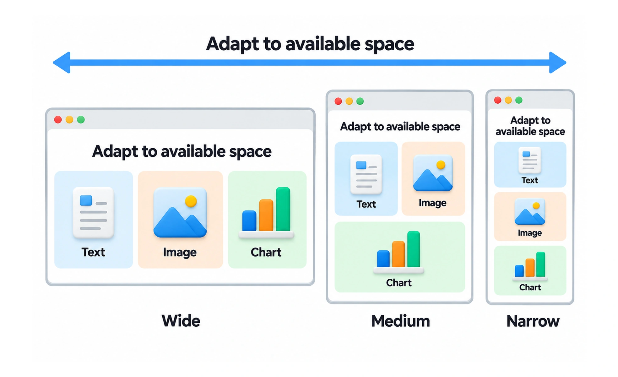
Resizing is the change in an element’s dimensions as content or available space changes. A robust interface defines what may grow, shrink, wrap or remain fixed.
An expandable suitcase makes room for more items, while its handles and wheels keep their useful size.
Choose which dimensions are flexible
Text areas often need to grow in height as content wraps. A sidebar may have a bounded width while the main region absorbs extra space. A control can keep a minimum height while becoming wider. Specify these behaviors based on the role of each item.
Prevent content from being squeezed
When a row gets crowded, items may shrink in unexpected ways. Set minimum widths where labels or actions must remain legible, and allow the layout to wrap or stack before content becomes unusable. Avoid truncating critical information without a way to inspect it.
Account for user changes
Browser zoom, text scaling, localization and validation messages can all change dimensions. Make sure containers can expand and scroll when appropriate. Resizing should not move an action out of reach or cover content with a fixed footer.
Example: a search field
In a toolbar, a search field may take the remaining width but respect a useful minimum. As the viewport narrows, optional toolbar items can move to an overflow menu while the search remains available. If the minimum no longer fits, stack the toolbar rather than compressing the input to a few characters.
Frequently asked questions
Key takeaways
- Define what grows, shrinks, wraps or stays fixed.
- Protect minimum sizes for readable and usable controls.
- Test content changes, zoom and translated text.
- Use structural reflow before squeezing important content.