

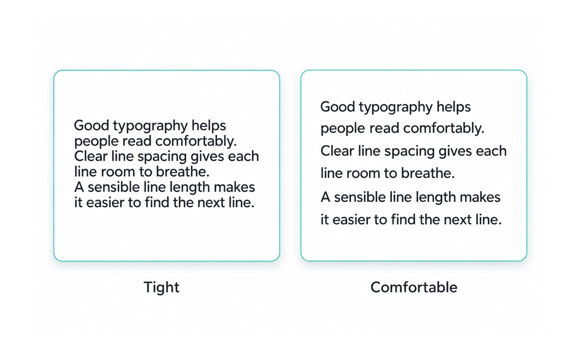
Body text is the main text people read in a page, lesson, or interface. Its typeface, size, line spacing, and line length should support comfortable sustained reading.
Body text is the road through an article: if it is clear and steady, readers can focus on where the ideas are taking them.
Optimize for sustained reading
Paragraphs are read differently from short labels. Choose a comfortable size, line height, and measure so a reader can move from one line to the next without losing their place. Dense blocks, tight leading, and very long lines can make even well-written content tiring.
Use paragraph structure
Break ideas into paragraphs that each have a clear purpose. Use headings, lists, and examples when they make a long explanation easier to scan. Do not create visual variety by making every sentence a separate paragraph; the structure should reveal how the ideas relate.
Keep links and emphasis readable
Links need a visible cue beyond a subtle color shift, and emphasized text should remain distinguishable without interrupting the sentence. Avoid long passages in all caps or italics. Make sure inline code, quotations, and other special text treatments preserve enough contrast and do not break the reading rhythm.
Example: a lesson article
A lesson can begin with a short introduction, then use descriptive section headings and occasional examples to guide learners. Keep paragraphs at a readable width on desktop and let them use the available width on mobile. Verify that embedded diagrams and captions do not create cramped columns beside the text.
Frequently asked questions
Key takeaways
- Treat body text as a sustained-reading experience.
- Use readable line length and spacing.
- Structure paragraphs around related ideas.
- Make links and emphasis visible without disrupting flow.