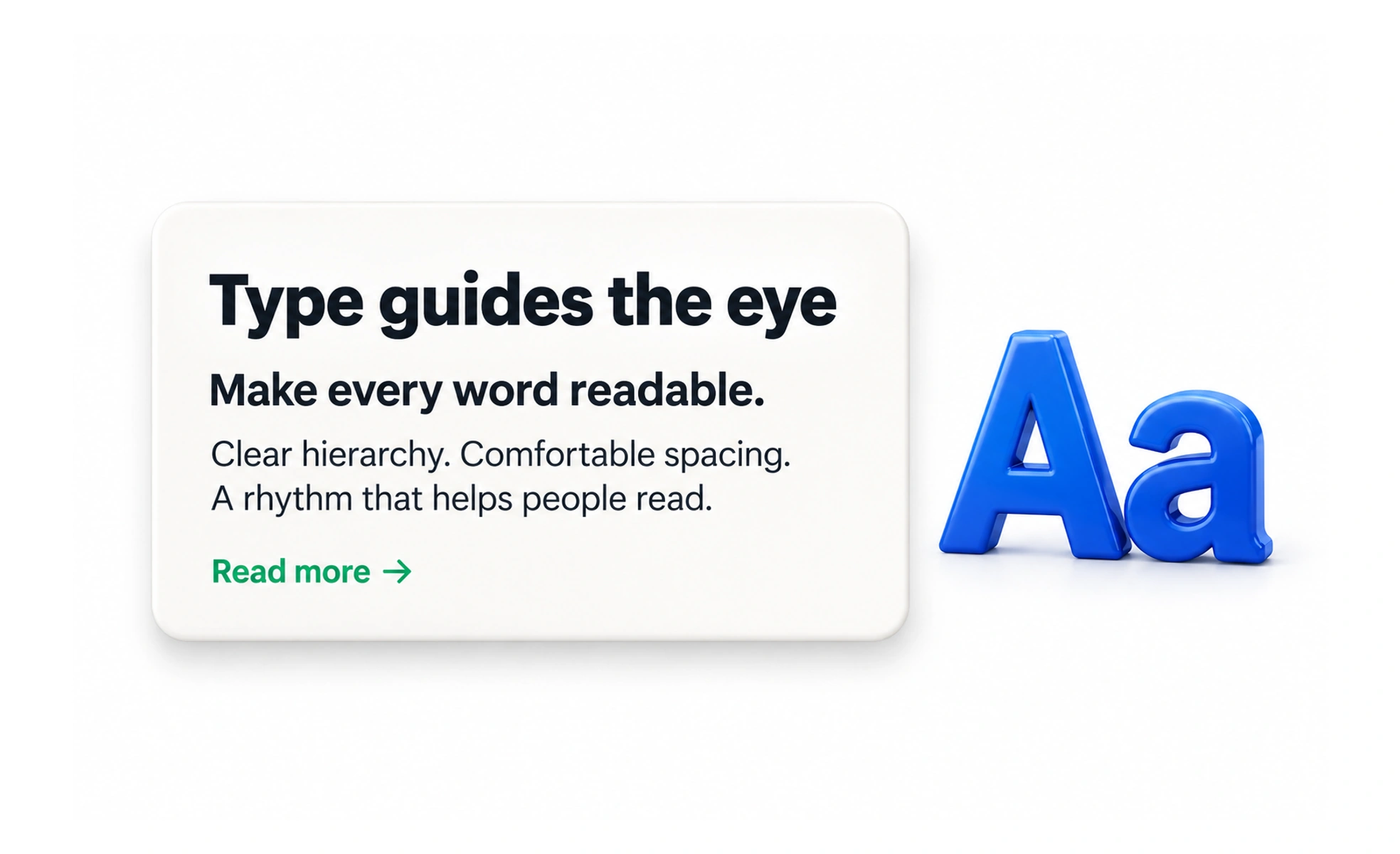
Every interface is full of text. Headings, labels, body copy, buttons, error messages and tooltips are all type. Every piece of text is a design decision, because its typeface, size, weight and colour all communicate something. Good typography disappears when it is working. Bad typography is noticed immediately.
Think of it like this. A road signs uses a typeface that is boring but readable at speed, in rain, at night, by someone in a hurry. A novel uses a typeface that is comfortable over hours of reading. Same alphabet, different job. Typography is the choice of which job your text is doing.
How it works
A type scale is a system of sizes that creates consistent hierarchy. It defines how large headings are relative to body text and how the system grows. Modular scales use a mathematical ratio. Practical scales are defined by what the interface needs. Either way, a consistent scale is one of the most effective ways to create visual order.
Line height, called leading in print, is the vertical space between lines. Too tight and text feels cramped. Too loose and the eye loses its place. Body text usually wants a line height around 1.5 to 1.75 times the font size.
Measure, or line length, is how many characters fit on a line. The comfortable range for body text is roughly 45 to 75 characters per line. Longer lines make it hard to find the start of the next line. Shorter lines create excessive breaks.
Hierarchy is created through size, weight, colour and spacing together. A clear typographic hierarchy tells users what to read first and how the content is organised. It should be obvious at a glance.
When to use it
Typography decisions matter in every interface, because every interface has text.
- System fonts when speed and familiarity matter. System fonts like SF Pro and Roboto load instantly and match platform conventions. They are a deliberate choice, not a fallback.
- Custom fonts when brand character matters. A distinctive typeface strengthens identity. The trade-off is load time and familiarity.
- Variable fonts when you want flexibility with less weight. A variable font is one file that interpolates between weights and widths, reducing file size and enabling more fluid expression.
The choice between system and custom fonts is a product decision, not a typography rule.
Common mistakes
- Treating all text the same. Headlines, body, labels and captions have different jobs and need different sizes, weights and spacing. A single size for everything produces a flat interface with no hierarchy.
- Ignoring contrast. Text that looks elegant at 3:1 contrast is unreadable for many users. WCAG AA requires 4.5:1 for normal text and 3:1 for large text.
- Picking display typefaces for body text. Romantic, decorative and highly stylised typefaces work at large sizes. They are poor for body text. The job of body type is to be invisible.
- No type scale. Ad-hoc sizes create visual noise and make the interface feel unfinished. Design a scale and use it.
- Forgetting internationalisation. A typeface needs glyph coverage for the scripts you support. Different scripts have different baseline behaviours and typical sizes. A system that works for Latin text may need adjustment for Cyrillic or Arabic.
Frequently asked questions
Key takeaways
- Typography is not making text look good. It is making text work: legible, readable and appropriate.
- A type scale creates hierarchy. Without one, the interface has no visual order.
- Line height and line length both affect readability. Body text wants roughly 1.5 to 1.75 line height and 45 to 75 characters per line.
- System fonts are a deliberate, defensible choice. Custom fonts are a brand decision with a load-time cost.
- Accessibility and typography are deeply connected: contrast, size, line height and typeface choice all determine who can read the interface.