Type Terms: Hierarchy, Alignment and Spacing
Learn the words designers use for type hierarchy, alignment, kerning, tracking and line height.
Good typography keeps people reading; poor typography sends them elsewhere. This lesson covers the terms designers use every day: the levels of a type hierarchy, the four kinds of text alignment, and the spacing settings kerning, tracking and line height.
Typographic hierarchy
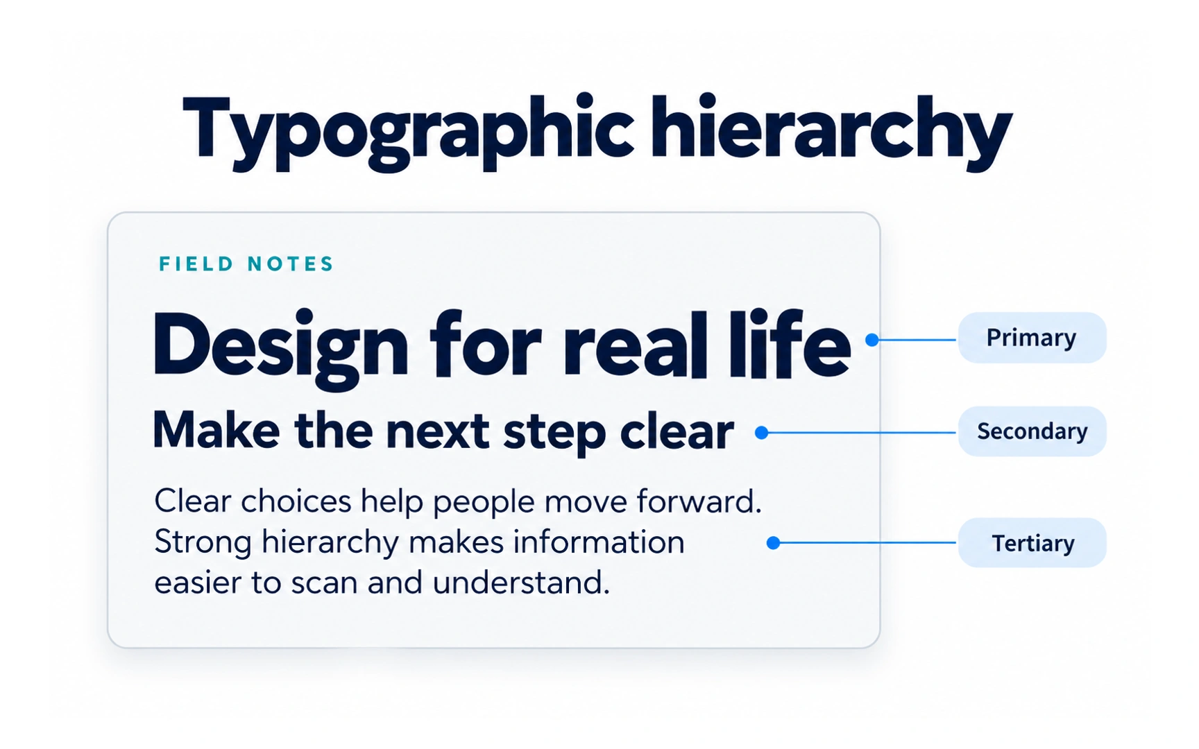
Typographic hierarchy is visual hierarchy applied to text. It shows readers what to read first, second and third, using size, weight, color, typeface and position.
A simple hierarchy can use three levels. In the example, the headline "Design for real life" is primary, the subheading "Make the next step clear" is secondary, and the paragraph below is tertiary.
A quick test: blur your eyes or step back from the screen. If you can still tell which line matters most, the hierarchy is working.
Headline
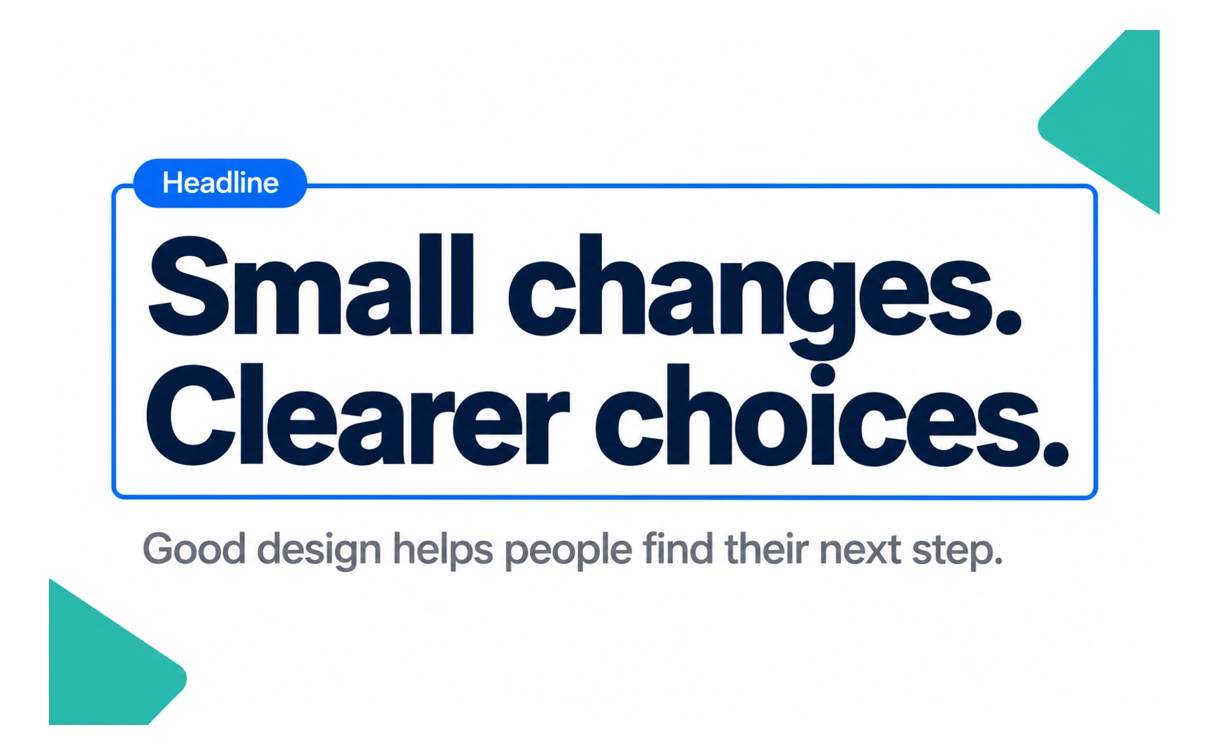
A headline is the main title of a page, article or section, like "Small changes. Clearer choices." in the example. Its job is to catch attention and tell people what the content is about.
Keep headlines short and specific. A reader should understand the point in a single glance.
Headlines are where you can be expressive: a display typeface, a heavy weight or tight letter spacing. Choose one or two effects, not all of them at once.
Eyebrow headline
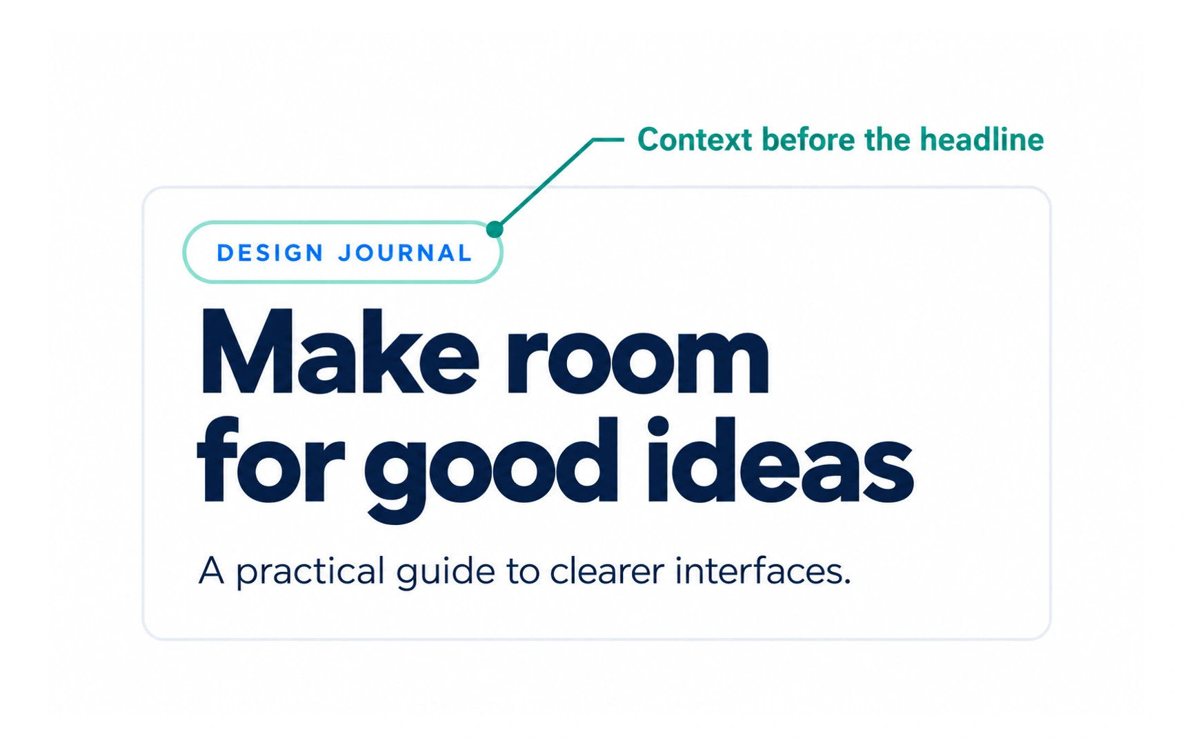
An eyebrow headline is a short label that sits above the main headline, the way an eyebrow sits above an eye. In the example, "DESIGN JOURNAL" sits above "Make room for good ideas".
It gives context before the headline: a category, a topic or the name of a series. Eyebrows are often set small, in capitals, with a little extra letter spacing.
They are most useful in collections, such as a grid of article cards, where the labels help people scan by topic.
Body
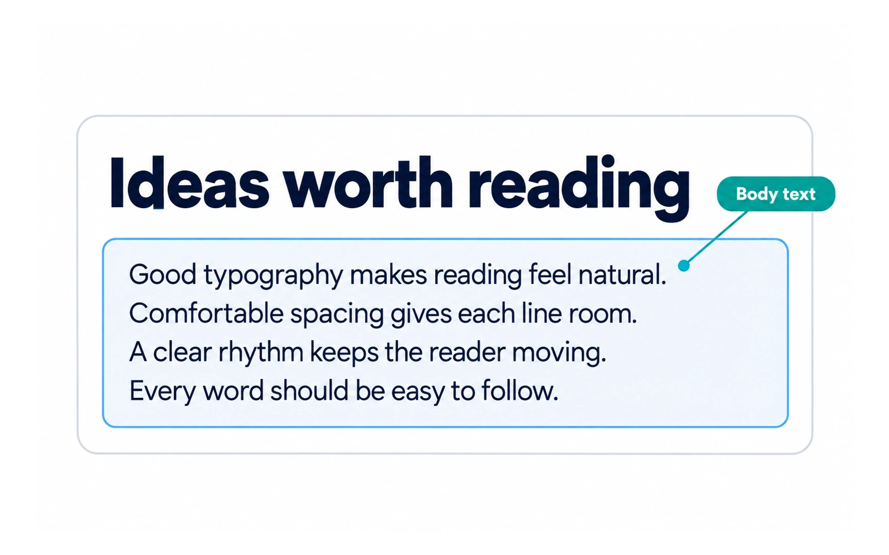
Body text is the main reading text, the paragraphs that follow the headline. It is usually the largest amount of text on a page.
Because people read it for longest, body text needs to be comfortable: a readable typeface, a comfortable size, enough line height and good contrast. Around 16 px on screens is a common starting point.
Keep lines from getting too long. Around 45 to 75 characters per line is a useful starting point, because very long lines make it hard to find the next one. Check both with the actual typeface and your readers.
Flush left alignment
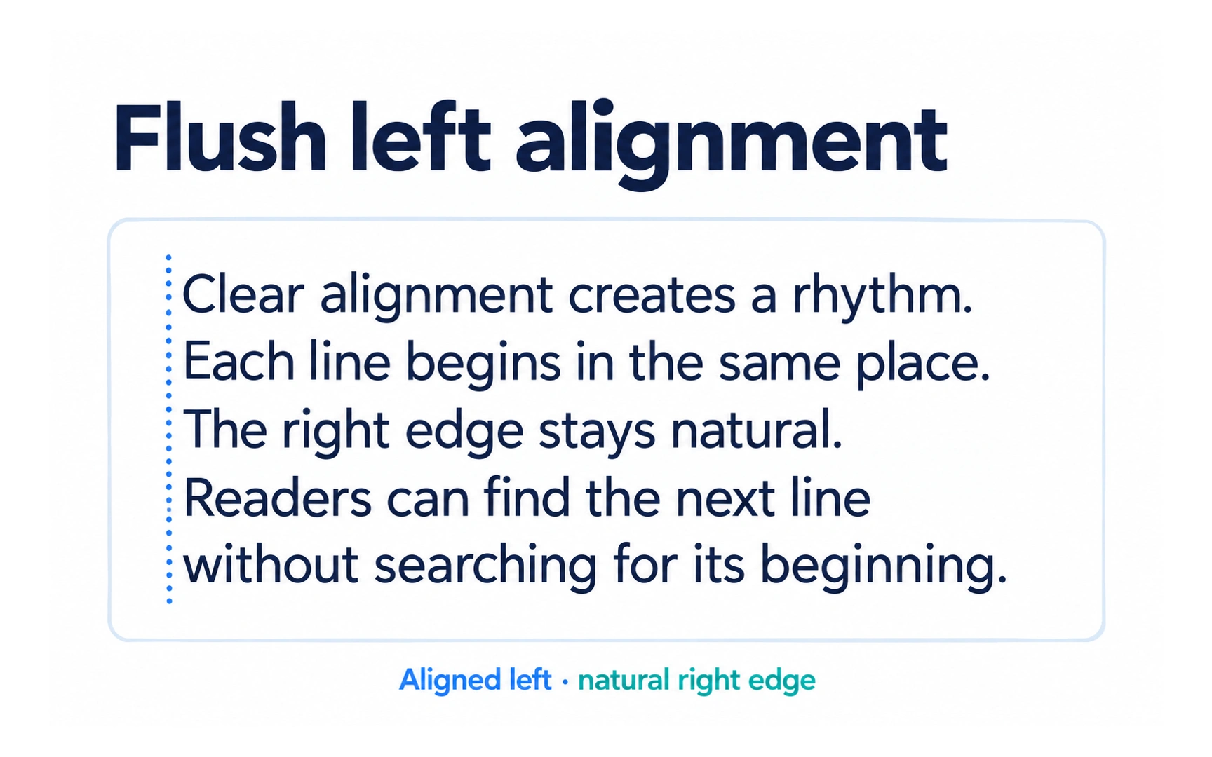
Flush left text lines up along the left edge, while the right edge stays uneven, or "ragged". In the example, every line starts in the same place.
In left-to-right languages such as English, this is the easiest alignment to read, because the eye always returns to the same starting point. It is the default for body text and long content.
For right-to-left languages such as Arabic and Hebrew, the same idea applies in reverse: text should start from the right edge.
Centered alignment
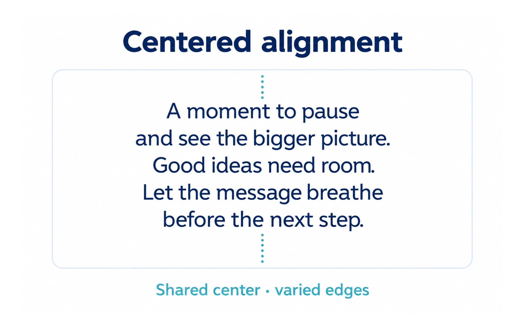
Centered text is balanced around a middle line, so both edges are uneven. In the example, each line shares the same center.
Centering draws attention and feels formal, so it suits headlines, short titles, quotes and buttons.
For longer text it slows reading down, because every line starts in a different place. Keep centered text to a few short lines.
Flush right alignment
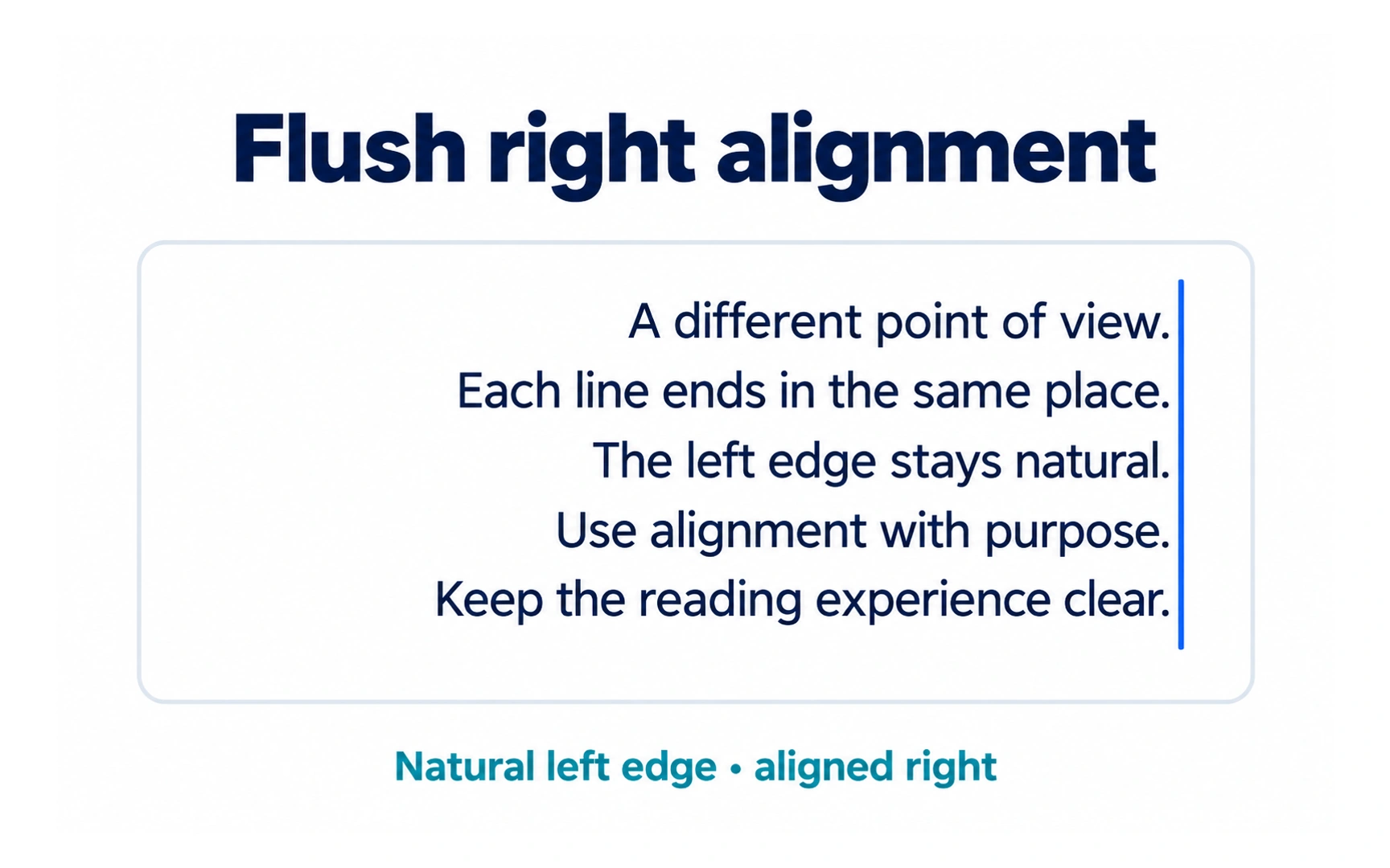
Flush right text lines up along the right edge, with an uneven left edge. In the example, every line ends in the same place.
It is the natural alignment for right-to-left languages. In left-to-right interfaces, it is useful in small doses: dates and metadata, labels next to a form field, and numbers in a table.
Numbers in a column are easier to compare when they are right-aligned, because units, tens and hundreds line up. Use tabular figures, where every digit has the same width, and keep decimal places consistent, or align the decimal points when precision varies.
Justified alignment
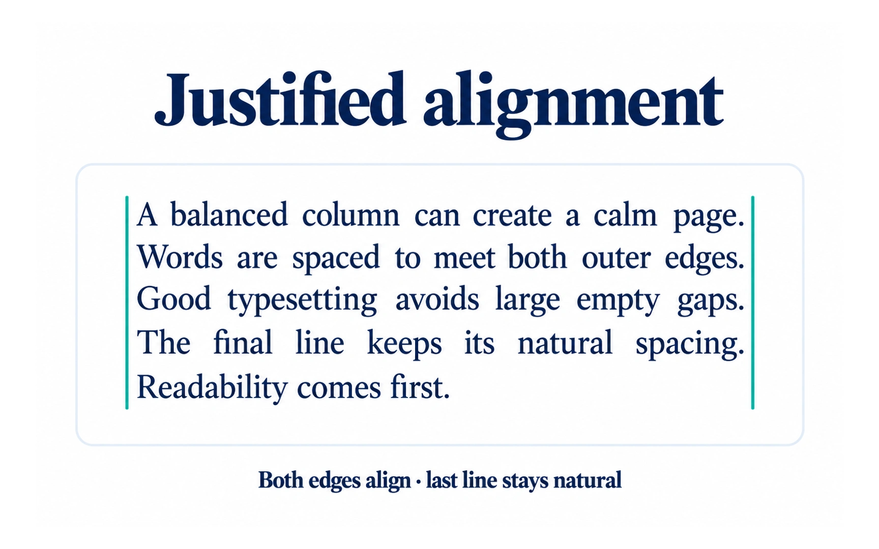
Justified text stretches each line to reach both edges, except the last line of a paragraph. In the example, both edges line up and the spacing between words changes from line to line.
It is common in printed books and newspapers, where careful hyphenation keeps the gaps even.
On screens, especially in narrow columns, justified text often creates uneven gaps and "rivers" of white space. These make reading harder, especially for people with dyslexia, so prefer flush left for digital body text.
Kerning
Kerning adjusts the space between two specific letters. The video shows how changing one gap affects a word.
Some letter pairs look too far apart with default spacing because of their shapes:
- "To", "Ta" and "Te": the bar of the T leaves space for the next letter to tuck under.
- "AV" and "VA": the diagonal strokes leave a large gap at the top or bottom.
- "Wo" and "Yo": wide diagonals leave room beside the round letter.
Most typefaces include built-in kerning for common pairs. Manual kerning matters most in large text, such as headlines and logos, where small gaps become obvious.
Tracking
Tracking, also called letter spacing, adjusts the space between all the letters in a piece of text at once. The video shows how tracking changes every gap in a word.
Small text and all-capital labels often benefit from a little extra tracking, which helps the letters stay distinct. Large headlines often look better with slightly tighter tracking.
Body text rarely needs it, because typefaces are already spaced for reading. In CSS, tracking is set with letter-spacing, often in em units so it scales with the font size.
Line height
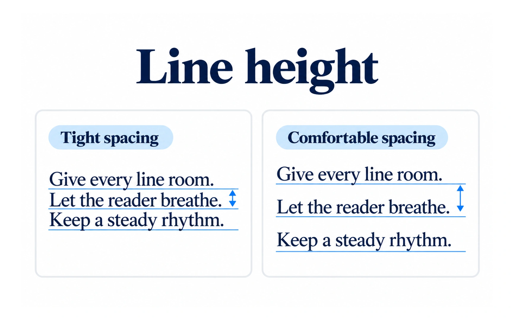
Line height, also called leading, is the vertical distance from one line of text to the next, measured from baseline to baseline. The example compares tight and comfortable spacing.
Too little line height makes text feel cramped; too much makes it hard for the eye to find the next line. For body text, around 1.4 to 1.6 times the font size is a good starting point.
Headlines usually need less, around 1.1 to 1.3, because their lines are short and large. In CSS, a unitless value such as line-height: 1.5 scales with the font size.
REFERENCES
TOPICS
FROM COURSE