Typographic hierarchy
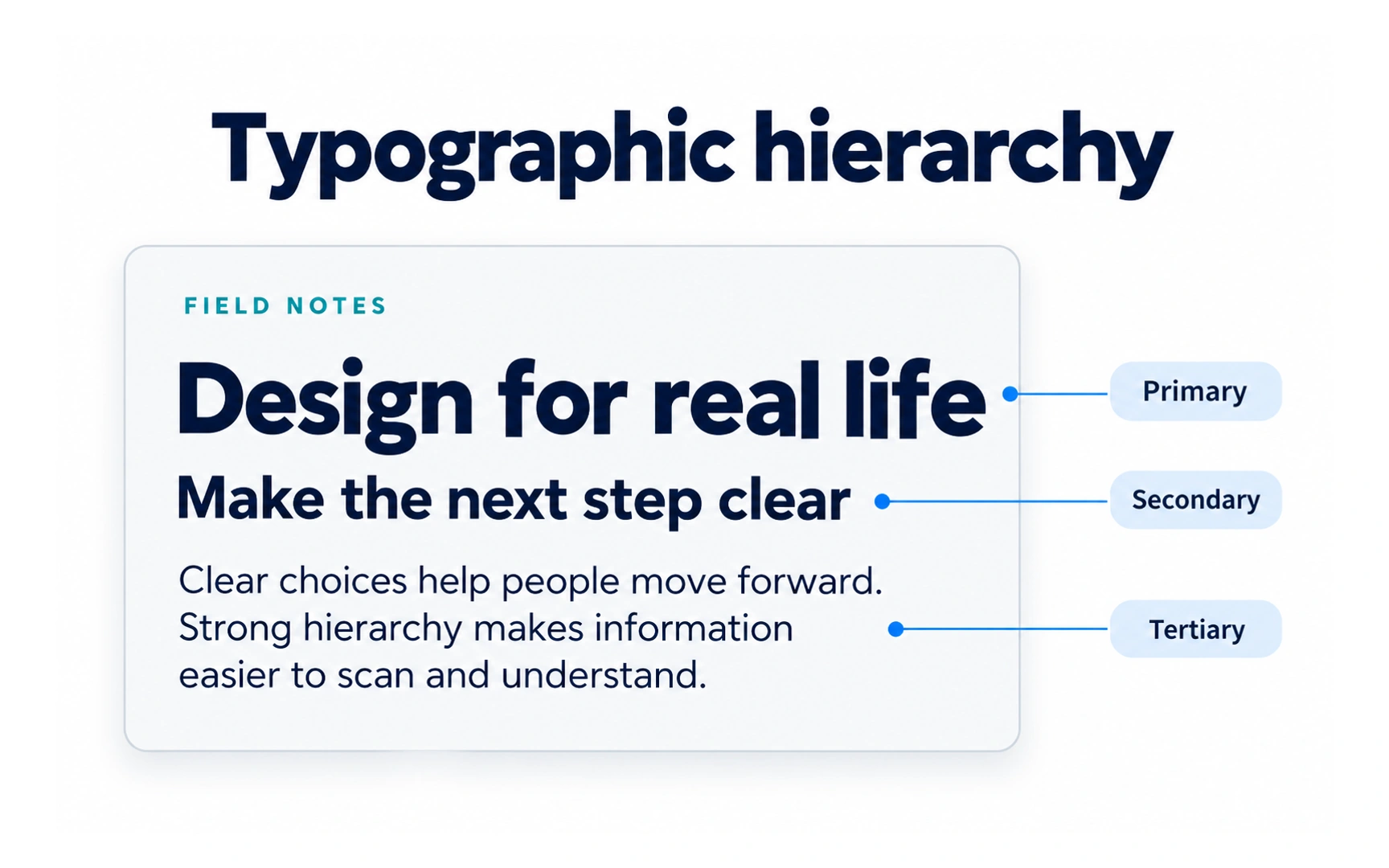
Typographic hierarchy is visual hierarchy applied to text. It shows readers what to read first, second and third, using size, weight, color, typeface and position.
A simple hierarchy can use three levels. In the example, the headline "Design for real life" is primary, the subheading "Make the next step clear" is secondary, and the paragraph below is tertiary.
A quick test: blur your eyes or step back from the screen. If you can still tell which line matters most, the hierarchy is working.

