

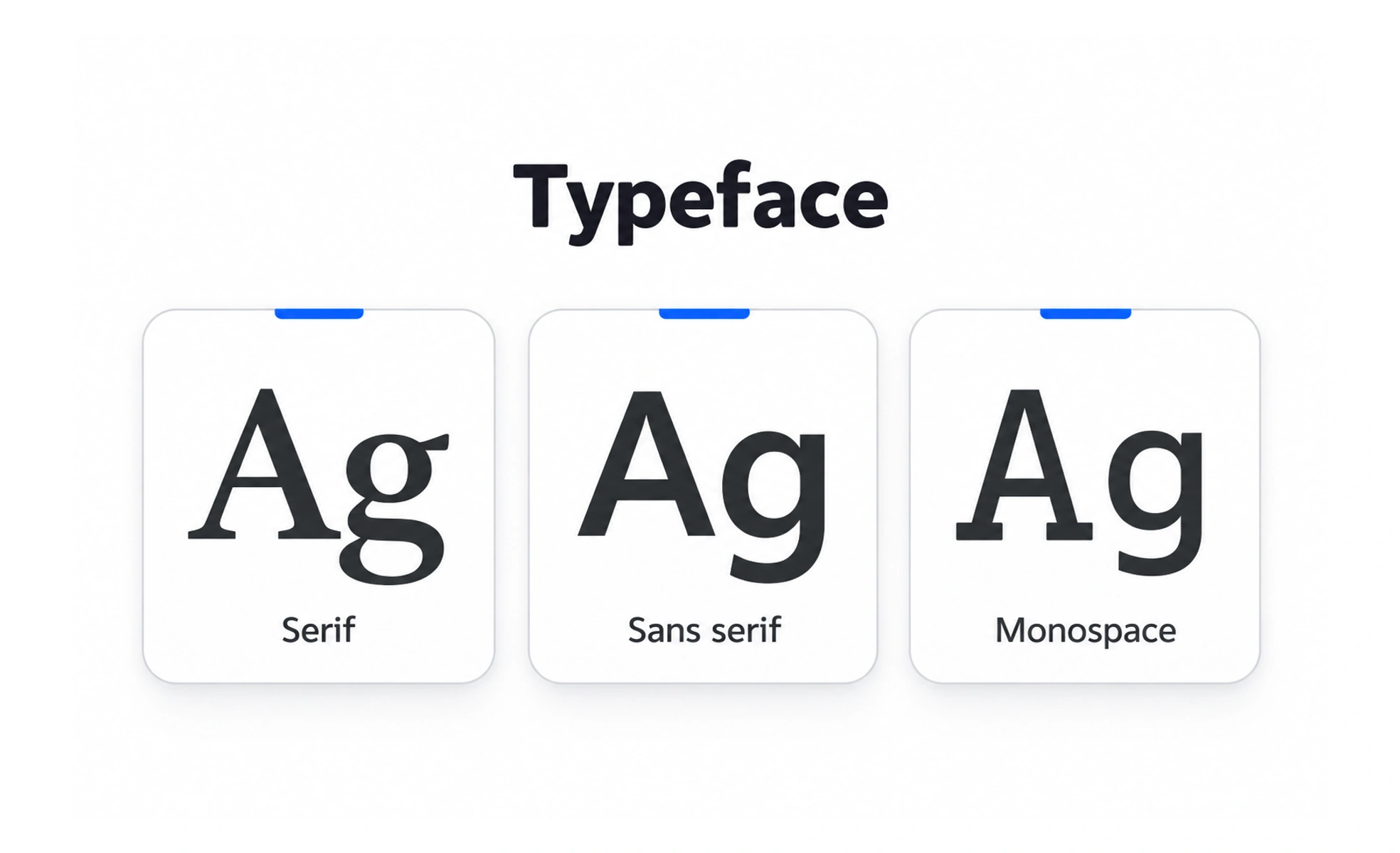
A typeface is a designed family of letterforms, such as Inter or Georgia. Its shapes and proportions give text a distinct voice and affect how easily people can read it.
A typeface is like the voice used to read a message: the words stay the same, but their character changes how they feel.
Choose for the reading task
Start with the content and the conditions in which people will read it. A typeface for long paragraphs needs comfortable, recognizable letterforms at common screen sizes. A display face can be more expressive when used briefly for a title. Check numerals, punctuation, and characters used by the languages your product supports.
Build a small, useful type family
A product rarely needs many unrelated typefaces. One family with suitable weights may cover headings, body copy, and interface labels. A second family can add contrast when it has a clear role. Too many styles make hierarchy harder to learn and increase the work of loading and maintaining fonts.
Check real content and devices
Review the typeface with actual paragraphs, buttons, numbers, and error messages. Letter shapes that look clear in a specimen may become crowded in a dense interface or at a small size. Test supported scripts, fallback fonts, and loading behavior so a temporary font change does not disrupt the layout.
Example: a learning platform
A learning product might use a neutral, highly legible family for lesson text and a distinctive weight for course headings. The difference creates hierarchy without making every screen feel like a poster. If the chosen family has no glyph for a learner’s language, a compatible fallback should preserve readable line spacing and consistent tone.
Frequently asked questions
Key takeaways
- Choose a typeface for the reading task and audience.
- Use a small family with clear roles.
- Test real content, scripts, devices, and font fallbacks.
- Let expressive display styles support, not compete with, reading.