

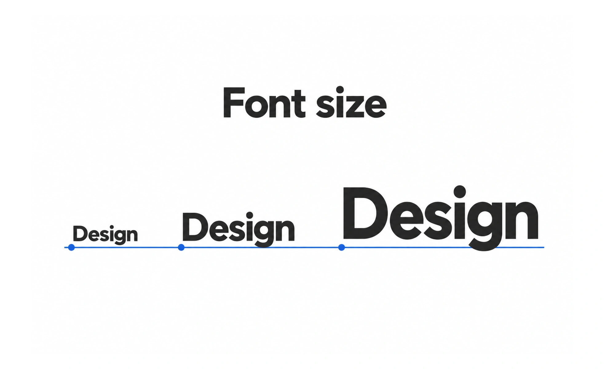
Font size is the measured size of text, usually expressed in pixels, points, or relative units. It affects readability, hierarchy, and how much content fits in a layout.
A map uses larger labels for major places and smaller labels for details. Text size helps readers find the same kind of hierarchy on a screen.
Set sizes by role
Define sizes for roles such as page title, section heading, body text, and helper text instead of choosing a new value for every component. The roles should make a useful hierarchy and remain comfortable at the distances and devices where people read. Small labels still need to be legible and important.
Scale across viewports
A title that fits on a wide monitor may wrap awkwardly on a phone. Use responsive sizing only when it improves the reading experience, and check the result at intermediate widths as well as the smallest and largest supported sizes. Avoid shrinking body text simply to preserve a fixed layout.
Respect user settings
People may increase browser zoom or use text enlargement. Layouts should accommodate larger text without clipping controls, hiding content, or forcing horizontal scrolling. Relative units can help components respond to user settings, but the whole interface still needs practical testing at enlarged sizes.
Example: a form
A form’s question can be visually stronger than its helper text, but the helper still needs enough size and contrast to be read. Test the form with long labels, validation messages, and zoom. If the only way to fit it is to make instructions tiny, revise the layout instead.
Frequently asked questions
Key takeaways
- Choose sizes by semantic role.
- Check wrapping at narrow and intermediate widths.
- Support zoom and enlarged text without clipping.
- Keep supporting instructions readable.