

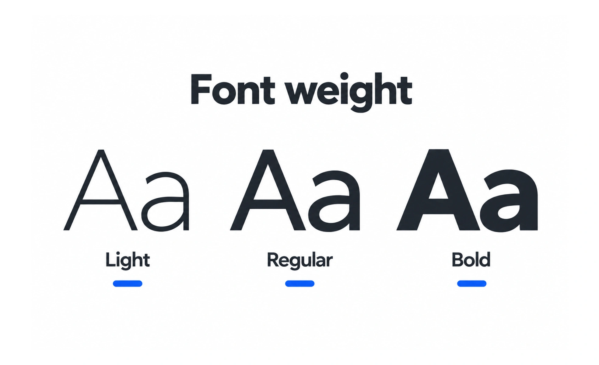
Font weight describes how thick or thin a typeface’s strokes appear. Designers use weight to create hierarchy and emphasis, while keeping text readable at its actual size.
In a spoken presentation, a speaker can add emphasis without shouting every sentence. Font weight gives selected words a similar visual emphasis.
Use weight to show hierarchy
A stronger weight can distinguish a heading, selected value, or primary action from supporting copy. Give each weight a role that people can learn. When every label is bold, the page loses contrast and users have to rely on size or position alone to understand what matters.
Balance weight with size and color
Weight is one part of hierarchy, not a substitute for it. A small bold label may still be difficult to read, and a light typeface may disappear against a low-contrast surface. Evaluate the complete combination of size, line spacing, color, and background in each theme.
Check available font files
A design may specify several weights, but the product must actually load those files or use a variable font that supports them. Browser-synthesized bold can look uneven. Confirm the loaded font, keep the number of requests reasonable, and define a sensible fallback for slower connections.
Example: a course card
The course title can use a semibold weight, while its description and duration remain regular. This makes the title easy to find without turning the entire card into a block of heavy text. Check the hierarchy with longer translated titles, where wrapping may change which line receives the strongest emphasis.
Frequently asked questions
Key takeaways
- Assign weights clear, repeatable roles.
- Use weight alongside size, spacing, and contrast.
- Load the actual font weights the interface specifies.
- Check long labels and translated content.