

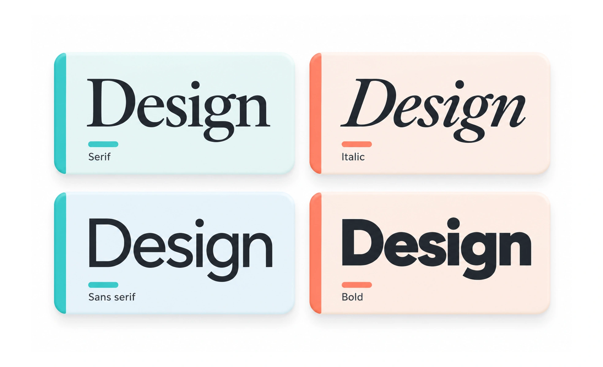
While a typeface is the underlying creative design, a font is the practical software file. Choosing the right font determines legibility, emotional tone and accessibility.
Think of it as the difference between a song and an MP3 file. The typeface is the musical composition, while the font file is the specific recording you play.
Types
Modern digital fonts fall into distinct classifications suited for different reading contexts.
- Serif fonts feature small decorative strokes at character ends, conveying traditional authority and literary depth.
- Sans-serif fonts lack decorative strokes, delivering clean modern legibility on digital screens at small sizes.
- Monospace fonts assign equal horizontal width to every character, making them essential for code editors.
- Variable fonts package multiple weights, optical sizes and slant angles into a single efficient file.
How to spot it
You can evaluate font quality by inspecting character rendering in high-density interface contexts.
- Poor x-height makes lowercase characters look cramped and illegible when rendered at twelve pixels.
- Ambiguous glyph shapes cause users to confuse uppercase I, lowercase l and the number 1 in forms.
- Inadequate optical kerning creates awkward gaps between specific letter pairings like A and V.
- Missing unicode characters result in broken placeholder rectangles when rendering international text.
Common mistakes
Product teams frequently damage interface usability by mishandling font selections and weights.
- Loading too many font files over the network, which introduces heavy download delays and layout shifts.
- Selecting expressive display fonts for body paragraphs where plain, neutral letterforms read much faster.
- Using ultra-light font weights that fail contrast criteria and wash out under bright sunlight.
Frequently asked questions
Key takeaways
- A font is the digital delivery file, whereas a typeface is the overarching visual design.
- Clear letterform distinction between similar characters is vital for input interfaces.
- Limit font families and weights to maintain fast page load performance.
- Variable fonts offer multiple weights while cutting total network request overhead.