

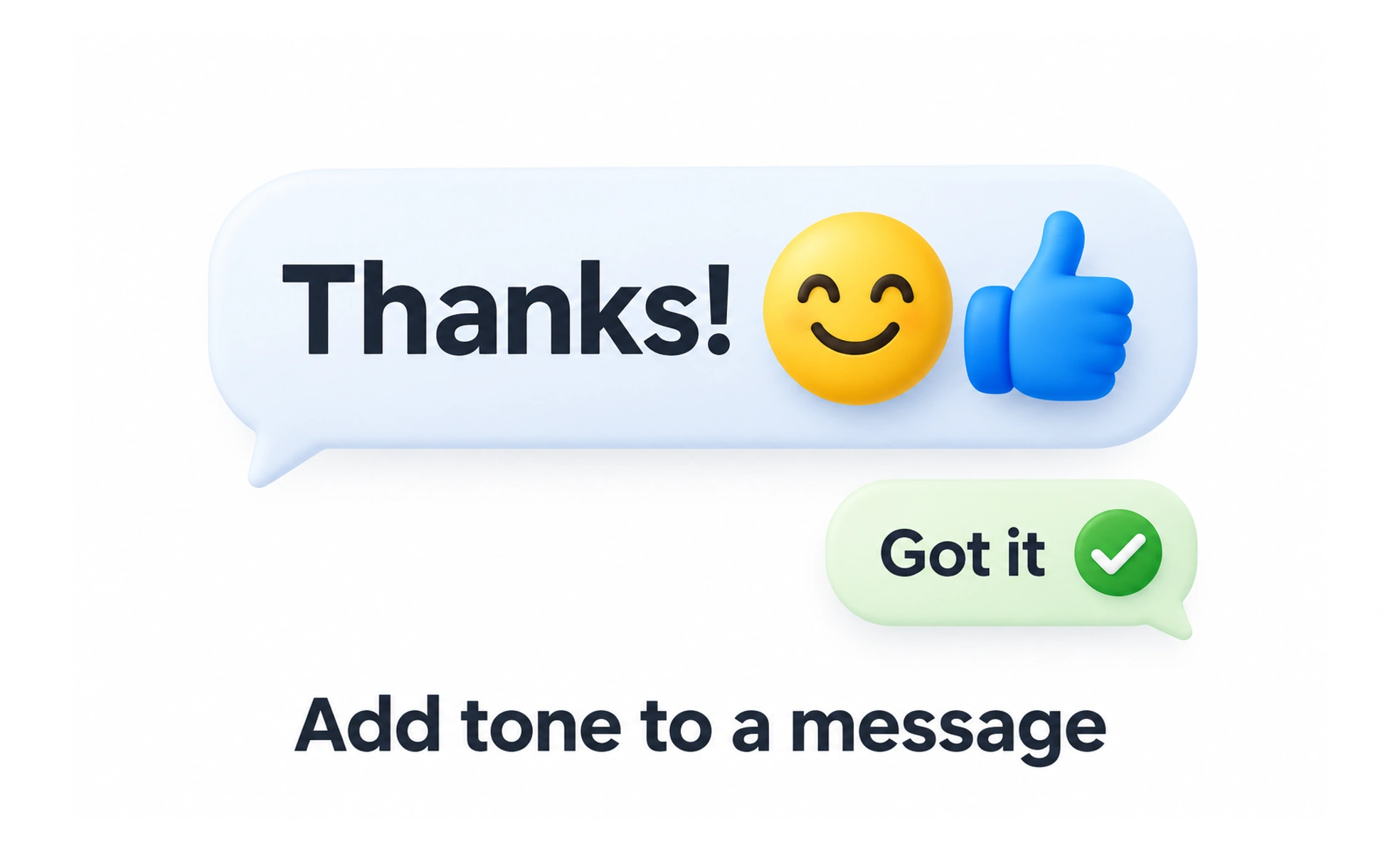
Emojis can add tone or make a short message easier to scan, but their appearance and interpretation vary across platforms, cultures, and assistive technologies. They work best as a supplement to clear words rather than a replacement for essential meaning.
A quick sketch in the margin can add tone to a note; an emoji offers a compact visual cue within a digital message.
Consider audience and context
The same emoji can feel friendly, ironic, or confusing depending on the audience and situation. Use them carefully in formal, sensitive, or high-stakes communication. If a message depends on one emoji to explain what a control does, rewrite it with words.
Check how assistive technology reads them
Screen readers may announce an emoji’s text description, which can become repetitive in long sequences. Keep decorative emojis limited, and ensure the surrounding text carries the actual message. For meaningful standalone emoji controls, provide a clear accessible name.
Expect visual variation
Emoji artwork differs across operating systems, fonts, and apps. A symbol that looks playful on one device may look serious or different on another. Do not use emoji as a precision icon in a product interface when a consistent icon asset or text label is required.
Use them with restraint
A small number can soften tone or make informal content approachable. Long runs can reduce readability and create extra work for people using assistive technology. Keep emoji optional and avoid making a user’s identity, progress, or status depend on them.
Frequently asked questions
Key takeaways
- Use emojis to supplement meaning, not carry essential instructions.
- Consider cultural interpretation and communication context.
- Account for screen-reader descriptions and platform-specific artwork.
- Use consistent icons and text for important interface controls.