

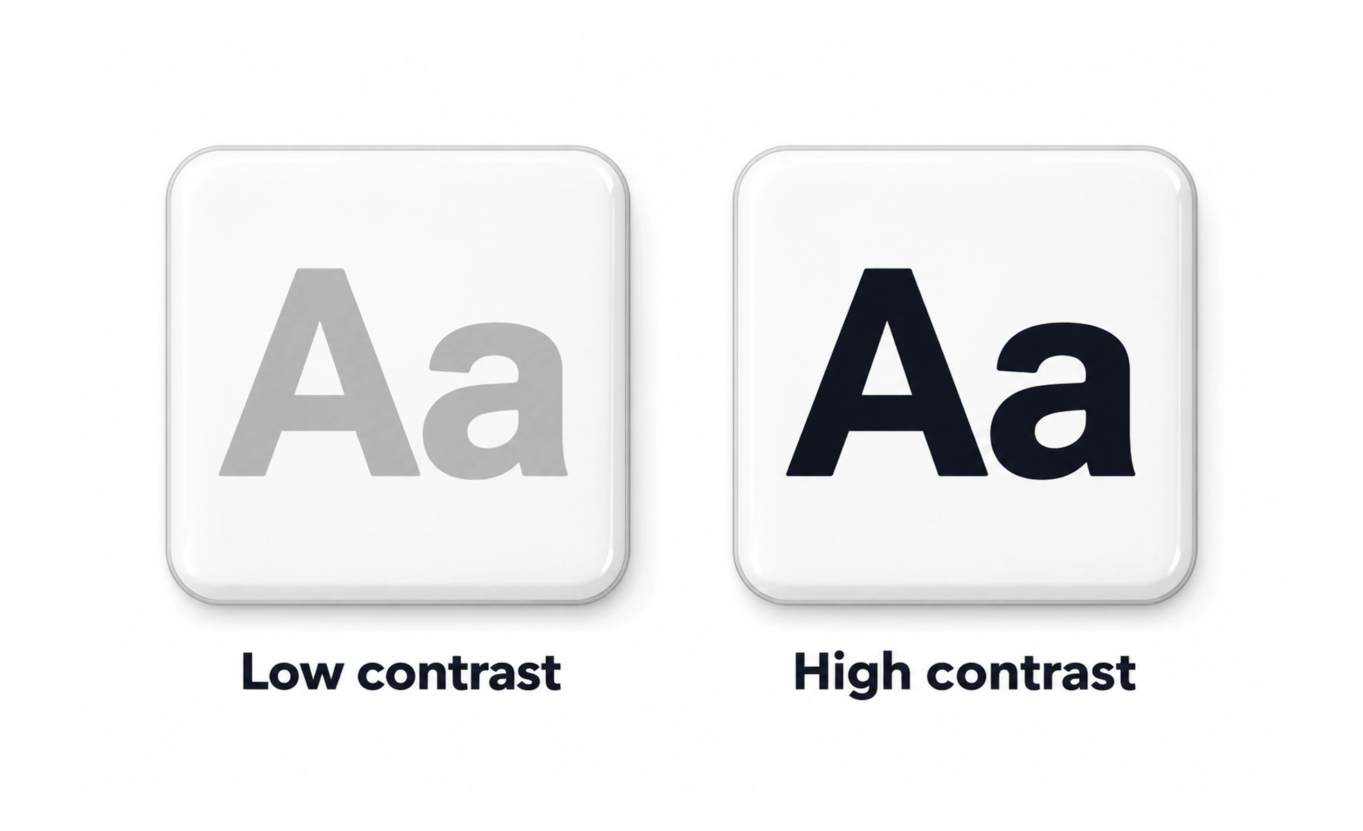
Contrast is a difference between visual elements, such as lightness, size, weight or shape. It helps people distinguish content and notice important states when used with care.
A clear voice stands out in a noisy room because it differs enough to be heard; visual contrast helps important information stand out on a page.
Create hierarchy with differences
A larger heading, stronger text weight or distinct surface can help people see what matters first. Use contrast selectively; if every element is bold, saturated or outlined, nothing gains priority. Relate each contrast choice to the task and information hierarchy.
Meet text and interface contrast needs
Text must remain readable against its background, and controls need visible boundaries or states. Check actual color pairs in each theme and state, including hover, disabled and error conditions. Do not assume that a brand color is automatically suitable for small text on every surface.
Use more than color
Color differences may be hard to perceive for some people or in some display conditions. Combine color with labels, icons, patterns, position or shape when communicating status or selection. Keep those extra cues consistent so people can learn them.
Example: selected tab
A selected tab can use a stronger surface, a clear underline and an accessible selected state. If the only difference is a slight hue shift, the active location may be hard to find. Check both visual perception and assistive-technology output.
Frequently asked questions
Key takeaways
- Use contrast to establish clear, selective hierarchy.
- Check text and control contrast in every theme and state.
- Do not rely on color alone for meaning.
- Test contrast at real sizes and against real backgrounds.