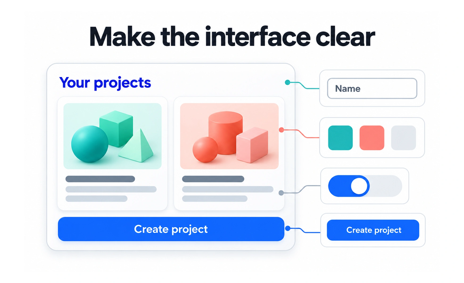
Interface design translates product behavior into something people can perceive and operate. It includes hierarchy, typography, spacing and color, alongside interaction states and feedback. A screen is incomplete if it looks correct only before anyone focuses a field, enters invalid data or waits for a request.
Design the behavior and its presentation
Start with the task and the information people need to make progress. Arrange the interface so the next action is understandable and related information stays connected.
Specify the states that change what the person can do: available, focused, selected, disabled, loading, successful and unsuccessful. A component library can implement those states, but the product still needs clear rules for when each appears.
Build a readable hierarchy
Use size, weight, spacing and placement to express relationships. Color can reinforce meaning, but should not carry essential meaning alone. A required field, an error and a selected option need cues that remain understandable without color perception.
- Give controls names that describe their purpose.
- Keep readable contrast between content and its surface.
- Provide visible keyboard focus and sensible focus order.
- Allow content to wrap and layouts to adapt as text grows.
Visual consistency helps people predict behavior. It does not mean every component must have the same size or emphasis.
Example: saving notification settings
A settings page groups related switches and explains what each changes. When saving is immediate, show pending and failed states without moving the control unexpectedly. If the request fails, keep the person informed and provide a clear recovery.
A visually polished switch that silently resets after reload is still a broken interface. UI quality depends on the connection between presentation, interaction and persisted product state.
Review beyond the ideal viewport
Inspect long labels, empty data, slow requests, keyboard use, zoom and narrow screens. Check both themes if the product supports them. Shared tokens and components reduce drift, but actual rendered checks reveal collisions that naming conventions alone cannot prevent.
Avoid adding motion that delays interaction or conceals state changes. Respect reduced-motion preferences and use transitions to clarify continuity.
Frequently asked questions
Key takeaways
- UI design includes interaction states and feedback, not only static screens.
- Use hierarchy and multiple cues to make information understandable.
- Connect displayed state to actual product behavior and persistence.
- Review zoom, keyboard access, long content and different viewport sizes.