

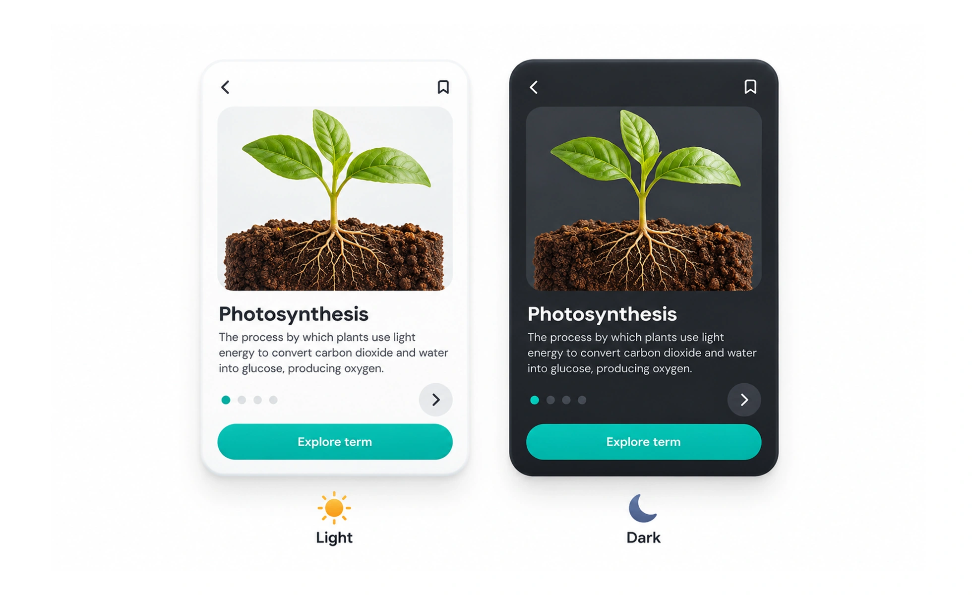
It reduces eye fatigue in low-light environments, minimizes display glare and prolongs battery life on OLED screens. High-quality dark modes use layered dark grays rather than pure black.
Think of it as dimming the overhead lights in a cinema. Lowering harsh glare allows your eyes to relax and focus on the movie screen without squinting.
How it works
Effective dark themes construct visual hierarchy through lightness elevation rather than shadows.
- Layered surface elevation uses lighter charcoal grays for elevated cards and modals to simulate closeness to the user.
- De-saturated color palettes tones down vibrant primary accents so neon colors do not cause visual vibration against dark surfaces.
- Off-white typography uses light gray shades like ninety percent opacity white to prevent harsh halation around characters.
- System theme detection listens to operating system preferences to switch automatically at dusk and dawn.
When to use it
Provide dark mode options across software products designed for extended daily use.
- Developer and creative tools where users spend eight hours a day staring at dense text, code editors or timelines.
- Reading and media apps used in bed at night where bright white backgrounds disturb sleep or light up the bedroom.
- OLED battery saving cuts power consumption dramatically on smartphones by turning off unlit black pixels.
- Visual accessibility preferences supports users who suffer from light sensitivity, photophobia or visual impairment.
Common mistakes
Designers frequently damage legibility by directly inverting colors without optical adjustments.
- Using pure black (#000000) for all surfaces, which creates harsh contrast and makes drop shadows completely invisible.
- Using pure white (#FFFFFF) text, causing stark contrast that creates uncomfortable visual halos for astigmatic readers.
- Forgetting image and logo adjustments, leaving dark logo marks and illustrations invisible on dark backgrounds.
Frequently asked questions
Key takeaways
- Dark mode replaces bright white surfaces with comfortable, layered dark charcoal tones.
- Use lighter surface shades rather than drop shadows to express elevation in dark themes.
- Desaturate accent colors and avoid pure white text to eliminate eye strain and visual vibration.
- Respect system-level user preferences by supporting automated light and dark mode switching.