

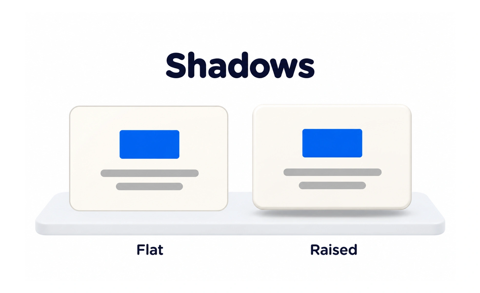
A shadow is a visual effect that suggests depth or separation between surfaces. In interface design, subtle shadows can clarify hierarchy, but they should not carry essential meaning alone.
A paper note casts a shadow on a desk, helping you see that it sits above the surface.
Use depth to explain relationships
A raised card, popover or dialog may use a shadow to distinguish itself from the background. Keep the effect consistent with the product’s depth model so similar components feel related. Borders, contrast and spacing can often provide enough separation without adding a shadow.
Keep shadows restrained
Heavy shadows can make every element appear elevated and compete for attention. Define a small set of levels for meaningful surfaces rather than choosing a new blur and opacity for each component. Check light and dark themes because a shadow that works on one background may disappear or look harsh on another.
Do not rely on shadow alone
A shadow may be subtle, disabled by user settings or difficult to perceive. Use clear boundaries, labels and focus states where needed. Interactive affordances should not depend only on whether an element appears to float.
Frequently asked questions
Key takeaways
- Use shadows to support a consistent depth model.
- Reserve stronger elevation for meaningful overlays.
- Check appearance across themes and contrast settings.
- Pair depth cues with boundaries and accessible states.