

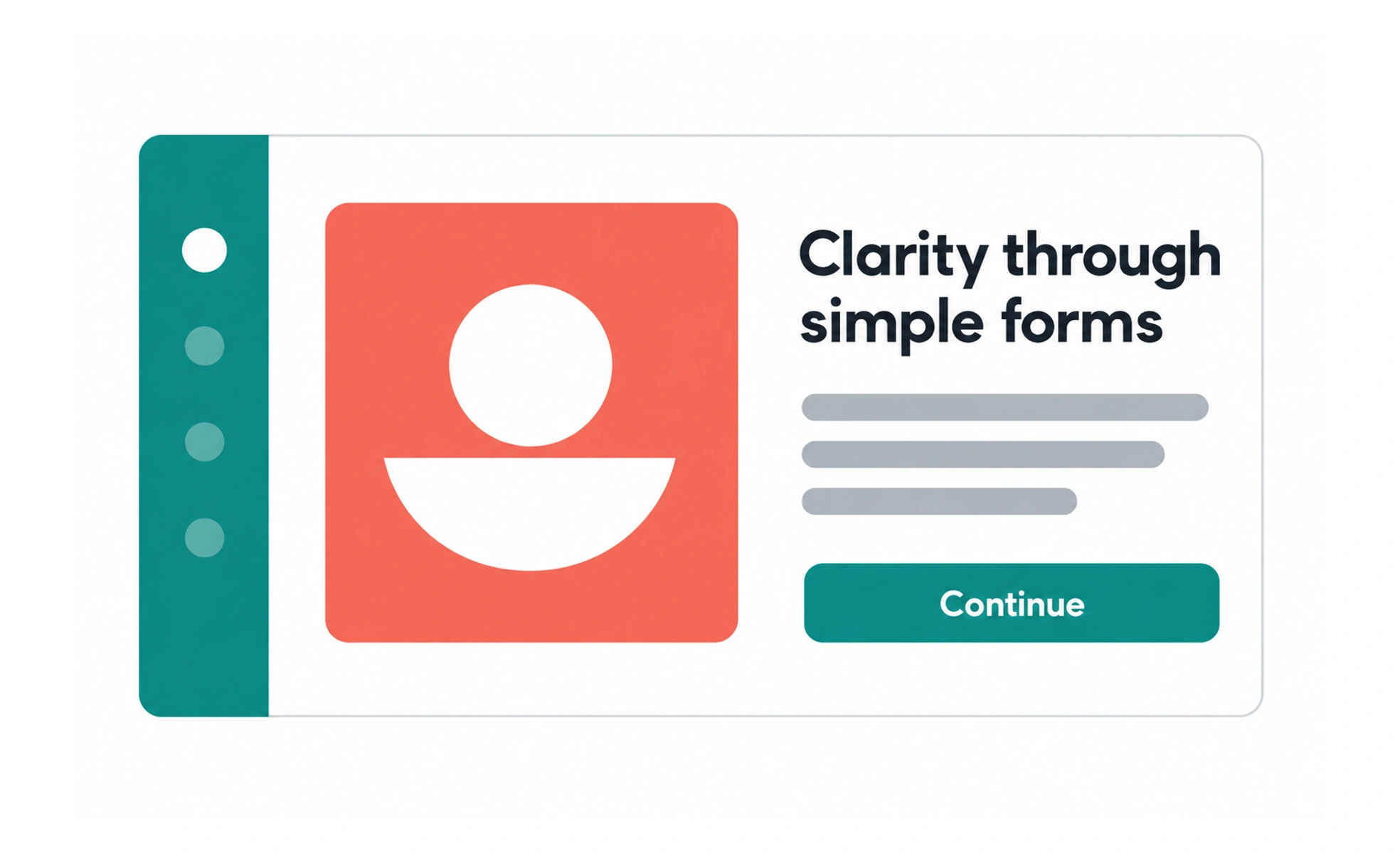
The style can make interfaces feel direct and uncluttered, but removing visual effects does not automatically make a product easy to use. People still need clear hierarchy, recognizable controls, sufficient contrast, and feedback that explains what happened after an action.
A transit map uses deliberate lines and labels instead of realistic landscapes; its simplicity helps people follow the route, not because detail is always bad.
Reduce decoration with purpose
Flat visuals often use solid colors, simple geometry, and restrained shadows. Removing texture or ornament can focus attention on content. Keep any visual detail that helps people understand grouping, affordance, status, or priority; simplicity is useful only when meaning remains clear.
Preserve hierarchy and affordance
A minimal interface still needs to distinguish headings, actions, selected states, and supporting information. Use spacing, typography, shape, and contrast together rather than asking color alone to carry meaning. Controls should look interactive and respond visibly to hover, focus, press, and disabled states.
Make color do useful work
A small palette can create consistency, but colors must remain distinguishable in different lighting and for people with color-vision differences. Check text and control contrast, and pair color with labels, icons, or patterns whenever the state matters to completing a task.
Avoid confusing simplicity with sameness
When every card, button, and panel has the same weight, the screen becomes difficult to scan. Introduce deliberate emphasis through scale, spacing, or a restrained accent. Test the design with realistic content so a clean concept still works when labels wrap or data is missing.
Frequently asked questions
Key takeaways
- Flat design reduces visual effects, not the need for clear interaction.
- Use hierarchy, contrast, and feedback to make controls understandable.
- Do not rely on color alone for important states.
- Test minimal layouts with real content and accessibility needs.