

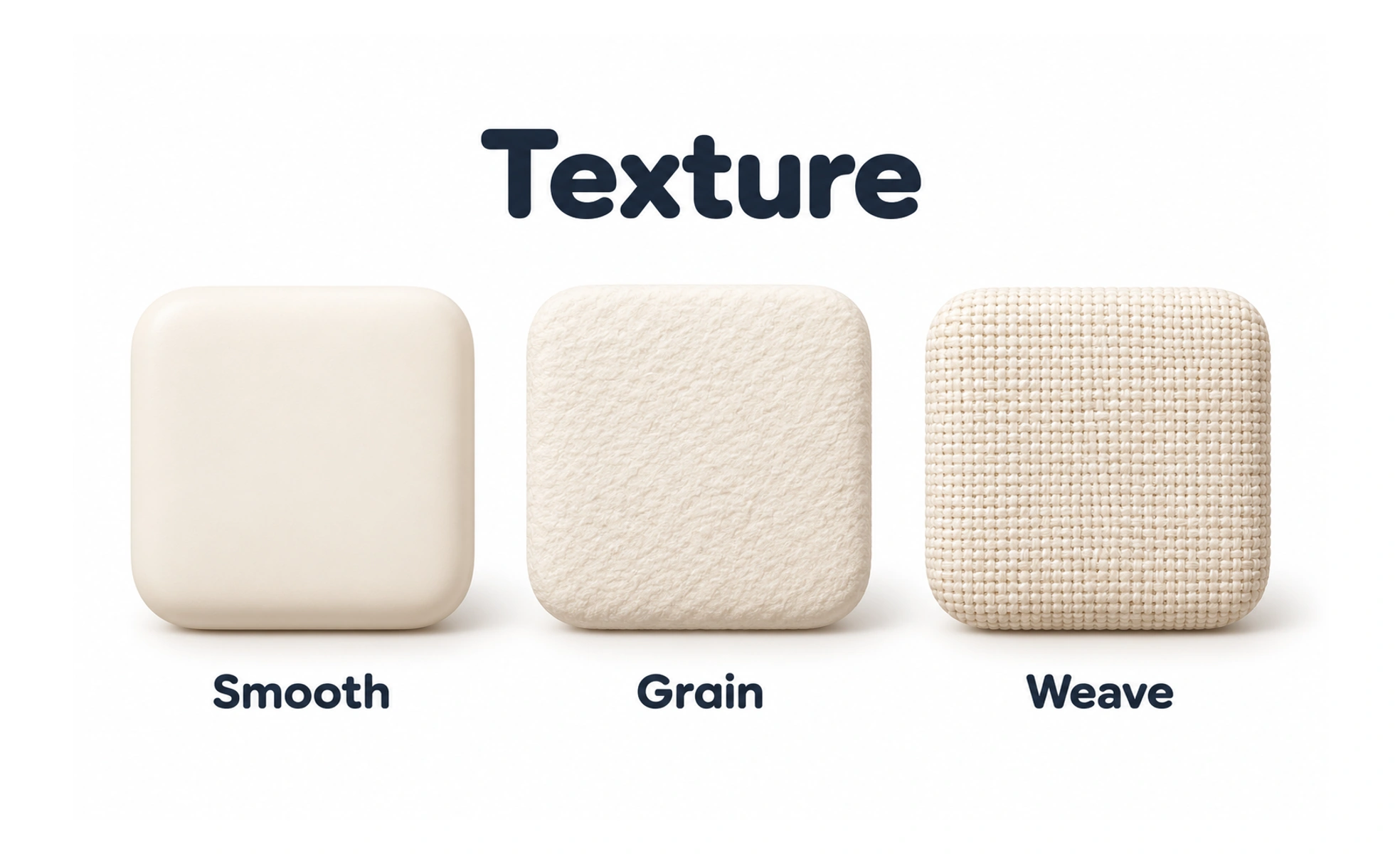
Texture is a visual surface quality created by pattern, material cues or repeated detail. It can add character, but excess texture can reduce clarity and compete with content.
The grain in wood gives a surface character, while a smooth area nearby can keep an important label easy to read.
Use texture with a purpose
Texture can communicate material, add warmth or help an illustration feel distinctive. Decide whether it supports the content or merely adds noise. A product surface that already contains dense data often benefits from simpler backgrounds so information remains the focus.
Protect legibility
Text and controls placed over a pattern need enough contrast across the entire area. Avoid detailed texture behind small type, charts or form fields. If the texture is decorative, keep it out of the way of the message and make sure it does not imply an interactive state.
Consider rendering and performance
Large raster textures can increase download and rendering costs. Repeated patterns may be better represented with a small asset or CSS when appropriate. Check scaling, compression and high-density displays so the texture does not become blurry or visually uneven.
Example: a profile cover
A subtle grain or abstract pattern can make a cover feel less flat. Keep the person’s name and profile controls on a calm, high-contrast area. Offer a solid-color fallback when an image fails, and avoid texture that makes the page feel like a different visual system.
Frequently asked questions
Key takeaways
- Add texture only when it supports meaning or tone.
- Protect contrast and legibility.
- Keep decorative patterns from competing with controls.
- Check asset size, scaling and fallback behavior.