

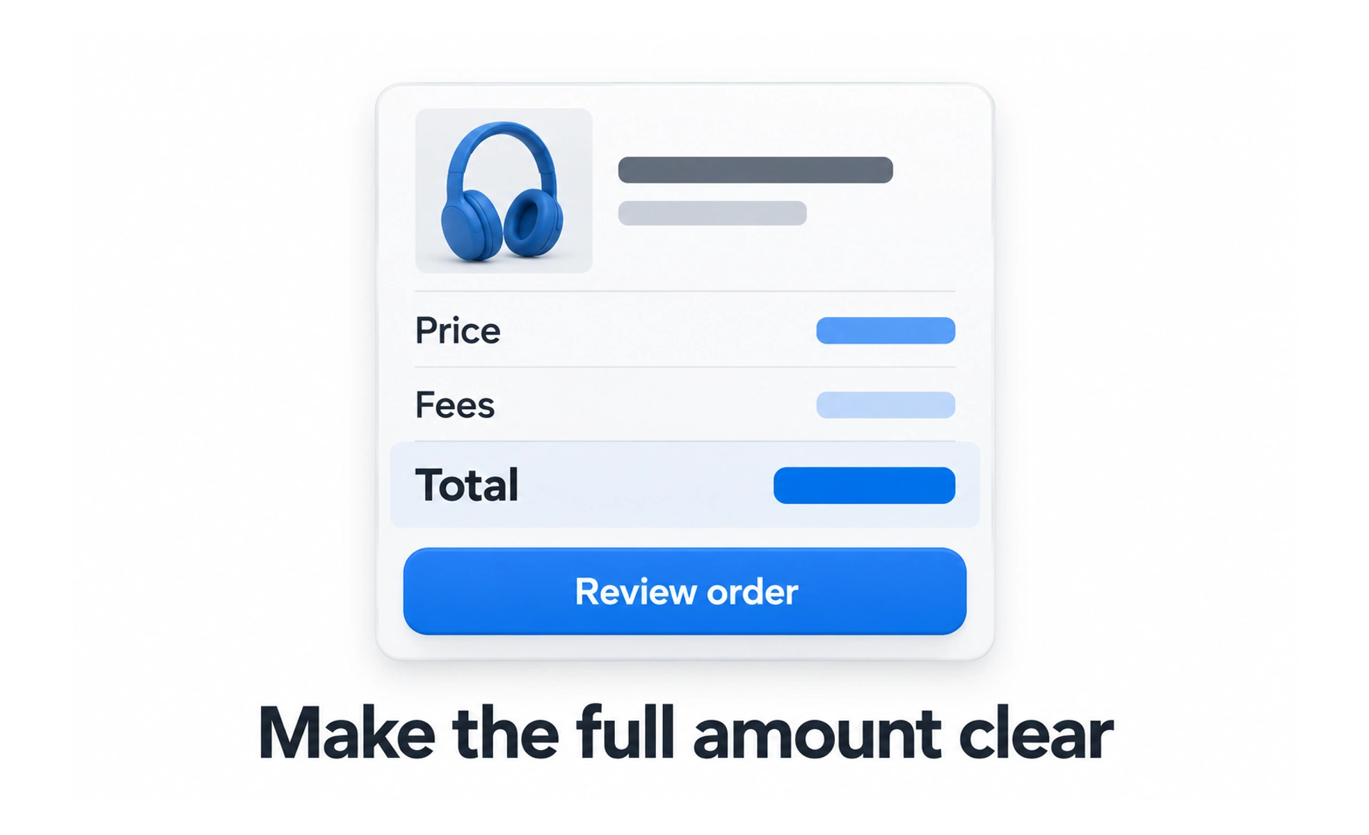
In an interface, price is part of the decision, not merely a number on a button. People need to understand the amount, billing interval, included items, additional charges, and what happens when a trial or contract ends before they commit.
A price label is like a travel itinerary’s fare: the headline number matters, but people also need to know what is included and which conditions change the total.
Show the amount and billing basis
Pair a price with its currency and time period when relevant, such as per month or per year. Make it clear whether a displayed monthly equivalent is charged monthly or billed as one annual payment. Use locale-aware formatting so separators, symbols, and decimal conventions are familiar.
Explain what is included
List important limits, usage allowances, and features that distinguish plans. If taxes, setup charges, or usage fees may apply, disclose them before checkout. Avoid making the lowest visible amount appear to be the full cost when conditions or required add-ons change what the customer pays.
Make changes and renewal understandable
For trials and subscriptions, explain when billing begins, how often it recurs, and how a customer can cancel or change plans. Show the resulting price before confirming an upgrade. Important terms should be readable at the moment of decision, not hidden in a distant policy page.
Use comparisons honestly
A discount or crossed-out reference price should be based on a real, clearly described comparison. State the time period and conditions for promotions. Test the pricing layout with assistive technology and small screens so currency, interval, and plan terms remain connected and understandable.
Frequently asked questions
Key takeaways
- Show currency, amount, and billing interval together.
- Disclose meaningful limits, additional charges, and renewal terms.
- Explain the total change before a customer confirms a purchase.
- Make discount comparisons accurate, accessible, and easy to verify.