

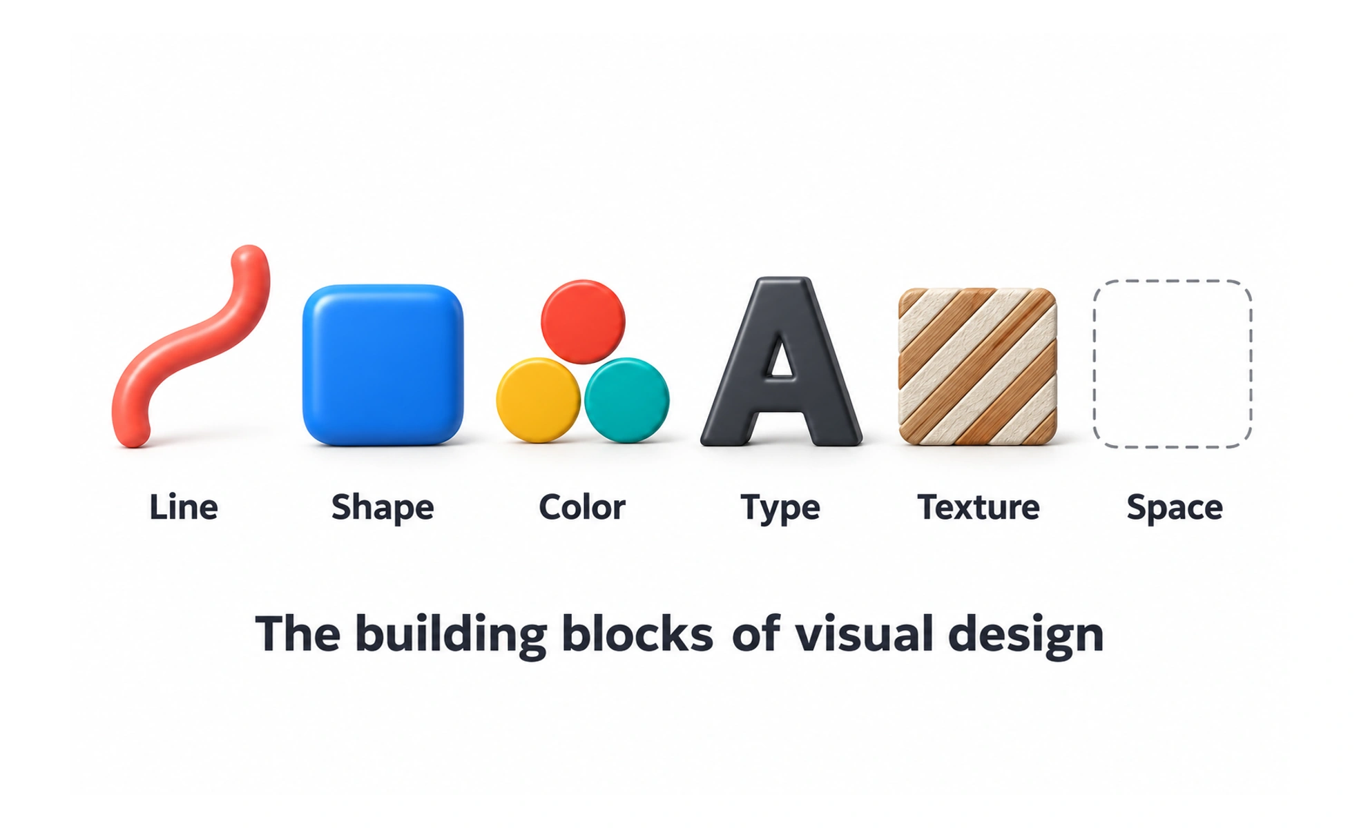
They are the raw materials of visual design. Principles tell you how to use them. Elements are what you have to work with. Every decision about colour, shape, spacing or typeface is a decision about a design element, whether you name it or not.
Think of it like this. A chef has ingredients like flour, salt and heat. A recipe is the principle. The same ingredients in different proportions and orders produce a flatbread, a souffle or a brick. Knowing what each element does is what lets you choose deliberately instead of hoping for the best.
Types
- Line. Divides space, guides the eye and creates structure. A thin divider separates sections. An implied line comes from aligned elements that the eye connects.
- Shape. Geometric shapes like circles and squares feel stable and ordered. Organic shapes feel friendlier and looser. Buttons are usually rounded rectangles. Cards are rectangles. Icons use shape to signal function.
- Colour. The most powerful element for hierarchy, state and mood. Red signals error. Green signals success. Blue often means primary action. Colour also carries brand. Do not rely on colour alone to convey information.
- Space. White space is not empty. It creates breathing room, establishes hierarchy and improves readability. Tight space feels urgent. Generous space feels calm and deliberate.
- Typography. Typeface, size, weight and spacing all communicate tone and hierarchy. A bold condensed heading says something different from a light serif. Every piece of text in an interface is a design decision.
- Value. Lightness and darkness regardless of colour. Value contrast creates emphasis and determines readability. A dark button on a light background works because of value, not colour.
How it works
Elements work through their relationships, not in isolation.
- Size and hierarchy. Bigger elements attract attention first. Consistent size ratios create a clear order of importance.
- Colour and state. Colour communicates what is interactive, what is selected, what is an error. Consistent colour use across a product builds a mental model.
- Proximity and grouping. Things placed close together are read as related. This is how you create structure without labels.
- Alignment and order. Elements aligned to a common edge feel deliberate. Misalignment of a few pixels reads as careless.
A financial dashboard uses the same elements as a children's app, colour, shape, space, type, but chooses very different specific values. That is what creates the difference in feel.
Common mistakes
- Using colour alone to convey meaning. Colour blind users and high contrast mode both break this. Pair colour with text, icons or patterns.
- Inconsistent type scales. Two headings that are 14px and 16px apart look like a mistake, not a hierarchy. Design a scale and stick to it.
- Fighting white space. Removing space to fit more content usually makes everything harder to read. Space is the element that lets the others work.
- No type scale. Ad-hoc sizes create visual noise. A modular scale or a practical scale defined by the interface produces cohesion.
- Choosing elements by trend. A gaming interface legitimately uses saturated colour and dramatic contrast. A banking app does not. Context decides the choices, not what is fashionable.
Frequently asked questions
Key takeaways
- Design elements are the raw materials: line, shape, colour, texture, space, typography, form, value, size and pattern.
- Elements are the what. Principles are the how. You need both to design deliberately.
- The same elements create different experiences in different contexts. A financial dashboard and a gaming interface both use colour and type, but choose very different values.
- Colour alone is not enough to convey meaning. Pair it with text, icons or patterns.
- White space is a design element, not the absence of one.