

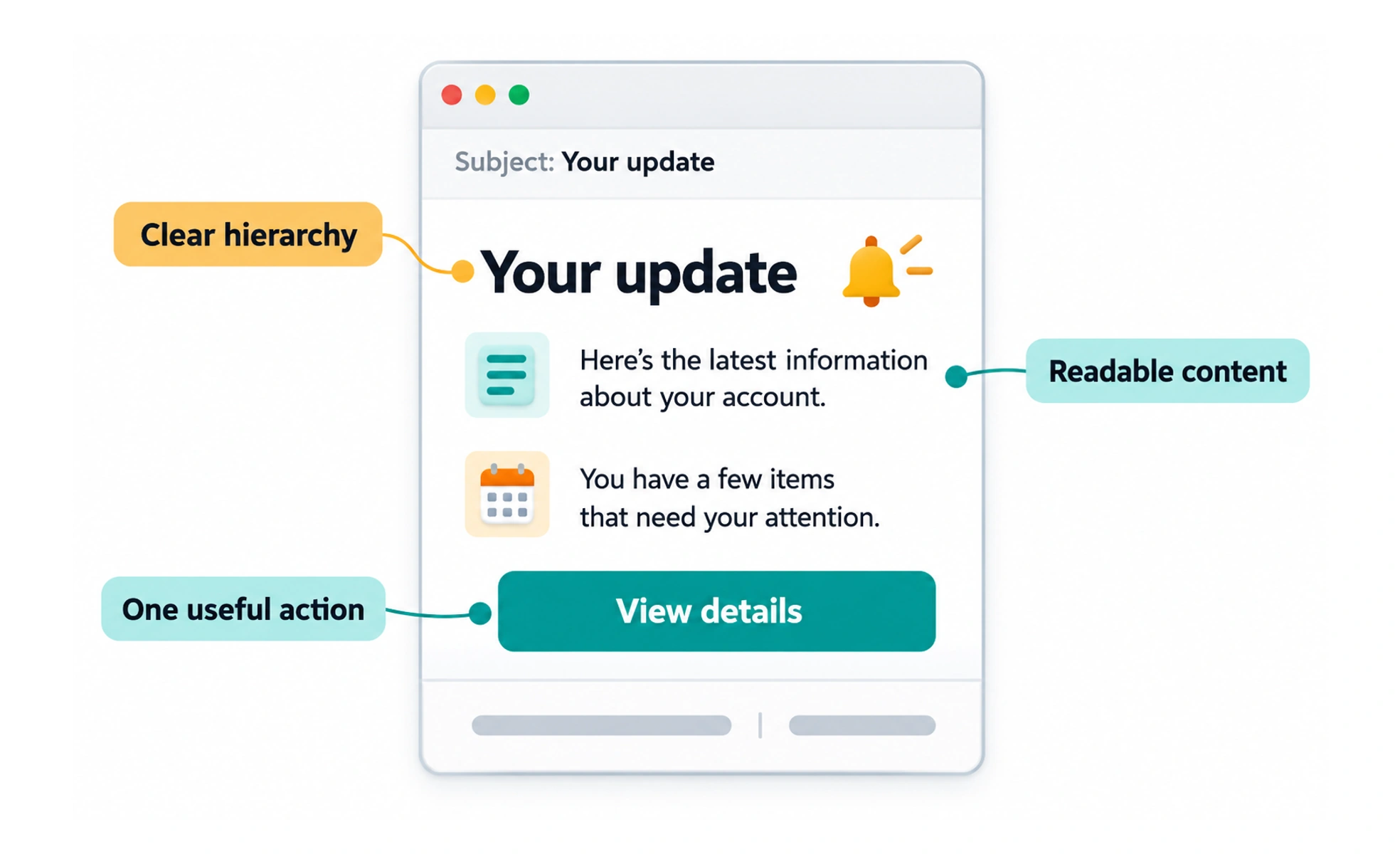
Email design organizes a message so recipients can understand why it arrived and what to do next. It combines clear content, accessible structure, dependable rendering, and appropriate delivery behavior.
A useful letter identifies its sender, explains its purpose, and makes the requested response clear. Email needs the same foundation across many viewing conditions.
Lead with purpose and identity
Use a recognizable sender and a subject that accurately describes the message. Explain relevant context near the start, especially for account actions. A recipient should not need to inspect a decorative image to understand why the service contacted them.
Design for varied clients
Keep the layout readable on narrow screens and when images are blocked. Use meaningful text, accessible links, and suitable alternative text for informative images. Test actual rendering rather than assuming a web layout will behave identically inside every mail client.
Make actions and limitations clear
Give the primary action a descriptive label and explain relevant expiry or next steps. Keep sensitive information out of unnecessary message content. Account verification and deletion need careful server behavior; a mail preview or automated link visit should not unintentionally complete a destructive operation.
Example: verifying an address
A verification message can identify the service, explain the request, and offer one clear confirmation link. The destination should handle expired or already-used proof understandably. Delivery success and account verification are separate states, and the interface should report each accurately.
Frequently asked questions
Key takeaways
- Make sender and purpose recognizable.
- Keep meaning available without images.
- Test responsive and client-specific rendering.
- Design links and account actions for safe, clear behavior.