

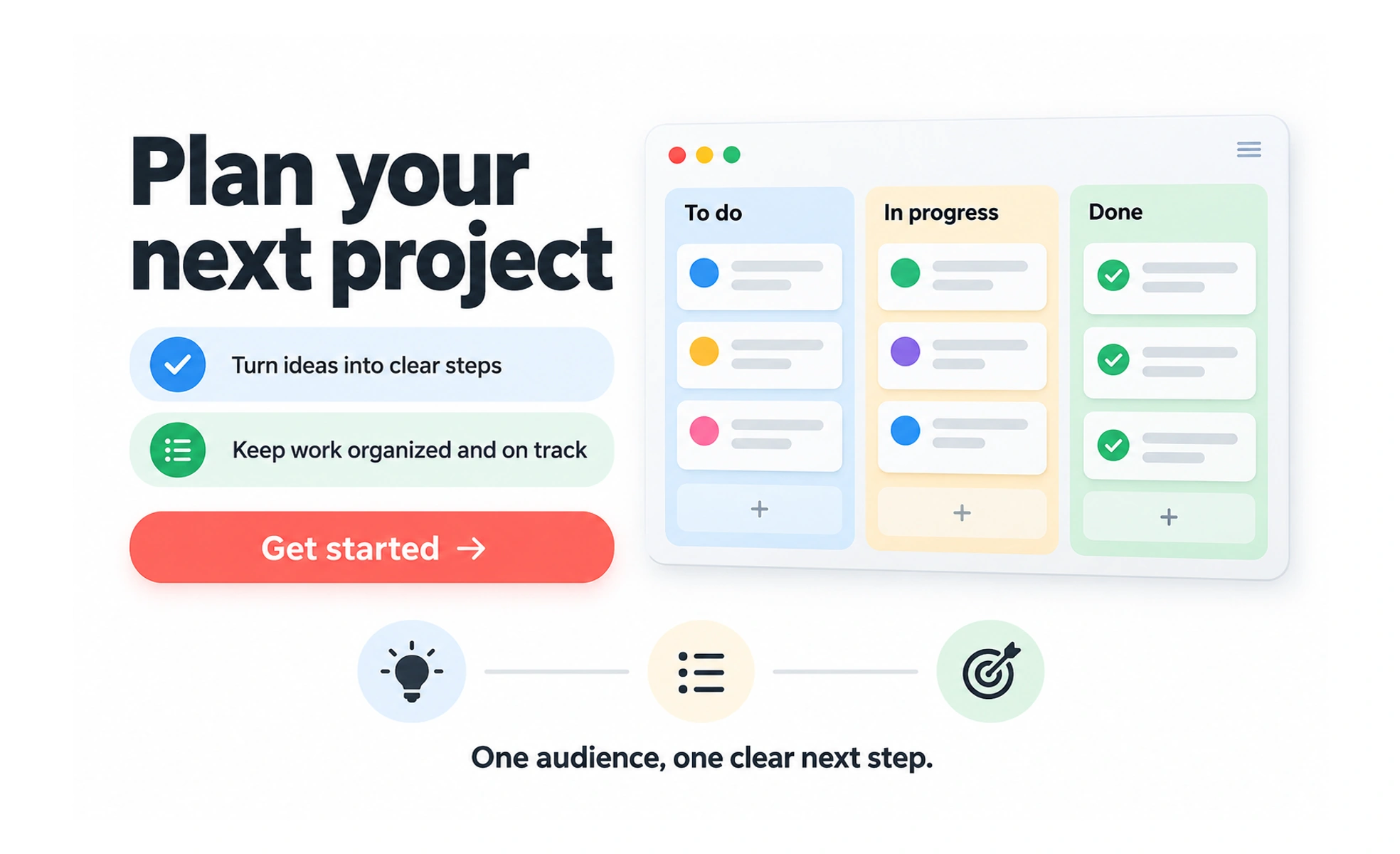
Landing page design shapes a page around a particular audience and next step. It helps visitors understand the offer, evaluate relevant evidence, and decide whether the action suits their needs.
A clear shopfront tells passersby what is inside and why they might enter. A landing page connects an arrival context with an understandable offer.
Match the promise that brought people
Consider the advertisement, search result, or referral that leads to the page. The heading and visible content should confirm a relevant destination. If the offer changes after arrival, people may feel misled even when the visual design is polished.
Explain value and evidence
State who the product serves, what benefit it offers, and the conditions that matter. Use authentic examples and supported claims. Screenshots or demonstrations should represent available behavior rather than imply that unfinished capabilities are already part of the offer.
Support the intended decision
Place a clear action where people have enough context to choose it. Include important pricing or commitment information before the action becomes binding. Keep navigation, content length, and form fields appropriate to the task instead of following a fixed template for every campaign.
Example: a course preview
A page can explain the course audience, skills, lesson format, and effort before inviting a learner to preview it. Check small screens, loading, and keyboard use. Measure whether visitors reach useful learning, alongside immediate signups, so a persuasive page does not hide a disappointing next step.
Frequently asked questions
Key takeaways
- Connect the page to the visitor’s arrival context.
- Present a specific offer with credible evidence.
- Make actions and material commitments clear.
- Evaluate the complete experience after conversion.