

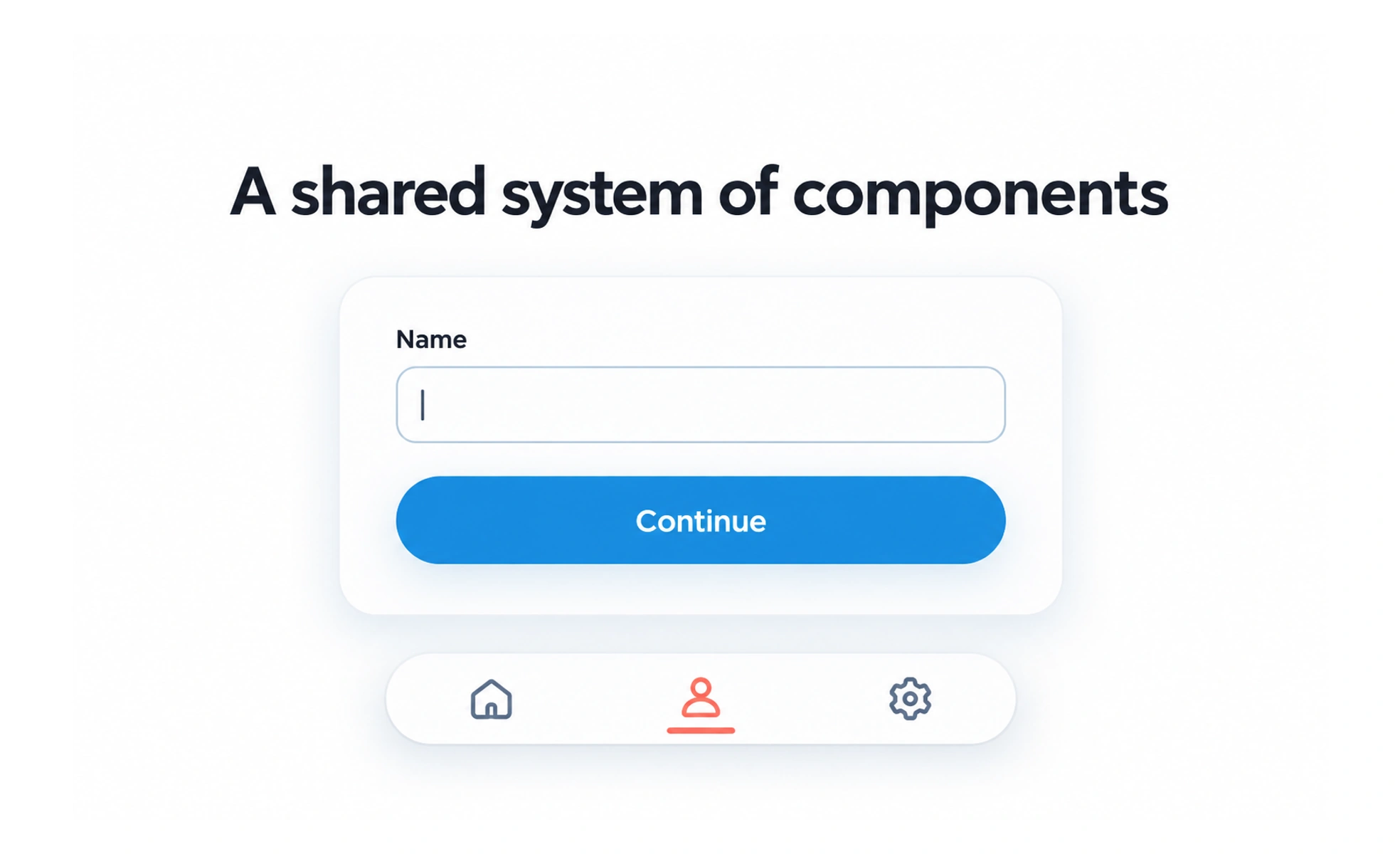
Material Design is a design system created by Google that provides guidance and components for building digital interfaces. It has evolved over time and should be applied with attention to product context.
A design system is like a shared construction guide: it offers reliable parts and rules, while the final building still needs to fit its people and place.
Understand it as a system
Material Design includes principles, patterns, components, and implementation guidance rather than a single visual style. Its versions have changed, so identify which guidance and component library a project uses. Mixing recommendations from different generations without a reason can create inconsistent behavior.
Adapt to the product
A design system helps teams make consistent decisions, but it does not remove the need to understand users and tasks. Evaluate whether a pattern fits the product’s information, brand, accessibility needs, and platform conventions. Adaptation should preserve usability rather than copying a surface treatment mechanically.
Use components with their behavior
Components come with interaction expectations, states, and accessibility behavior. When adopting a component, review its keyboard support, focus management, responsive behavior, and customization limits. Styling a component to look different while leaving its interaction model unchanged can create confusing results.
Example: choosing a dialog
A team using Material guidance can start with its dialog patterns, then verify whether a centered dialog or a mobile bottom sheet better fits the task and platform. Test dismissal, focus, scrolling, and screen-reader behavior. The system provides a strong starting point, while product evidence guides the final choice.
Frequently asked questions
Key takeaways
- Treat Material Design as a versioned system of principles and components.
- Apply patterns in context rather than copying appearance alone.
- Preserve component behavior and accessibility when customizing.
- Verify the chosen interaction on target platforms.