

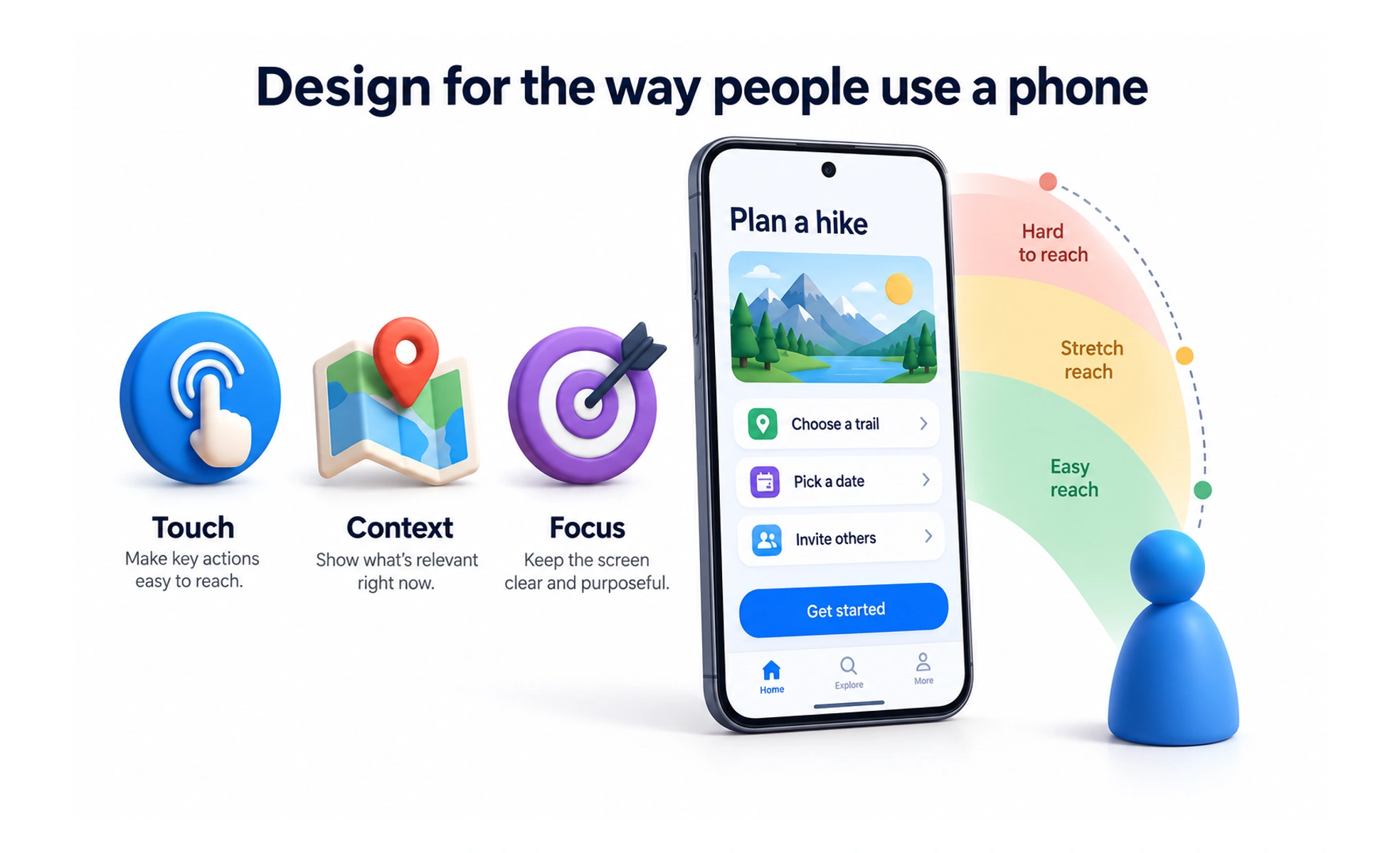
It accounts for small screen viewports, thumb-driven ergonomics, variable network conditions and physical distractions. Designing for mobile requires rigorous prioritization of content and large touch targets.
Think of it as packing a small carry-on suitcase for a flight. You cannot pack every piece of clothing in your wardrobe. You must pack only the essential items you genuinely need.
How it works
Mobile design optimizes interfaces around physical touchscreen mechanics and variable environments.
- Thumb zone ergonomics places primary action buttons within comfortable reach of the user's thumb near the bottom.
- Minimum touch targets maintain at least forty-four by forty-four pixel hit areas to prevent accidental mis-taps.
- Linear vertical scrolling organizes complex content into single-column feeds that feel natural to browse on mobile.
- Adaptive keyboards automatically trigger numeric or email-specific software keyboards based on active form fields.
When to use it
Apply mobile-first design principles whenever your product serves users on smartphones or tablets.
- Responsive web applications scale layouts down gracefully from desktop displays to mobile viewports.
- Native iOS and Android apps leverage native platform capabilities like cameras, biometric auth and push alerts.
- Field service and delivery software supports frontline workers operating in distracting, outdoor physical environments.
- Mobile checkout optimization integrates Apple Pay and Google Pay to enable seamless one-tap purchasing.
Common mistakes
Teams often stumble by attempting to cram full desktop software into tiny mobile screens.
- Shrinking desktop tables directly, forcing mobile users to perform awkward horizontal scrolling to read data.
- Placing primary buttons in top corners, forcing users into awkward two-handed grip acrobatics to tap actions.
- Relying on hover states, forgetting that touchscreens have no mouse cursor and cannot trigger hover effects.
Frequently asked questions
Key takeaways
- Mobile design prioritizes thumb-friendly navigation, large touch targets and single-column layouts.
- Touchscreens lack cursor hover states; all critical interactive elements must be visible upfront.
- Optimize for real-world distractions by designing simple flows that tolerate interruption.
- Leverage native smartphone hardware like biometric login and mobile wallets to cut friction.