

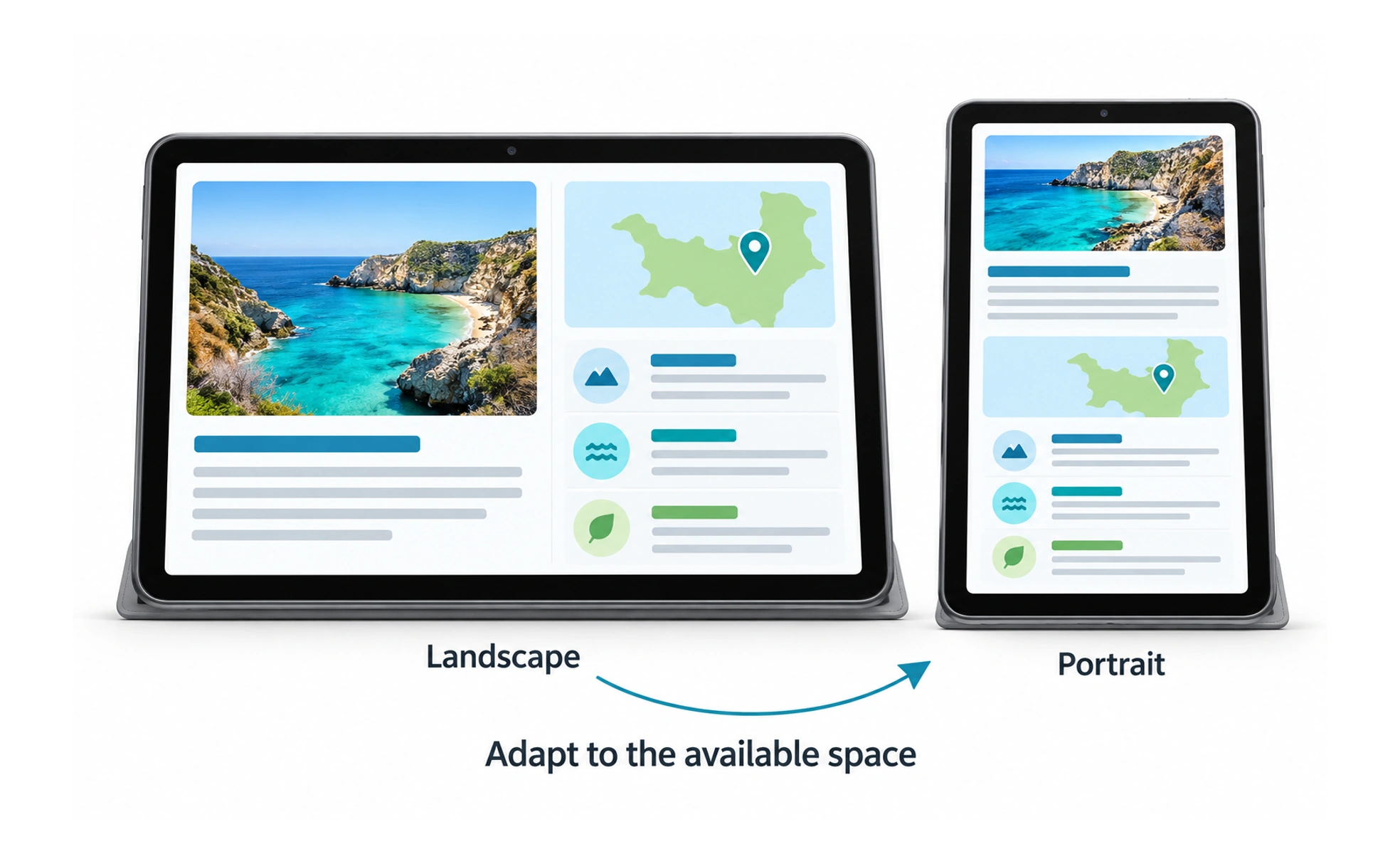
Tablets can move between handheld and desk-based use, in portrait or landscape, with touch, a keyboard, a stylus, or assistive input. A tablet interface should respond to these changing conditions instead of assuming one fixed orientation or interaction style.
A tablet is like a flexible sketchbook that can become a small workstation: the same task may feel different when held, propped up, or paired with a keyboard.
Use the available space well
A phone layout stretched across a tablet can leave content awkwardly far apart, while a desktop layout may feel too dense for touch. Use the extra width for meaningful parallel content, larger reading areas, or improved navigation without making each line difficult to scan.
Support changing posture
People may hold a tablet in one hand, rest it on a table, or use a stand. Controls should remain reachable and content should reflow when the orientation changes. Do not hide a critical action in a corner that is difficult to reach in common holding positions.
Design for multiple inputs
Touch is common, but many tablets also support a keyboard, pointer, or stylus. Keep keyboard focus visible and make important actions work with available input methods. Stylus interactions can add precision, but essential navigation should not depend on drawing or handwriting.
Test actual combinations
Check portrait and landscape layouts, split-screen use, text enlargement, and external accessories where relevant. Screen size and aspect ratio differ across devices, so use responsive constraints rather than targeting one tablet model. Ensure the interface remains useful when an accessory is disconnected.
Frequently asked questions
Key takeaways
- Treat tablet as a distinct, flexible context rather than a stretched phone.
- Use extra space to improve the task without hurting readability.
- Support touch, keyboard, pointer, stylus, and assistive input.
- Test orientation, split-screen, and changing accessories.