

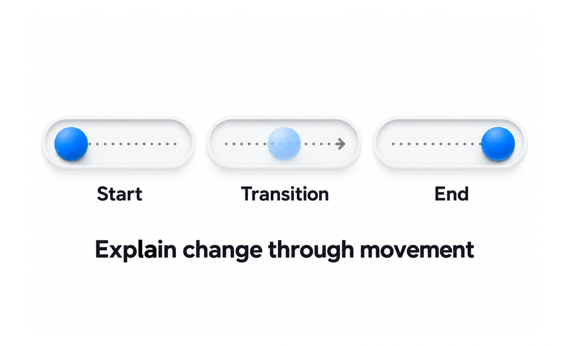
A transition can help people understand where content came from or what changed after an action. Motion becomes a problem when it delays the task, distracts from content, causes discomfort, or carries meaning that is unavailable to people who cannot perceive it.
A well-timed motion cue is like a guide pointing out a change in a room; constant waving would make it harder to focus on anything else.
Give movement a communication job
Use motion to show continuity, direction, cause, or feedback. A panel that expands from its trigger can explain the relationship between the two states. Decorative movement should not compete with reading or make a simple action feel slower than it is.
Keep timing and easing restrained
Short transitions usually fit frequent interface actions, while larger changes may need more time to remain understandable. Consistent easing can make movement feel connected, but timing should respond to distance, task importance, and device performance. Avoid holding users until an animation finishes when the result is already ready.
Respect motion preferences
Some people experience nausea, dizziness, or distraction from movement. Honor reduced-motion settings and provide a less animated way to reach the same state. Avoid flashing and rapid repeated movement, and do not use animation as the only way to communicate success or error.
Test real interactions
Check motion on keyboard, touch, and pointer input, including interrupted or repeated actions. Ensure transitions do not create layout jumps, hide focus, or obscure information. If the interface updates from a network response, design the loading and failure states as part of the same sequence.
Frequently asked questions
Key takeaways
- Use motion to explain state, cause, feedback, or spatial relationships.
- Keep animation proportional to the task and avoid unnecessary waiting.
- Honor reduced-motion preferences and preserve equivalent information.
- Test performance, focus, and interrupted interaction states.